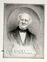
Hi everyone, okay, so for Me & Shan Huang Our collaboration Mid-Term presentation we are researching about the the typographer Firmin Didot.
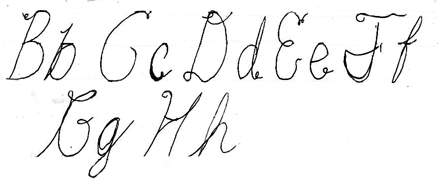
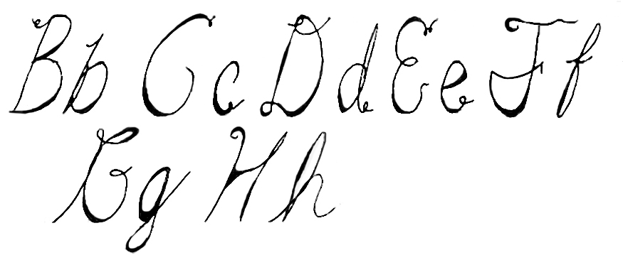
Firmin Didot was a French printer, engraver & has also created his own type Didot.
He was born in France in Paris from a family of printers. His family own their own printing manufactory which at the
Time was a place for many printers came from around the world They called it the house of Didot & they were the King’s printers & were
Often encouraged to create new fonts. Of the 3 generations in His family, Firmin Didot was considered the most important as far as type design.
He created the first modern Roman typeface in 1784 which is known as didot.
He also created the typeface Ambroise, which is a contemporary interpretation of various typefaces belonging to Didot’s late style, conceived circa 1830, including the original forms of g, y, &; and to a lesser extent, k.
These characters are found in Vibert’s typefaces. Vibert was one of the appointed punchcutters of the Didot dynasty. Punch cutting at the time was a hard and long task. In the case of the various Didot styles of typefaces we find in the company’s catalogues of typefaces that it was more the job of a team over a long period rather than the unique work of one designer.
In the past, (before the 20th century) you generally find only one style of typeface, Garamond at the time of Claude Garamond, Didot at the time of Didot, according of the country were you live. There is also a certain amount of influence between European master-punchcutters, an example being that of Bodoni, who cut and printed from fonts derived from those of Fournier. In the past, typeface trends remained in vogue for long periods of time. For instance, the Didot family, who began working in the middle of the 17th century, continued until the 20th century. Several punchcutters, such as Pierre-Louis Vafflard, Léger, Vibert, Molé and Didots themselves such as François-Ambroise or Firmin, worked on Didot typefaces with different styles. The Didot cut by Ambroise Didot, and used in the ‘Virgile’ published by Pierre Didot in 1798, is generally described by the specialists as the most accomplished. After some years of interest in Didots, it seems that it was Vibert who cut the some unusual lowercases to improve the rationality of the forms. Theses unusual forms endorse the general effect of verticality which is the prime characteristic of the Didot.

It is the weighty Black, which was the basis for the conception of the family of display Didots. In the second half of the 19th century, it was normal to find fat Didots in several widths in the catalogues of French type foundries, mostly alphabets of capitals only. The narrow versions were widely used for heavy titlings in theatre posters. These same typefaces continued to be offered by French foundries such as Deberny & Peignot (in Spécimen général des fonderies Deberny & Peignot, Paris, 1955) until the demise of the last type foundries in France at the end of the 1960s.
Revivals
It is know that Didot faces are highly contrasted, generally more than their italian counterparts designed by Giambattista Bodoni. Original Bodoni counterforms are more round compared to the much later interpretations such as the Morris Fuller Benton (1910) or Henrik Jost version for Bauer (1927). In fact, it is the Didots typefaces which are truly vertical in their counterforms. The general flavour of the Bodonis is more soft and curvy, whereas Didots are more strict in their design.
Compared to Bodoni, there are fewer Didot revivals. The Didots were used in France until the 1970s because of their availability in Deberny & Peignot catalogues. Today, Didot is not so much used, but the name Didot remains a reference in France because of the long duration of their dynasty. For example, there are many places and streets in Paris which are called Didot but only one very tiny street is named after Garamond! Didot is also the name used by the older generation of French typographers when they refer to didones (or Modern) typefaces. And there is the Francis Thibaudeau classification (La lettre d’imprimerie, Paris, 1921) which uses ‘Le Romain Didot’ as a category.
Today, there are two major revivals of Didot typefaces. Adrian Frutiger designed a Linotype Didot in 1991 based on the work of Firmin Didot (1764-1836). Frutiger used Voltaire’s book, ‘La Henriade,’ published by Firmin Didot in 1819, as the basis for his design. Jonathan Hoefler designed HTF Didot originally as a titling family for ‘Harper’s Bazaar’ in 1992, but quickly the magazine asked for more sizes and weights, and for versions more adapted to text composition. HTF Didot is now part of the Hoefler typefoundry collection. Hoefler had two sources of inspiration: one seems to be Molé le Jeune (1819); and the other Pierre Didot and Vibert. Both of these revivals, HTF and Hoefler, take the most common model of Didot.
I try to focus on uncommon sources as a complement to these previous revivals rather than a direct competitor. Ambroise is a titling family which exist only in roman form but which includes many different weights and widths as used in late 19th century French publishing and early advertisements.
This was the standard typeface in Frace for about a centry.
“France is indebted to the Didot family for the publication of the Biographie Nationale, and Belgium is also indebted for the establishment of her Royal Press. Relatives of Firmin Didot include François Ambroise Didot (1730–1804); Pierre François Didot (1732–95); Henri Didot (1765–1862); and Pierre Didot (1760–1853).
Essai sur la Typographie by a member of the Didot family was published at Paris in 1852.”
Interestingly enough, He also founded the phrase “Sterotype” which is a actually the name for the metal printing plate used for printing on pages. He redefined the way in which people printed with metal plate printing in Contrast to the popular method of the time which was movable type Which involved printing pages directly.
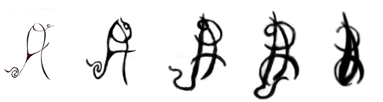
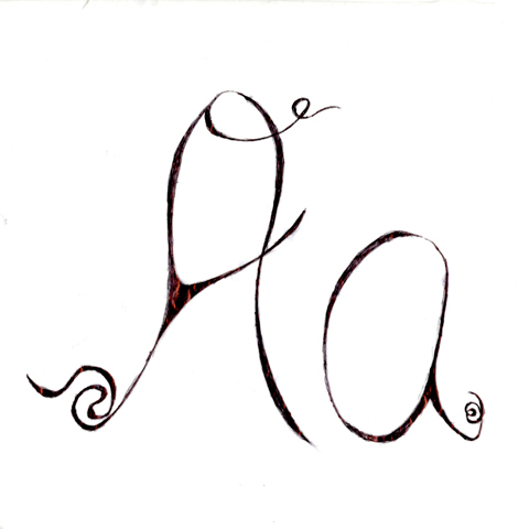
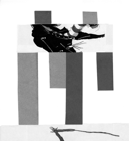
His Font was quite popular around the time period of The 17th & 18th centuries, which was quite the wild times as you can see in this
His work can be seen gracing the covers of such Famous magazines such as Vogue, Bazaar & Elle Magazine.
Hi all, okay for my typographer I’ll be researching Firmin Didot & creating a presentation for Monday. Here are some of my initial findings listed below. I’ll be using this information to help me present.
THESE ARE OUR SOURCES BELOW
~Information above Referenced from wikipedia.org/wiki/Firmin_Didot
~Information above Referenced from identifont.com