Hi everyone, so today I’m going to talk to you a little bit about my latest project called the 5 in 5. Basically, my mission is to build 1 project a day for 5 days, document my projects before I start and after I finish them as well. Basically to just show the process in which I used to create it. But there is a little bit of a curve ball thrown in, that is, I can’t just create anything that I want without a constraint or limit to the project involved. Constraints are the underlying parameters used to define a project. They are usually present in the world of design. So I’m supposed to think of them instead being a limiting factor; but to view them as a window of opportunity to open me up to creative areas that I might not otherwise have thought of. Constraints can be as simple as a color palette, song lyrics, objects on your desk, etc. I try to think of them of as a set of rules that needs to be followed. Here are the rules in which I need to abid by for my 5 in 5:
My constraints are the following:
Limited time daily to be able to create a project & then write about it afterwards.
To create 5 projects in 5 days, 1 project a day that is.
2 of the projects I’m creating need to be analog (no computers or digital devices allowed)
2 of the other projects I’m creating need to be projects that are digital (software or hardware ok)
& 1 Project that is a hybrid between Analog and Digital (Combines both elements)
Guiding Questions:
€ When is a project fully complete? How do you know you are ³finished² with a project?
€ How does the framing of a project, its context, scope, and parameters, determine the
content created?
What is the relationship between concept and execution?
€ After completing your projects what do you think could have been improved?
If you were to do another iteration of the project what would you change or refine?
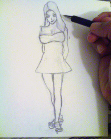
So for my first assignment, I have decided to do an illustration of the main character from a story that I’m writing by means of pencil & paper. I will try to show you the process in which I use to create the character step by step. Since this illustration will eventually be used in a book, the user/viewer will have to interface with it by manually turning the pages of the book…LoL. Okay so for my first sketch for many of you who do not understand illustration, one of the first things you do is to start with in a drawing is composition. Composition is an integral component of siring new artwork. Basically composition means “where you place your subject matter in a drawing” These are some basic rules in which I try to loosely follow in my sketches drawings & paintings.
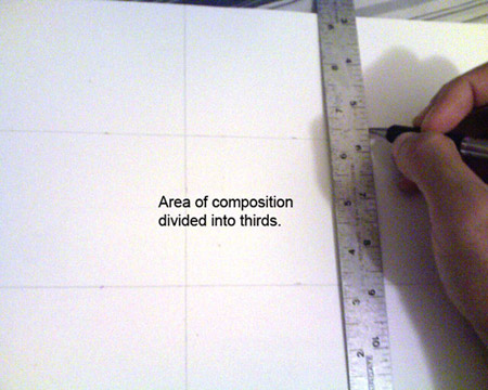
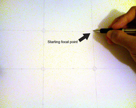
The rule of 3rds this can be used in various types of drawings. Here’s how it works, pick the size of your artboard, & divide the area into thirds in both directions top to bottom & left to right. The four points where the lines cross are usually some of the best places for the focal point of a drawing. It’s not really an inflexible rule but it’s usually a good way to get a nice composition without messing up too much.
(Ran into some problems with my computer. Will try to get some imagery up soon.)
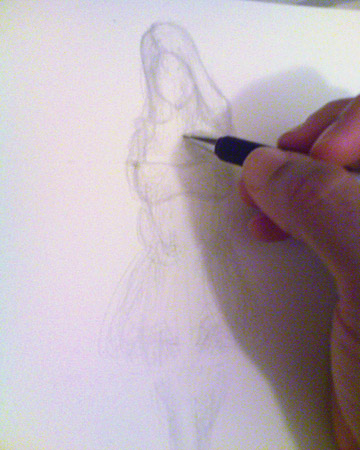
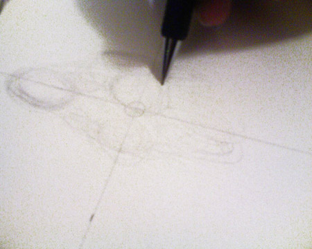
Okay, so after I have decided on where my focal point will be for my drawing, one of the first things that I do when I create a new drawing is to create a gesture drawing. For those of you who are not sure what a gesture drawing is, basically it is a work of art that is drawn by an artist in kind of a rapid execution style. For some artist, myself included, the gesture can be considered a 1st step toward a more complete piece of work. Usually a gesture drawing takes not more then 2 minutes. So that will be my constraint for this first project. In this particular case, I will use a gesture drawing as the 2nd step toward a more complete piece of work. Since I was having some technical trouble with my computer yesterday which shortened my time, so I had to end up taking my 5 in 5 project in a different direction then originally intended. Here is my process below:
1.

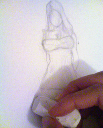
2.
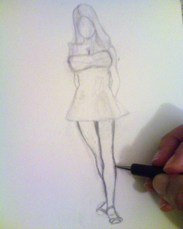
3.
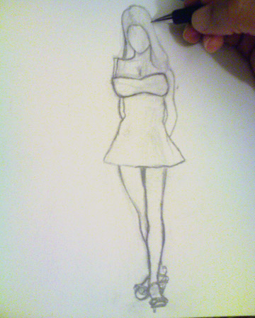
4.
5.
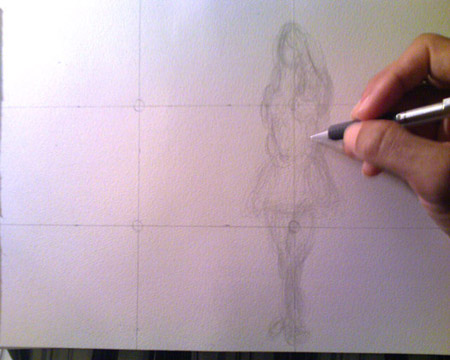
For my next 5 in 5 project, I will start defining the figure.