Design Blog by Dennis

Design for this Century – The Genius of Design

For my proposed reading submission, I want to review the book “The Genius of Design” by Penny Sparke; 2009. What I enjoyed the most about this book was the part named “Tomorrow and Tomorrow and Tomorrow” for many reasons. When the subject of the space moon walk in 1969 was introduced I thought it was interesting because it was said to be the quintessential technological achievement in mankind’s history that was supposed to lead the way to new technological achievements to the future. Robot house keepers, jetpacks & routine flights into space for a day of leisure. However, real life did not pan out to be so. The economic downturn in the early 70s that followed, caused people to rethink their materialistic attitude they had toward future innovations & made their thinking more practical. Designers in particular, had to constantly re-evaluate their roles with shifting economic crests & troughs. The 80s brought back the economy’s strength, once again causing designers roles to change with the times. Designers often had to deal with problems of over utilization & rehabilitated their roles to face problems like design’s social, cultural & ethical roles. I think this book gives interesting perspectives on a designer’s ever changing roles with the world around us. Especially in these economic times when peoples sense of practically in terms of design affects us designers directly in the products people consume.

Posted in Assignments | 3 Comments

Design for this century – Jamer Hunt: Lecture reflection

In the lecture by Jamer Hunt, he basically starts off talking about Scaler Shifts & designs potentialities. He begins talking about portions & gives an example of how human beings grow in a un-proportional way to adulthood from toddlers. Jamer then talks about Tom Freedman & how he created the 1 ft ruler based on his own feet & talks of how originally the inch came from the length of the human thumb. In European earlier days aristocrats (Kings) based scale of 1 foot based on the current reigning king & in 1959 a new standard on meter was established based on how far light travels in a vacuum in 1/299 792 458 of a second equaling distance of 1 meter.
Hunt then goes into talking about scales of disaster & how in the US millions of soda bottles goes to waste every 5 secs & shows us an image of a junk heap of discarded bottles. In the next image it zooms back top show the enormity of scale of what that actually looks like in real life. He proceeds to do a similar example with discarded cell phones.

The part of the lecture I found most interesting was the photo of Tokyo city & how the photographer created a camera lens that would distort the images of real life buildings to look like toy model mock-ups of the city. I’ve never seen anything like it or could even image how something like this can be done with a lens.

However, I think that the main point of this lecture was that as designers we should really be trying to re-evaluating how we design in terms of small focused scale & how we should always step back to see how our designs can affect the world around us. We should, whenever possible take on the consideration of designing not just in terms of small scale but large as well, to have a positive influence in the world around us us based on the resources available to us as designers at that moment.

Posted in Assignments | 2 Comments

Alien Space Ship – Maya: Box Modeling

Hey everyone, so today I will be modeling an alien spaceship using what’s most commonly known as box modeling. I added a background after I finished modeling it.

Final Render

Step 1

Step 2

Step 3

Step 4

Step 5

Step 6

Step 7

Step 8

Step 9

Step 10

Step 11

Step 12

Step 13

Posted in Assignments | 4 Comments

Lecture Reflection #2 – Design for This Century: Ted Byfield

In the lecture by Ted Byfield, he starts off talking about a map designed to represent a cross section of information about murders occurring in New York city. Everyday the NY Police department announces crimes happening in the city usually made from reports, news accounts & other reporting in general. The map shown to us was the reported data from 2003 – 2009. Byfield pointed out the fabricators & designers of the map could have done a better job by including some key information about the crimes. For example, listing information about the month & time of day it happened. Information about race or ethnicity of the perpetrator, the gender of the victim, the age of the victim, the age of the perpetrator, type of weapon used, the borough in which the crime occurred could have made this a more comprehensive resource for others to review. He went off on a tangent about the various names for these types of charts. They were
“scientific visualization”, “information visualization”, “information architecture”, “information design”, “infographics”, “explanation graphics” & “data visualization”.
He then went on to talk about informational images & the common characteristics of them. Characteristics such as the hybrid use of text, quantitative data, maps, images, and/ or legends.
The next thing he covered was how our perception of knowledge consumption is influenced by technology creating seeming jumps in our average human knowledge base. We were shown a comparative analysis of human consumption of knowledge in the contrasting form of an average Sunday New York Times newspaper & how it compares to the lifetime knowledge of people living in different historic periods of time. E.g. “The New York Times on an average Sunday contains more information than a Renaissance-era person had access to in his entire lifetime.” Something I didn’t know & found quite fascinating, whether it is true or not. We got into a discussion in class about a designer’s ethics, principles & the omission of certain data when creating data visualization charts in professional practice. There have been times when as a designer, we sometimes have a bias in the creation of our designs. For me, when working with others, there have been times when I made a prototype or thumbnail concept I really liked & presented it in a certain positive light to influence the people I worked with regardless if they really preferred one of the other thumbnails or sketch concepts I made as an alternative. This lecture & the following recitation class let me reflect on my own design practices & design practices in general.

Posted in Assignments | 3 Comments

Reading Reflections

The Social Life of Urban Spaces

Hi everyone, so today I’m going to be reviewing an excerpt from the book “The Social Life of Urban Spaces” by William Whyte. Whyte starts off by talking a little bit about public city spaces & why some work to serve the people using them & why some spaces designed do not function as they were intended to for various reasons. He brings up the group he called “The Street Life Project” which he founded in the early 1970s. This organization started off studying New York City parks & playgrounds. They focused on the subject why some parks were crowded for recreational use & why some were not. They looked at why kids in East Harlem at the time preferred playing in the streets in comparison to a local playground. They noticed additional factors such as concerned mothers & family member’s ability to watch their kids all the while staying close to their home overlooking the kids playing from a stoop. It seems that convenience had a bit of a role to play here. In continuation of their study the next focus was on the mid town Manhattan area & the observation of key choke points where overcrowding took place. They next looked at office building plazas & the convenience they played for the people occupying these spaces for leisure at lunch time for chatting & sunbathing on a sunny day. Plazas like the one observed at 77 water street were highly successful in serving the public but most office plazas built as public spaces did not. The city offering contractors & builders millions of dollars incentives to build these public spaces begin to demand a better use of their money for these plazas & wanted to instill new guidelines for better plazas to be built. As it turns out, in the interviews following the observations of the people going through the space, that office workers occupying the buildings just wanted to put as much space between their bosses & themselves during their free time. After several presentations of their findings were presented to architects, local groups & city planners, eventually new zoning rules were implemented for the construction of urban plazas to better serve the cities they were built for.


Cultural Probes

Recently I was reading an article called “Cultural Probes from Interactions magazine” by Bill Gaver, Tony Dunne, & Elena Pacenti. The article starts off discussing how designing for pleasure can be different then designing for utility & reflecting upon how difficult it can be for researchers to use probes into a scientific approach. The examiners observed in research probing into peoples lives asking certain questions, that it was the hope the results would bring ideas for innovative designs that are useful to people. Unfortunately the questions had their limits, causing the creation of another more playful & game oriented technique to gather information from people. The new probes were found to be interesting, abstract, left open to interpretation & somewhat informative to the design groups leading the studies. They used a disposable camera repacked with requests for a specific list of things in their lives, a dream recorder with a 10 sec limit for reflection & a family & friends map based on Dante’s Heaven & Hell map interpreted by the subject for use. I don’t know why or even if it is right for me to say but on a personal note, I found this article used a lot of dull & un-engaging language to get it’s point across. I liked the idea of probing as a research tool & the methodology used here but found the article a bit hard to follow at times & caught myself almost falling asleep reading it :(

Posted in Assignments | 1 Comment

Parthenon creation – CG Modeling in Maya

Okay I recently was working with Maya & here is a Parthenon I modeled. I’ll try to take you through the process I took to create it.


Final Scene

Step 1

Step 2

Step 3

Step 4

Step 5

Step 6

Step 7

Step 8

Step 9

Step 10

Posted in Assignments | 2 Comments

Design for this century – Lecture reflection

In the lecture by Clive Dilnot, he basically starts off talking about the artificial & how it is becoming ever more present in our daily lives to the point where the artifacts today will have melted away to absolve us from the organic tomorrow from the song lyrics “Artificial” by The Wailing Souls. He then went on to present the perspective an Italian Intellectual Designer by the name of Ettore Sottsass. What Sottsass believes is that in the U.S. the word intellectual carries negative intonations un-synonymous with the world of design in comparison to designers in Europe. He believes that designers here are more practitioners who basically want to distance themselves from the neighborhood of the intellectual. He believes that the fallacy to their thinking is in that they miss the opportunity to use their intellect to shape the world around political, cultural, scientific and technological institutions. He believes that “the stamina to reveal contradictions, to rock the boat of self complacency, to compare what is to that what could be are all valuable virtues he would like to see Intellectuality maintained in design for the next century. Basically what I understood from this is that the designer should act more on the conceptual of what could be & inspire to create the world of tomorrow by distance themselves with the traditional conventions of today.

Posted in Assignments | Leave a comment

Pantheon Greek Building – CG Modeling Maya

Here is a greek building I modeled in Maya 2011. Still getting the hang of this software
but overall I like the new improvements implicated by Autodesk.

Wireframe build

Posted in Assignments | Leave a comment

Malcolm Animation Studios – My company website

www.dennismalcolm.net16.net

HTML Site

Posted in business | 2 Comments

Reading Reflections – Mashups

Mashups: The new breed of Web App by Duane Merrill

Hey, so this week I’m going to be reviewing the article Mashups: The new breed of Web app, An introduction to mashups: by Duane Merrill. Merrill starts off describing what are “Mashups” which are web-based data integrated applications that are becoming more & more main stream for web developers to work with. A good example of a web mash up is ChicagoCrime.org It is what you call a mapping mashup. People can work together with the mashup website, inculcating it to graphically exhibit a map enclosing pushpins that divulge up to date burglary crimes in South Chicago. Common types of web based mashups are: Mapping mashups (MapQuest), Video & photo mashups (Flickr), Search & shopping mash ups (PriceGrabber) & news mash ups (New York Times,).
Popular technologies involved in the creation of web mashups are Ajax – Asynchronous JavaScript + XML, Web protocols: SOAP (Simple Object Access Protocol) and REST (Representational State Transfer), RDF (Resource Description Framework), RSS (family of XML-based syndication formats) & ATOM (a newer, but similar, syndication protocol which maintains better metadata than RSS & provides better and more rigorous documentation)

Hacking, Mashing, Gluing: Understanding Opportunistic Design

In the reading of Hacking, Mashing, Gluing: Understanding Opportunistic Design by Björn Hartmann, Scott Doorley, and Scott R. Klemmer, I understood that the authors were focusing on the reader learning about the principles of opportunistic design through interviewing mashup designers from 3 different disciplines, which were the Web, hardware & ubiquitous computing. Opportunistic practices in interactive system design usually involove replicating & reusing code from online forums into the designers own coding, separating electronic devices & using their pieces for design prototypes, & also putting together hardware and software pieces by any means possible. Whether it be glue or duct tape. These practices are a part of what makes up mashup design.

1 + 1 + 1 = 1 The new math of mashups

In the New Yorker article “1 + 1 + 1 = 1 The new math of mashups” by Sasha Frere-Jones, the writer talks about musical mashups by various DJs & the popularity of sampling & mixing from different artists to create something new & interesting. For example, July of 2003, Jeremy Brown, a.k.a. DJ Reset, took apart a song; utilizing software, DJ Reset sampled some elements of “Debra,” a song by Beck. DJ Reset attuned the rhythm of “Debra” and incorporated live drums and human beat-box sounds he recorded at his studio. Then he went through many a-cappella vocals & after going through nearly a thousand vocals, DJ Reset found that an a-cappella of “Frontin’,” a collaboration between the rapper Jay-Z and the producer Pharrell Williams, which almost was in identical synchronization with the temple of “Debra.” DJ Reset used his software to put the two musical sounds in tune to one another. With the right software, everyday people are going through the less known pop songs manipulating them to make some of them as good as the great songs.

Grey Album Producer Danger Mouse Explains How He Did It

In the MTV.com web article “Grey Album Producer Danger Mouse Explains How He Did It” by Jocelyn Vena it talks about the process in which Grey Album creator Brian Burton went through to create his popular mashup music mix created from Jayz’s Black album & the Beatles iconic White album. Burton broke down the instrument sounds of the White album to individual sample tracks to make it easier for him to splice it with Jayz’s Black Album. He had a lot of trouble putting a few of the songs together & even felt like quitting or using sample sounds from some other album beyond the 2. For example ‘Piggies’ or ‘Change Clothes’ he struggled working with. Burton truly felt that Jayz’s Black album & the Beatles White album were a good fit. He said that’s what made him so passionate about doing the Gray album project.

Mashup ideas:

So I have this idea for doing my own mashups. I wanted to do one digital – web-based mashup which will combine two data sources to create a novel interface or idea & to do another mashup which will be digital meets physical.

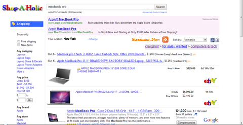
Mashup web based – Shopping

When I started this project I thought about my recent reading of Mashups &how to intergrate the lastest in web technologies such as Ajax – Asynchronous JavaScript + XML, Web protocols: SOAP (Simple Object Access Protocol) and REST (Representational State Transfer), RDF (Resource Description Framework), RSS (family of XML-based syndication formats) & ATOM (a newer, but similar, syndication protocol which maintains better metadata than RSS & provides better and more rigorous documentation). The precedents before this project include Googles Android News Reader, live blog updates & Ebay. I wanted to use something that hadn’t been done before to improve previous concepts of online  shopping.  That’s how I came up with the idea of Shop-A-Holic.com where as the website is a mashup of the most popular shopping sites that continuously updates from different web servers on whatever it is that you are shopping for at the moment.

Mashup – Digital meets physical – 3D Holographic Interface

For this next project I thought about more conceptual design as a mashup to inspire the interfaces of tomorrow. The precedents before this project were Windows 7, Gene Roddenberry’s Star Trek & CNN’s Holographic presidential election coverage. I wanted to create an interface for the world of tomorrow. I made it as a step in the evolution of melting away the artifacts in interface we are familiar with today & to somehow integrate them all around us, as 3D holographic projections activated by a pad you either step on or are motion sensitive. For example accessing the internet or other aspects of our lives that will make them less clunky tomorrow. Basically I made it to save space.


Posted in Assignments