Page Layouts in CSS are not as straight forward as one might expect, but then, tables were not exactly straight forward either.
As layouts became more complex, a mix between tables and CSS was used, and by about 2007, the bugs had been removed enough that the New York Times, a standard-bearer, could go to a table-less layout based on floats. That broke the ice and after that almost everyone migrated to an all CSS layout
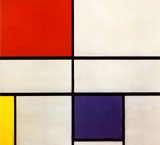
A float is easy enough, and it was introduced by Netscape Navigator 1.1. There is also a clear, to clear the float. It was originally intended to float pictures. The code that floats this example is <img style="float: right; padding: 0 0 10px 10px;" src="http://b.parsons.edu/~dejongo/12-fall/stuff/images/mondrian2.jpg" alt="clear float picture demo">
The next paragraph has clear applied to it. That forces the next element to clear the float. The second paragraph above, for example, does not clear, and continues to flow to the side of the picture.
There are a number of methods to achieve the same goal, but most of these build on the ability to float elements to the right or the left of the containing box. The problem using this method is getting the parent containing element to expand to hold the floated children, as the children can become unruly, and stick out below the parent box (see below for an example).
To prevent that, all kinds of fixes were created, like floating the parent container or the .clearfix method to push the parent box below its floated children. There is a faux column solution that uses a background element to give the impression that all the columns are the same size, and a method called the one true layout that uses margins to push the content into columns, which is similar to one called the holy grail, but they have mostly been supplanted by the overflow: auto method detailed below. For more information and links to tutorials, you can go to CSS tricks or smashing magazine.
Floating Columns
When you apply float to an element, you make a box, take it out of the normal document flow, and shift it to the right or left of the containing box. The remaining content flows around the floated element. The floating elements always needs an explicit width. The #bbb and #999 boxes demonstrate what happens when you float boxes to the right, and they are handled as if they were inline elements so that the boxes float next to one another till there is no more space. To stop an element from flowing around the floated element, you have to clear it, as in clear: right;. That way the boxes can float under one another, as demonstrated by the #ddd box. The problem with building a complicated layout with floats lies in browser incompatibility, for it is possible that the page does not degrade properly. To not invite any more problems than necessary, make sure you reset the CSS.
Unruly Children
So floats can be used to create columns, but there is another issue to consider.
A containing box will not expand unless there is content. For some reason, when you float a child element, the containing element fails to keep track of it. This becomes unsightly when there is a border or background color on the containing box, and the floating box extends below the border like this.
As you can see, this is not acceptable. The W3 recommends that you put in additional markup and clear: both;, but that is a bit of a hack and requires additional markup introducing an unwanted element at bottom. All kinds of clever solutions were found to create a CSS only solution to that problem, which I need not go into as someone discovered that adding overflow: auto; to the containing box did the trick.
A 3 Column Layout that Works
It appears that all is well in CSS multiple column land. If you want more columns, you can make the floated child a parent to another floating child, so nesting floated children inside of floated children.
3 Column Float Demonstration
CSS Code View
HEADER
You will see that the columns fit the content, and that they do not all go to the bottom. This is a problem if you want to have columns with different backgrounds. The solution is to use an image that repeats vertically all the way to the bottom, which I have all ready for you to uncomment. You then have to comment-out the background colors of the columns themselves before you can see it.
HTML markup for the example
<div id="cd-wrap">
<div id="cd-header">
HEADER
</div>
<div id="cd-container">
<div id="cd-side-a">
SIDE A
</div>
<div id="cd-content">
CONTENT
</div>
<div id="cd-side-b">
SIDE B
</div>
</div>
<div id="cd-footer">
FOOTER
</div>
</div>
</div>