Parsons students have experience with the language of design as it pertains to graphic design, illustration, fashion, product design, architecture, or photography, and so on. Lang students have experience developing cerebral arguments of one sort or another. There will be two main projects this semester: a portfolio and a final project. Each project follows the process of research/concept/sketches/comps/final. These steps need to be documented in a worksheet.
8 steps everyone needs to document in the worksheet before creating their website.
You are required to document each of your creative decisions in a Worksheet. I will use them to evaluate your midterm and final.
1) Develop Your Idea
Define the problem you are to solve when developing a web site. It is hard to create a good end product if the problem is not very well defined at the beginning.
Sometimes the problem is given to you by the client but the client does not alway know exactly what the problem is. It’s your job to figure that out.
Either way, develop your idea.
It’s hard to sell a bad idea.
This time you are your own client. That’s difficult.
Make sure that whatever you come up with will work and is worth the time spent making it real.
2) Discovery and Research
Discovery and research is the second step. You might have a good idea of what you want but test it by contrasting the idea with similar ideas that have already been executed.
Using OpenAI text is a great tool expand awareness of what the options are.
Google to see what others have done. The first assignment should have been a gigantic step in the right direction.
Find competitor web sites that have a track record that you can learn from, or have developed novel ways to express things that you are also desiring to express.
Tell me what you have learned and the conclusions you have reached from your research. I will be looking for that in the worksheets for both the midterm and the final projects.
3) Target Your Audience
Focus your energy by figuring out who your audience is, and target them.
Develop your content with that audience in mind.
Read the user experience article.
Go further and read Designed For Use by Lukas Mathis and develop a killer user interface because this excellent book will give you a good understanding of how user interfaces work, and work well, and what to look out for, to make sure that they do work.
Whatever you do, keep the user in mind.
4) Inspiration and concepts
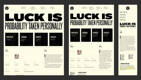
Look for sites that inspired you. There are lots of examples out there and precedent to follow.
Then experiment Mood boards are one way to proceed.
Mood boards visually stimulate your design sense. You can test colors images, design elements, ideas, etc, as you develop your design intent. Print these out and place them on a board, or layer them in a Photoshop document. Playing with the visual hierarchy of like or contrasting elements can help gel the creative process.
Mood boards are used to develop the overall feel of a project, putting together images and objects which inspire, target desires and facilitate creativity and innovation in establishing the aesthetic feel of a web site.
Things to explore in a mood board include photography style, color palettes, typography, patterns, and the overall look and feel of the site. Soft or hard? Grungy or clean? Dark or light? A rough collage of colors, textures and pictures is all it takes to evoke a specific style or feeling. This process can act like a catalyst and save a lot of time and help focus in on your final design.
Come up with a couple of different design concepts for the project. The concepts should be based on research and the target audience. Gather up content and make a compelling case for each concept. Minimum of two concepts but no more than five.
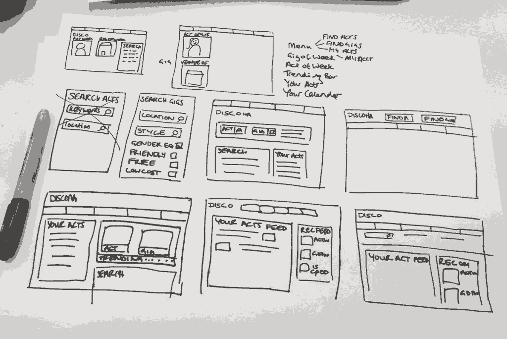
5) Thumbnails and Sketches
Illustrate and explain each of your concepts. Once you are clear as to what your problem is, have content, and direction, the next step is to explain the best concept and develop a responsive user centered design solution using pencil and paper.
Sketches show how you arrived at the solution. They should start simple and remain small (thumbnails).
Explore responsive possibilities, from watch to phone to tablet to computer desktop and back again. Each device needs to present the concept organized in a way that is coherent for the device.
It takes many thumbnails to work through and develop a finished concept. You can’t tell ahead of time what will or will not work but you can separate out what doesn’t work ahead of time. Increase your success rate by staying with paper and pencil till you are clear about how to solve the problem.
Circle or otherwise indicate the concept you will develop. Take a picture of or scan the drawings and upload them to the worksheet.
6) Wireframes and Prototypes
Wireframes are simplified designs devoid of any style, type, color, pictures, or meaning. They are fast to create and explore different elements of your design, and provide feedback on the general layout, are easy to manipulate and change, to get it right, before filling in the details. Wireframes allow you to explore user flows and the different ways to structure your website, without having to design any elements or design any content.
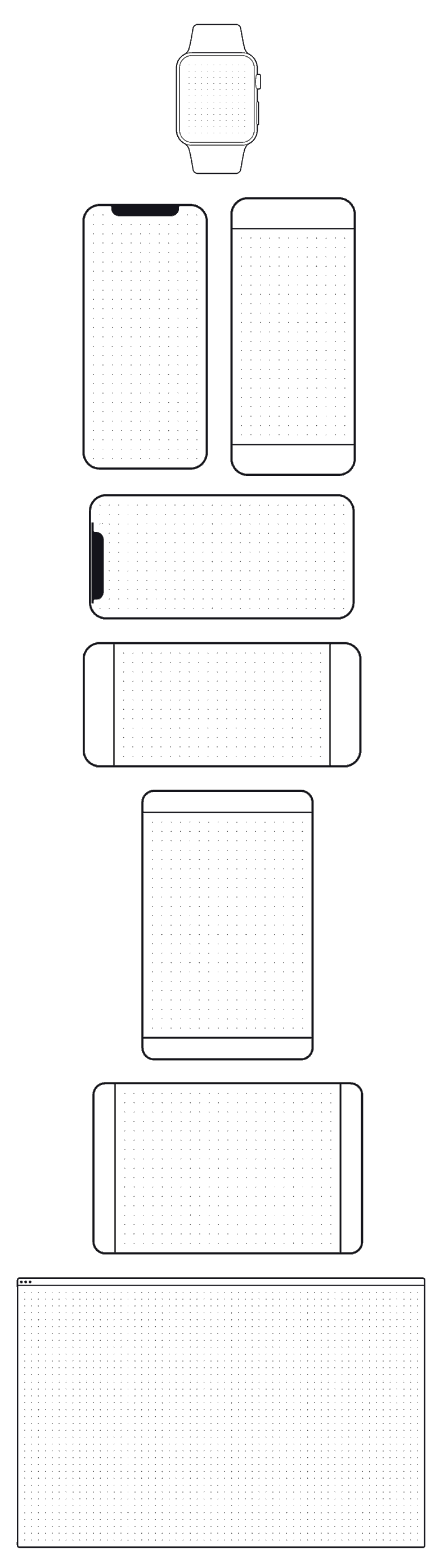
Translate the picked thumbnail into a wireframe for each device category. One each for the watch, the phone, the tablet and the desktop. If you are using FIGMA, pick out a frame for each page, and each device.
The wireframe of a website is the skeleton of a web page assembled using boxes and lines. A wireframe is conducive to content placement making it easy to establish hierarchy, figure out functionality and navigation problems in a format that can be adjusted easily. Wireframes are lines or boxes with little text and few visual widgets that represent your website structure and help you establish hierarchy. It is a clean interpretation of the thumbnail that you selected to develop.
Wireframes and prototypes help you understand the big picture. Rapid prototyping helps you explore more ideas, faster. Don’t let yourself get bogged down in unnecessary details too early. Create your wireframe/prototype in prototyping programs, illustrator, or hand draw them, but be ready to recreate them using CSS and HTML.
7)Responsive Mockup
Software like Adobe XD and Origami allow for quick and amazing prototypes, tools that facilitate and realize user experience design on different devices. The tools are slick, but don’t prototype something you can’t possibly code. It is easy to get lost when prototyping. Stay focused on what you need to communicate to your target audience. Some prototyping software allows you to export to HTML and CSS. Avoid them. We are here how to code, and shortcuts turn out to be longcuts. The code they produce is uneditable for beginners.
Prototype tools are both web based and stand along products. These can all be used free. figma.com (you can also sign up to get their professional package for education free of charge), Invision, Mockplus, Facebook’s Origami, and Adobe’s XD. You can also use HTML and CSS. That’s probably the most useful way to develop your prototype as you will learn HTML and CSS. You’ll be required to transform your prototypes into an actual website in two weeks, after we’ve covered layout using CSS in Week 4. You have till then to perfect your prototype.
8) PhotoShop Comp
The last step is to create Photoshop/Illustrator comp of what your website is to look like on a phone, a tablet, a desktop screen.
Putting It All Together
The next step is to build the site using HTML and CSS. You have three weeks to accomplish that.
Think of the photoshop comp as the end. It is a strategy game to figure out how to achieve that end using the HTML and CSS you will learn in the next three weeks.
Break your design into the fundamental boxes that determine how your design moves through every iteration of your responsive design. It has to work on a smartphone where the finger-tip is huge and will quickly slide through the information vertically, to the large horizontal monitors with 50 inch diagonal screens.
Your site is to look good every step of the way. Figure out how to make the HTML and CSS work. That is the strategy. Figure it out by creating a simple wireframe representing the elements as they move though each iteration of the responsive experience.