We start with the CSS3 additions that were rolled out first: HSL color transparency rounded borders and box shadow. You can be introduced to the properties here pursue them in the exacting details of the W3.org specification itself or use a CSS3 generator to create the code for you.
Hue Saturation and Luminance Color
The first specification to be widely implemented CSS3 color includes opacity and the hue saturation and luminance (HSL) color space.
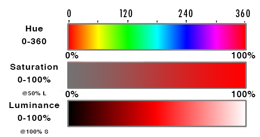
HSL takes three values: Hue is a degree on the color wheel from 0 to 360 where 0 is red 180 is green and 240 is blue and 360 is red again. So is 720 or any other multiple of 360 — the colors repeat.
Saturation is a percentage value: 100% is full saturation and 0% is no saturation. Saturation works in conjunction with luminance.
| Hexadecimal | Percent |
|---|---|
| #000 | 0% |
| #111 | 7% |
| #222 | 13% |
| #333 | 20% |
| #444 | 27% |
| #555 | 33% |
| #666 | 40% |
| #777 | 47% |
| #808080 | 50% |
| #888 | 53% |
| #999 | 60% |
| #aaa | 67% |
| #bbb | 73% |
| #ccc | 80% |
| #ddd | 87% |
| #eee | 93% |
| #fff | 100% |
Luminance is also a percentage; 0% is dark (black) 100% is light (white) and 50% allows for full chroma before it is made lighter or darker. The table on the right gives percentages of grey translated from hexadecimal or base 16 with middle grey being #808080.
Connecting up the color with the degree is the least intuitive part of this more intuitive way to think about color but it is preferred over the RGB method of specifying a color. With hsl it is easy to increase the saturation or luminance for a particular hue something that is not at all intuitive using RGB.
Opacity
CSS3 also added the alpha property transparency or opacity or alpha which can be combined with color to change RGB to RGBA and HSL to hsl. The value range is from 0 to 1 with 0 being transparent and 1 being opaque. That makes .5 half way transparent. color: hsl(0 50% 50% /.5); You can make any element transparent by using the opacity property.
To help you see the relation between the HLS and opacity change the numbers in this demo. I’m sure you have a favorite color or color combination. Try changing some of these colors to your favorite colors:
CSS Code View
red=0° orange=30°
yellow=60° green=120°
cyan=180° blue=240°
purple=280° magenta=300°
pink=320° red=360° and so on for the colors repeat.
Pick a Color: hsl Generator
Mother-effing hsl() by Paul Irish (using the old notation)
Border Radius
Rounded corners was one of the most requested features and was released early as the work around was complicated and inflexible. We used to create rounded corners by placing a picture of a rounded corner in each of the four corners. No Fun!
Using only one value every corner is rounded an equal amount. Using four values each corner can be given its own unique border. Using eight values or two values for each corner its it possible to create asymmetric or oval corners.
The individual border-radius property can accept either one or two values expressed as a length or a percentage (percentages refer to the corresponding dimensions of the border box). The individual corner are: border-bottom-left-radius border-bottom-right-radius border-top-left-radius and border-top-right-radius.
When two values are defined they determine the horizontal and vertical radii of a quarter ellipse separately which in turn determines the curvature of the corner of the outer border edge. When only one value is supplied the horizontal and vertical radii are the same. If either value is zero the corner will be square not round. It is possible to go beyond 100% but that begins to eat into the border itself. I pushed the number to distort the border in Safari/Chrome as an example. It looks slightly different in Firefox. Play with it and see how it works for you.
CSS Code View
Border Radius Shorthand
The border-radius shorthand property can be used to define all four corners simultaneously. If you want to define both horizontal and vertical radii separately for each corner you can do that by first specifying the horizontal for each corner separating them with a slash / and then specifying the vertical radii. For example: border-radius: 30px 80px 30px 80px / 80px 30px 80px 30px; Don’t forget that the shorthand code can be further compacted if the values are the same for example: border-radius: 30px 90px / 110px; The 8 points are masterfully manipulated by the Interactive Border-Radius Tool.
CSS Code View
Box Shadow
Another place that CSS3 has removed the need for additional images is the drop shadow. The browser will handle multiple shadows on both the inside and the outside of the box. The property box-shadow: takes up to five values, one each for x-offset y-offset blur radius spread distance and color.
By default the value for box-shadow is none. If only one number is supplied it determines a drop shadow with the same horizontal and vertical offset and the default color which is black. You can specify the horizontal and vertical distances separately add an optional blur distance and a spread distance as well as the color: box-shadow: 0px 0px 15px 5px #966;.
CSS Code View
By default the shadows are on the outside of the box but it’s possible to place them on the inside of the box by specifying inset. If the inset is in addition to the regular shadow, you need to add a comma , The code for the 3D looking ball then looks like this: box-shadow: 40px 40px 50px -20px #444, inset -40px -40px 50px 25px #666; .
CSS Code View
Multiple shadows, each on its own layer, can be created using a comma , . Learn more about shadows at CSS-Tricks.