Going over how everything works does not mean you understand it. This demonstration will help you understand how to lay out a page. It explains step by step how to lay out a page using no floats, and then explains how to use floats to create the same page. It assumes familiarity with the information contained in these other pages in this section, and with the previous sections:
The Document’s Default Behavior
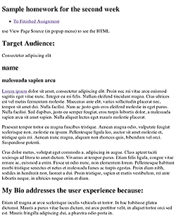
In the first homework assignment you marked up content using heads <h1>–<h6> and paragraphs <p>, added links <a> and images<img>, and grouped certain content together using the generic <div> or the more semantic HTML5 tags like <header>, <nav>, <section>, <article>, <figure> and <figcaption>.
At this time you did not nest too many tags inside of other tags, but know that every tag you created was already nested as a child of the body tag. As you develop the layout, you will increasingly nest tags inside of one another, usually to define and group an area of the layout, like the header, right column, main content, navigation or footer.
When you look at the first assignment, you see the browser’s default style at work. The content vertically lines up, one below another, while the text flows left to right.
To better understand this structure, change the embedded style included in the HTML5 template, which looks like this:
<style type="text/css">
.example {
}
</style>
To an embedded style that puts an outline or border on all elements, like this:
<style type="text/css">
	body, section, header, nav, article, p, h1, h2, footer, nav, figure, figcaption {
	outline: 2px solid red;
}
a, img, span, strong {
	border: 2px solid green;
}
</style>
A red outline is put on the elements that are displayed according to the block mode and a green border is put on the elements that are displayed according to the inline mode.
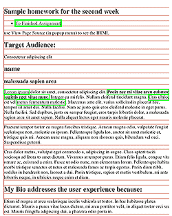
Each element of the assignment now has an outline or border.
Take a moment and explore the way the red outlined block elements stack below one another. Each element’s width extends all the way out to the parent by default.
Inline elements with green borders styles the content (type) in block elements, flowing from insertion point to the end of the box. It then start over on the next line. Not all languages flow horizontally or left to right, though english does, so we can say that type starts left and flows horizontally.
The other display modes besides block and inline are tables, which are not to be used for layout purposes, and the absolute display mode, which completely removes elements from the document flow.
Styling the Elements
I use an embedded style sheet for this example, but you should use an external style sheet. Because the rules act at a distance, you need selectors placed in front of the rules to target the elements.
The best selectors to use are type selectors, that select the element by its type, i.e. p for selecting all paragraphs. You can combine them to get more specific, like article div p, which targets only those paragraphs in the div in the article. If that doesn’t work, you can use the pseudo class selectors like :nth-child(N) or use class selectors if you want to target certain elements, but avoid using ids, as they are much stronger than classes and tend to dominate the cascade hierarchy.
Select each of the elements in the document and change the background color to know that you have successfully targeted that element with a CSS rule.
Altering the Default Layout Order
The block elements are like a child stacking playing blocks one on top of the other, only upside down, starting from the top with one box below the other. This is the normal document flow mode, and it is similar to how a word processor works. The difficulty of laying out a document using the normal document flow is that you have to build your way to every part of the document. The benefit is that if one thing changes, everything else adapts, if it’s done right.
Most Design students layout their documents using Indesign (Illustrator, or even Photoshop). The activity of creating and moving design elements where you want them is what layout is all about. Forget the normal document flow! The absolute display mode is similar to the layout mode of Indesign, but be careful. The web is a much more flexible environment than print, and the layout has to accommodate that. You need to be judicious in the way you use absolute positioning.
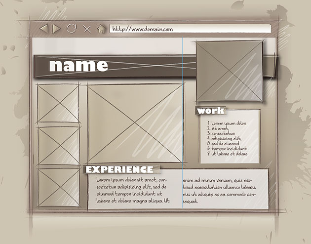
The flexibility of the web as a medium means the layout is much more likely to be determined by the normal document flow, whose default behavior we’ve just looked at, than the rigid absolute positioning used for print. This means that you can’t just pick up any item and move it to where it looks best. Instead, you have to figure out how to best position it where you want, using all of the previous elements in the normal document flow. This is possible with planning. That’s why the emphasis on the creative process with thumbnails, mood boards, wireframes and a Photoshop comp before starting to code the layout.
Yes, there is not much spontaneity in coding the layout, but then, there is little spontaneity in prepping an Indesign document for print. The creativity and spontaneity of web design happens in the early planning stages. After that it’s mostly creative problem solving as you try to execute the layout. You are ahead of the game if you can see this as a puzzle to be solved.
Homework Assignment Not Using Floats
The following step by step tutorial is meant to explain the homework assignment and uses the techniques explained in the Beyond Floats article.
You start by opening up an HTML5 template and pasting into a blank document. Paste in the CSS reset at the beginning of the style tags in the head. This prepares your document for coding.
Setting Up the Page
While we want the page to center in the window, if the window becomes too wide, it looks kind of funny, so we put in a wrapper div with a max-width: 1300px to keep the page from centering when the window gets wider than that. It’s tradition to call that first div “wrapper,” though you could just as easily select it with the selector body>div, which selects any immediate child div tags of the body tag.
<div class="wrapper">
with the style being:
.wrapper {
	max-width: 1300px;
}
If some of your pages have enough content on them that they force a scroll bar, the entire content shifts 8 pixels to the left. The web site then moves to the left as you move from a page that does not require a scroll bar to one that does and vice versa. If that annoys you, force a vertical scroll bar to appear by making the page 1 pixel more than the height of the window:
html {
	min-height: 100%;
	margin-bottom: 1px;
}
This page is long enough to force a vertical scroll bar, so it’s not an issue, but if you were to use this technique on your web site, it very well might be an issue.
Next comes section tag to create the actual page for us. We want to center the page inside of the wrapper div, so we need to specify its width (960px) and set the left and right margins to auto. I set the background color for the page to middle grey, create a margin on top to push the header element down 70px, and finally, set the positioning to relative, so that any absolute positioning will be in relation to the page and not the body.
section {
	width: 960px;
	margin: 0 auto;
	background: #888;
	padding-top: 90px;
	position: relative;
}
The first element is the header. This is the bar with the name and picture on it. The position of the bar is taken care of by the padding-top (90px) of the section element. The width is a little tricky. I want to put a shadow on the header element (shadow 1), but do not want the shadow to bleed out over the right edge of the page. The solution is to shorten the header to just 930px so that the shadow looks good. Had I not restricted the width of the element it would have expand to 100% of the parent window, and the shadow would have fallen outside of the header, and the page as well.
Nested inside the header is div that is given a width (848px) plus padding-left (112px) that equals 960px, the same width as the page. Because the div comes after the header in the way the computer reads the page, it is drawn on top. The HTML5 code for the header is:
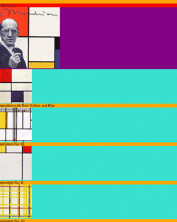
<header class="shadow_1">
	<div class="">
		<h1>Piet Mondrian</h1>
		<figure class="shadow_2">
			<img src="images/Mondrian.jpg" alt="Portrait of Piet Mondriaan" />
		</figure>
	</div>
</header>
The CSS for the header and div is:
header {
	width: 930px;
}
header div {
	height: 90px;
	width: 848px;
	background: #eee;
	outline: 1px solid black;
	padding: 20px 0 0 112px;
	position: relative;
}
Horizontal Layout Strategies: Absolute Position
Since the vertical relation between boxes is pretty much taken care of, most of the strategies concern how to place boxes horizontally next to one another. The relation between name and the picture provide us with an opportunity for using one of these strategies. I could choose to float the name to the left. That would put the picture on the right next to the name. I could also change the display from the block to inline, and vertically center the two, but I use absolute positioning instead.
The h1 element falls into place because of the padding added to the parent. As you can see, the header div has 20px of padding added to the top and 120px of padding added to the left padding: 20px 0 0 112px;.
I then apply absolute positioning to the figure that holds the picture. The figure no longer occupies any space in the document flow and floats above that layer by default. I’m free to move the figure up 70px, which is specified as top: −70px, and either 640px to the left or 40px to the right of the parent element. (640px + 280px (width of the figure) + 40px = 960px). It does not matter whether I go from the left or right side of the parent element since its width is fixed.
header h1 {
	color: #000;
	font-family: 'Anton', serif;
	font-size: 48px;
	font-style: normal;
	font-weight: 400;
	letter-spacing: 0.108em;
	word-spacing: 0em;
	line-height: 1.2;
}
header figure {
	position: absolute;
	height: 260px;
	width: 280px;
	top: -70px;
	left: 640px;
}
Judicious use of Absolute Position
I’ll also use absolute positioning to horizontally layout the aside, and nav elements. The potential problem this creates is a lack of flexibility, so I have to be careful, and be prepared to adjust things manually if there are changes. Some problems are avoided by using it only for horizontal placement, but I still need to be careful. Additional links would require a larger image or more space to push down the text box, for example, otherwise the navigation would overlap. This is the HTML with the content removed:
<nav>
	<h2 class="shadow_2">WORK
	</h2>
	<ul>
		<li><a href="#">… </a></li>
		<li><a href="#">…</a></li> 	<li><a href="#"> …</a></li>
		<li><a href="#">…</a></li>
	</ul>
</nav>
<aside>
	<figure>…</figure>
	<figure>…</figure>
	<figure>…</figure>
	<figure>…</figure>
</aside>
The nav is positioned absolutely to the right (0px) with a top margin of 130px and a right margin of 80px. This removes it from the document flow and positions it below the picture. Adding padding moves it down and over to the left, correctly placing it according to the comp. I could just as well have positioned it from the left side of the document. Flexibility is increased by not invoking absolute positioning for vertical positioning (by using top:), leaving that up to the document flow. That would have locked in the vertical position of the navigation to the page, causing a problem if I were to change the height of the header.
The navigation is targeted by three classes, first the anchor itself, which is made to act like a block so it will act like a box, the second is a:hover, which changes the style when you roll over, and lastly a:active, which changes the style when you click on the button.
nav {
	position: absolute;
	right: 0px;
	width: 120px;
	height: 140px;
	padding: 40px;
	margin: 130px 80px 0 0;
	background: #bbb;
}
nav a {
	display: block;
	width: 100px;
	height: 25px;
	text-decoration: none;
	background: #ccc;
	padding: 5px 10px;
	margin: 3px 0;
	color: #333;
}
nav a:hover {
	text-decoration: none;
	background: #eee;
	color: #000;
}
nav a:active {
	text-decoration: none;
	background: #fcc;
	color: #000;
}
Though the aside has no width, the figure that make up its content is 200px in total (160px for the figure and 40px for the left margin). Giving the article a left margin of 200px and a padding of 40px creates a place in the layout for the article.
The article content has a width of 960px −80px −200px, or 680px. Because the navigation is absolutely placed you have be aware of keeping content out of its way. This is the downside of absolute positioning, but it’s taken care of in this layout by the large picture in the figure tag.
<article>
	<figure>…</figure>
	<div>
		<div class="column1">
			<h2 class="shadow_2">EXPERIENCE</h2>
			<p>…</p>
		</div>
		<div class="column2">
			<p>…</p>
			<p>…</p>
			<p>…</p>
		</div>
	</div>
</article>
The CSS for these elements is:
aside {
	position: absolute;
}
aside figure {
	width: 160px;
	height: 145px;
	margin: 40px 0 40px 40px;
}
article {
	padding: 40px;
	margin-left: 200px;
}
article > figure{
	width: 360px;
	height: 310px;
}
Horizontal Layout Strategies: Table-Cell
There is no need to go over absolute positioning once again, and so I use table-cell to position the columns. The enclosing div has a 40px margin on top that separates it from the figure above and a background of #ccc. The two columns are layer out horizontally by divs whose display has been changed from the default block to table-cell. Here is the CSS:
article div{
	margin-top: 50px;
	text-align: left;
	width: 680px;
	background: #ccc;
}
#column1 {
	line-height: 1.2;
	display: table-cell;
	Width: 240px;
	padding: 40px 40px 40px 60px;
}
#column2 {
	line-height: 1.2;
	display: table-cell;
	Width: 240px;
	padding: 40px 60px 40px 40px;
}
Horizontal Layout Strategies: Relative Positioning
The headline on the navigation and the article use relative positioning, but with a trick. Relative positioning leaves a space in the document flow. By creating a negative margin, its possible to erase that space, which makes it possible to insert an element in the document flow without it taking up its normal space. This is the case with the headline, which is located above the insertion point by 60px. I set it for the navigation, but that turned out to be slightly off for the column, so I had to adjust that with two declarations. This is a useful trick if you want to include an aside that stays with the main text while you are editing it, for example.
nav h2, article h2{
	position: relative;
	top: -60px;
	left: -30px;
	height: 30px;
	width: 140px;
	margin-bottom: -40px;
	padding: 8px 10px 10px;
	font-family: 'Anton', serif;
	font-size: 24px;
	font-style: normal;
	font-weight: 400;
	letter-spacing: 0.108em;
	background: #ddd;
}
article h2 {
	margin-bottom: -30px;
}
The Footer
The footer only contains a link to the validator. The width is specified as 100%, which is the fill size of the section. The HTML is:
<footer>
		<a href="http://validator.w3.org/check?uri=referer"> Validate your page.</a>
</footer>
and the CSS is:
footer a{
display: block;
width: 100%;
padding: 5px 0;
text-decoration: none;
text-align: center;
color: #444;
background: #ddd;
}
footer a:hover{
background: #222;
color: #ddd
}
CSS3 Finishing Touches
Two shadows styles are added to any element that includes the following classes:
/*css3 effects*/
.shadow_1 {
	box-shadow: 14px 14px 26px #000000;
}
.shadow_2 {
	box-shadow: 0px 14px 26px #000;
}
You can look up the finished file.
Homework Assignment Using Floats
Floats are used to put boxes side by side which does not happen in either the header or the footer, so we only change everything in between. The page is divided into three columns: the aside, the article and the nav and the main content has two columns. Relative positioning is no longer need and is removed from the section and it gets overflow: auto; instead, to force the parent to recognize its floated children, a trick discussed in floating Layouts.
If you look at the HTML, you can see a few changes. The nav is now inside of the article and the h2 is now before the first column in the div.
<aside></aside>
<article>
	<nav> </nav>
	<figure></figure>
	<div>
		<h2 class="shadow_2"></h2>
		<div class="column1"></div>
		<div class="column2"></div>
	</div>
</article>
The aside and the article are floated left. This places the article to the right of the aside. There is no need for the 200px left margin on the article. As there is no need to change the figure in the aside and article, I do not list them in the CSS below:
aside {
	float: left;
}
article {
	padding: 40px;
}
nav {
	float: right;
	right: 0px;
	width: 120px;
	padding: 30px 40px 20px;
	margin: 95px 40px 0 0;
	background: #bbb;
}
The nav and the picture are children of the article. Floating the nav to the right places the picture to the left of the article. The margins and padding of the nav are updated to place it in the same place.
As long as the combined total width does not exceed the width of the containers, the elements will float next to one another: 200px for the aside, the plus the 550px of the article (260px for the figure (plus 80px margin) and 120px (plus 50px padding and 40px margin) for the nav) equals 750px, far less than the 960px of the section.
The div that follows the is given a clear: right, forcing it to position itself under the nav. That way it will be responsive and move down if additional links are added. This was not possible using the absolute positioning method. Chances are, however, that the layout would require fixing if that were to happen, so the difference is not so great from the work required to facilitate the absolutely positioned layout.
The Challenge with Floats
I also want to float the two columns, but ran into a problem with the h2 header. It got clipped by the floated column, but when I moved it to the div, it still got cut off because of the overflow: auto;. For that reason, an older solution to the problem was used to force the parent to recognize the floated children, using the pseudo object div:after to create an object after the last column that can be cleared using CSS alone. Clearing the last child forces the parent to recognize all of the children. Here is the CSS:
article div:after {
	content: ".";
    display: block;
    height: 0;
    clear: both;
    visibility: hidden;
}
What this pseudo element does is place a period after the article div. It then forces the period to display like a block element instead of the inline element that it is, and gives it height: 0; so it does not actually change the document flow. It then clears the floating children, which is the reason we are doing all of this. That is another way that the parent element can recognize its children. The final declaration makes sure that the period’s visibility remains hidden. OK, that’s a lot to comprehend for a technique that has been superseded by the overflow: auto; method, but its good to know that it’s still useful when overflow does not work. The rest of the CSS looks like this:
article div{
	clear: right;
	margin-top: 50px;
	text-align: left;
	line-height: 1.2;
	width: 680px;
	background: #ccc;
}
#column1 {
	float: left;
	Width: 240px;
	padding: 0px 40px 40px 60px;
}
#column2 {
	Width: 240px;
	padding: 0px 60px 40px 40px;
}
The first column is floated to the left and the second column appears to the right of it. All that’s left to do is to align the h2 header for both the nav and the div. Because both of them are in the selector of the h2 in the div selector has to be further specified as article div h2{}.
nav h2, article h2{
	position: relative;
	top: -55px;
	left: -30px;
	height: 30px;
	width: 140px;
	margin-bottom: -40px;
	padding: 8px 10px 10px;
	font-family: 'Anton', serif;
	font-size: 24px;
	font-style: normal;
	font-weight: 400;
	letter-spacing: 0.108em;
	background: #ddd;
}
article div h2 {
	top: -25px;
	left: 30px;
	width: 140px;
}
The footer and the shadows are the same. You can look up the finished file.