This page, originally started in 2011-2, contains four distinct phases. Over time, one phase supersedes the other. Much of the information is not longer relevant but is kept for historical reasons to explain the landscape that currently prevails.
When CSS started out, there was CSS1 and CSS2 (with a .1 and .2 release). This gives the impression that there will be a CSS 3 release. That is no longer the case. CSS has become modularized and no longer has a single monolithic release. Individual modules can attain additional levels, like level 4.
Still, what came after CSS2.2 is known as CSS3. Here is the original Draft written by Eric Meyer in 2000 on the CSS Working Group’s decision to modularize the CSS specification.
The change from CSS2 to CSS3 created a mind-shift from graceful degradation to progressive enhancement.
Phase 1: Graceful Degradation
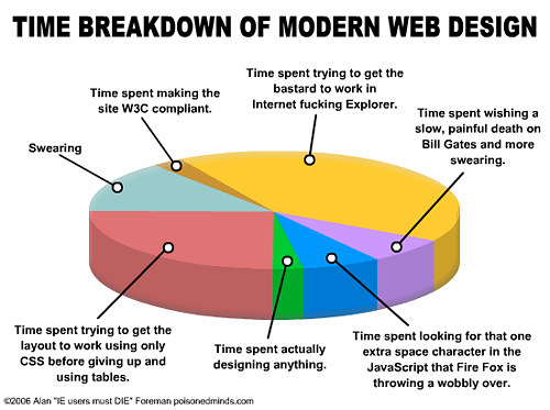
It used to be (from 2000-2010) that the web designer would work hard to get a website to look the same in all browsers. If that was not possible, every effort was made to achieve that end, or to make the failure appear as graceful as possible, so even older browsers could have well-designed web pages. This required a lot of extra effort for the standards-based community, mostly due to supporting Internet Explorer 6.5.
The Legacy of Internet Explorer 6.5
No one uses IE 6.5 anymore but in its day, a host of incompatibilities made life for the web developer a living nightmare.
Phase 2: Progressive Enhancement
Tables turned to keep up with shifting browser capabilities. Progressive enhancement replaced graceful degradation. Web sites no longer had to look similar in all browsers. The attitude became that the user should upgrade to the latest browser or eat dog food.
The strategy is the reverse of graceful degradation. A web page is created and styled for the latest browser. As long as that web page is readable on older browsers it’s good enough.
The strategy signified that Internet Explorer 6.5 no longer held web designers hostage, mostly because fewer people were using it. Progressive enhancement felt quite liberating at the time. Internet Explorer 7 and 8 were marginally better that version 6.5. Internet Explorer 9 attempted to be standards compliant. Finally, with Internet Explorer 10, Microsoft updated the browser to be mostly standards compliant. Unfortunately, many people still used older Windows operating environments and continued to use outdated browsers.
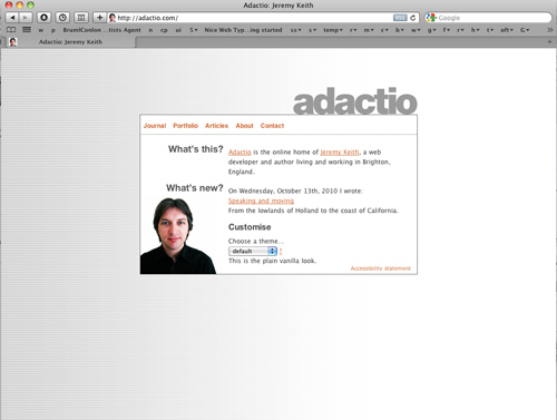
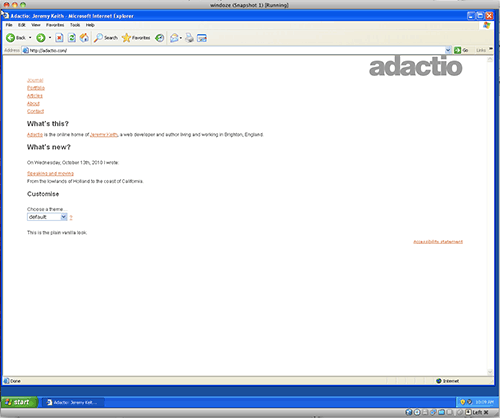
Progressive Enhancement is about using the new HTML5 and CSS3 goodness to create websites that, when displayed on non-compliant browsers, break down, sometimes significantly but such that the important information is still conveyed. The following two pictures demonstrate this difference from http://adactio.com/
Browser Support
Support for HTML5 and CSS3 is a moving target. Can I Use? is a website dedicated to updating browser support information.
Vendor Prefixes
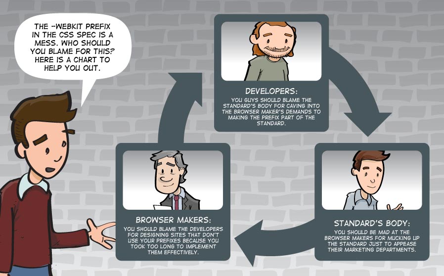
A mechanism was required to facilitate the development of new properties as they are introduced on different browsers. This led to vendor specific version of properties that are not yet stable. Those properties can be accessed by using a vendor prefix, with the idea that the prefix can be dropped as the kinks are worked out.
Each of the major browsers has its own prefix:
- -webkit- ( Webkit/ Safari/ Chrome)
- -moz- ( Firefox)
- -ms- ( Internet Explorer, Edge)
- -o- ( Opera)
More experimental properties are prefaced with a prefix. To target all browsers, the declaration has to be written five times, one for each browser and the last one without, for when the property achieves acceptance.
This started out as an attempt to avoid the proprietary wars experienced between IE and Netscape but the ubiquitousness of mobile browsing upended the process as developers were writing only for the WebKit engine. That left other browsers out in the cold. They started to read WebKit prefixes to render pages as a result, making the whole point of the prefixes mute.
Escape from Prefix Hell
Laura Vie created a javascriptroutine that removes the requirement of writing different vendors. Hurrah Lea Verou!! Just include the following code in the head of your page <script src="prefixfree.js"></script> and link it to the javascript from her website. I’ve already included a link on the HTML5 Template that links to a copy of the code on the b.parsons.edu server.
Google VS Apple
That is not the end of the story. Google is introducing its own “blink” rendering engine. The Google / Apple rivalry has erupted at the core of the browser rendering engine. This will be interesting to watch. Google says competition is good and that Apple’s rendering pipeline is not modern enough.
Opera enthusiastically jumped on board.
Mozilla is creating a new rendering engine called ”Servo” in collaboration with Samsung, so it looks like there are more possibilities on the horizon.
We will see what this all means. In the meantime, know that browsers have never been better.
Phase 3: Browsers differences are minimized.
Most Browsers today do an excellent job at rendering web pages. The result is that the entire issue is no longer the problem it was in the past.
On Desktops, Google Chome is the top browser. with 56% in worldwide usage, February 2017.
Microsoft killed Internet Explorer (out of shame) and introduced Edge, a standards compliant replacement. IE dropped to 20%, Edge is at 6%
Mozilla’s Firefox remain the alternative browser at 12%.
Safari reins supreme on the Apple OS but as that has a mere 7% market share in operating systems, it does not account for more than 4%.
Mobile is fast becoming the main portal for viewing web pages. Google Chrome has Android phones locked up at 70%.
On the iOS, Safari is the default browser and has 30% of the market. Numbers do not tell the whole story, as the iOS represents a more affluent and tech-savvy user base.
All of this greatly simplifies the building of a web page. The issue today is that the website be responsive to the device it’s on.
Phase 4: AI and the proliferation of web features
The pace of web development, in HTML, CSS, and Javascript, continues to speed up. Rather than cover everything new, this class continues to provide a firm foundation for learning all these goodies that are bound to transform the web experience. There is much effort put into making the browsers work together, and as there are only three left, Chrome, Safari, and Firefox, the browsers are more or less in synch, so everyone can access these new features. That said, there is much development on the Chrome development, and Firefox and Safari lag in picking up some of the new features. For that reason, there is a three tier Baseline system that provides the status of a new feature: New features start out with Limited Availability  , Newly Available
  is when the feature becomes supported by all the core browsers, and is therefore interoperable, and finally, Widely Available
  , when the features is robustly supported in all three browser engines. These features can be APIs (Application Programming Interface), Javascript, CSS, or HTML, and are often esoteric enough to mean little at this stage of web development, but professional web developers rely on the status of features to implement them. Expect the pace of web development to continue speeding up in the coming years as AI becomes mainstream.