The web changed completely when it comes to typography. For the first twenty years we could specify only a few fonts. There were 18 fonts to use in 2008. The core fonts licensed by Microsoft are: Andale Mono, Arial, Arial Black, Comic Sans MS, Courier New, Georgia, Impact, Times New Roman, Trebuchet MS, Verdana, Webdings. Apple added Helvetica and Times. That was it. By 2010, there were thousands of fonts available. What a change. Since then they introduced open type variable fonts.
While typography’s been around for hundreds of years, it’s only been in the last hundred years or so that it became both art and science. The art and science of typography forced typographers to ply their craft in the service of the end user who reads it. That makes them the original user experience designers, so take heed.
The web is different from print. The user is in charge in a way that is foreign to print. The attention span is different, and the typography should facilitate the user experience as soon as they arrive on the page. The typographic defaults that taken for granted took their shape from the years of experience in the print world. Do not blindly accept these defaults by which to express your content on the web. The web is different from print.
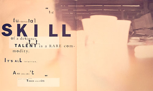
You will be required to deviate from the standard web fonts like Arial, Helvetica, Verdana and Georgia in the final. These are common fonts supplied by the operating system that have defined typography on the web for far too long. They are safe, legible and entirely predictable. It is possible that legibility may suffer in favor of better expression of the content. It’s a brave new world. Please push the typography if you can. It has been documented that legibility isn’t all that its been cracked up to be when it comes to retaining information.
On the one hand, the legibility of a typeface is its invisibility, that is, just like the cuts in a movie and they are not supposed to draw attention to themselves but convey the content in service to the story. The typeface and the way it is laid out should transparently facilitate the content to the user, whose focus, after all, is on what is being said. But if you want the delivery of the content to express something, it better have style. It’s possible to do both, and in the name of communication, even if you forgo some legibility, I encourage you to do so for the sake of communication, if that is what it takes.
Adobe added in access to all of the open type features exhibited in the following demo of comprehensive CSS font-feature-settings .