The backgrounds and borders module covers the background and border of the box element:
The Box Element

In the official language of the W3.org; when elements are rendered according to the CSS box model, each element is either not displayed at all, or formatted as one or more rectangular boxes. Each box has a rectangular content area, a band of padding around the content, a border around the padding, and a margin outside the border. (The margin may actually be negative but margins have no influence on the background and border.)
Background Properties
The background properties deal with the decoration of the border area and with the background of the content, padding and border areas. There are many properties: background-image, background-position, background-size, background-repeat, background-attachment, background-origin, background-clip, background-color, and background-blend-mode.
The background can have multiple layers. A number of elements can be layered on top of one another. Each layer can be determined by a number of properties, each separated by a comma. Be careful in creating complicated backgrounds. One mistake can render the entire background property null and void.
Layering Multiple Background Images
multiple background images are , separated by a comma.
background: url(#), url(#), url(#);
You can set all of the values associated with each background image in the same way, by a repeat use of “,” to separate each value. For Example
	background-repeat: repeat-x, repeat-x, repeat-x,;
	background-position: bottom, top, right;
	background-offset: 20px, 20px, 10px;
If you have selected a color in addition to the background images, it is rendered as the bottom layer, without a final “,”.
CSS Code View
Background Repeat
The background-repeat property is used to repeat the background image. You can use the actual property, repeat-style: but it is usually tagged on to the end of background: with the values: repeat-x, repeat-y, repeat, no-repeat, and values that will be supported in the future, space and round.
CSS Code View
Background Position
The position of the background element places it in relation to the box, with the default being center. If there are two values, the first represents the X (horizontal) Axis and the second represents the Y (vertical) axis. You can also use percentages or pixel values: background-position: px, %, top, center, bottom, left, center, right
CSS Code View
Background Clip and Background Origin
It is possible that the background peeks out from the border. To keep this from happening, use the background-clip property, which clips the background to one of the following values: background-clip: border-box, padding-box, content-box
When you supply a value of padding-box, the background is clipped relative to the upper left corner of the padding edge. With border-box it’s clipped relative to the upper left corner of the border, and content-box means the background starts from the upper left corner of the box’s content.
Background origin is like background clip only it resizes the image.
CSS Code View
Bla Bla Bla BLa
Background Size
Resizing background images requires only one value if the image is scaled proportionately, and two values if the image is to be distorted: Background-size: px,%, auto, contain, cover. The value cover automatically scales the image so the longest side fits inside of the element, contain scales the image so that the shortest side fits inside of the element, completely filling the background.
Apply background-size: cover to the HTML tag and you create a full-screen background.
html{
	background:url('picture.jpg') no-repeat center center;
	min-height:100%;
	background-size: cover;
}
body{
	min-height:100%;
}
The background size property works in conjunction with the background attachment property.
Background Attachment
The background-attachment property binds the position of the background to the element, to the element’s content, or to the viewport. The initial value is scroll, where the background is attached to the element and moves with the element. Change this value to local if the background is to scroll with the content of the element or fixed if the background is to stay fixed relative to the viewport, or window.
If the background picture is fixed to the viewport, the element acts like a window to the background. Change the background attachment to local, and the background moves with the text. The background will clip to the content when local is selected.
CSS Code View
words
are
here
to
extend
the
background
to
check
out
the
background-attachment
value
of
local.
Background Shorthand
It is possible to write all of these at one time (‘background-position’, ‘background-size’, ‘background-repeat’, ‘background-origin’, ‘background-clip’ and ‘background-attachment’) but if you do try to write a more complicated background, be careful, as one mistake can keep the background from showing. Each background image layer can have the following:
background: bg-image, bg-position, repeat-style, attachment, background-origin, background-clip and the final (bottom) layer can add background-color.
Gradients
Gradients were introduced by Apple in 2008. They’ve gone through some syntax changes and can be used without prefix. There are linear gradients, radial gradients, and conic gradients, and the syntax is similar. A gradient is a transition between a start color and one or more stop colors that has a direction, and optionally, can repeat. If there is no repeat, the last color on either side continues out to the edge of the box, otherwise, the gradient repeats.
Linear Gradients
The gradient uses the background property but instead of fetching an image, the computer uses the controls given in the value to calculate the image used to fill the background.
The value of a simple linear gradient like the one on the right is written as linear-gradient(to top, #eff6fb, #d3e4f3 68%). It is specified as a linear gradient, that has direction that goes to top that starts at (0%) with the color #eff6fb, and proceeds to the last stop, with the color #d3e4f3 occurring at 68% from the top, which it maintains to the top (100%) of the element. Its also possible to use length values like pixels or em units to specify the distance.
Simple gradient with the color being spread out evenly over the colors:
background: linear-gradient(red, purple, blue);
The angle can be specified in degrees: ‘0deg’ or by keywords: ‘to top’, ‘to right’, ‘to bottom’, or ‘to left’ where the angle of the gradient line is ‘0deg’, ‘90deg’, ‘180deg’, or ‘270deg’. These can also be combined as in to top right.
background: linear-gradient(to left, red, violet, blue);
Adding a percentage to the stop specifies where the color is located. If two colors share the same location, the result is a sharp color change.
CSS Code View
Radial and Conical Gradients
If linear gradients follow a single direction, think of radial gradients as all directions emanating out of a single point. The issue is then the location of the center point. The distance from the center then determines the stops. If the distance of the stops are all the same, the shape of the radial gradient is a circle. It is also possible to have an ellipse where the dimensions of the box determined the shape of the ellipse.
You can specify the position of the radial gradient in the same way as you can position anything, using the x and y coordinates, and keywords work just as well: right 100% means that the horizontal placement is all the way on the right and the vertical placement is all the way on the bottom. It is possible to go beyond the box, and make it 120% 120%, for example. It defaults to the center of x or y if either one is missing, and if both are missing, the radial gradient is centered in the box.
By default, the radial gradient covers the whole box but its possible to specify its size by using keywords that determine the size from its center to the edge or corner that is nearest or furthest from it. That gives us four possible keywords: closest-side, closest-corner, farthest-side, farthest-corner.
After the location, shape and size come the color stops. You have to specify a starting color and one or more stop colors, and if you what the blend to be other than evenly distributed, the percentage from the center, similar to how the linear blend is specified. The last stop will determine the color that fills the box if the blend is smaller than the box. Its also possible to use length values like pixels or em units to specify the distance.
Radial blends requires the keyword radial . Conical blends requires the keyword conic
background: radial-gradient(circle, white, black);
CSS Code View
Adding Transparency
Blends are background images and are layered in the same way as multiple background images, by using a comma to separate the layers. By adding transparency to the color stop it’s possible to show one gradient through another gradient. The following demo shows two superimposed linear gradients, separated by a comma , with transparency from the Hue, Saturation and Luminance added after the slash, with 0 being transparent, and 1 being opaque. (hsl)color, so that the one shows through the other:
CSS Code View
Repeating Gradients
CSS Code View
It is possible to repeat the blend instead of extend the color of the last stop to the edge of the box. This is done through the keyword repeating at the beginning of the value, for example: background: repeating-linear-gradient(#EFF6FB, #d3e4f3 10%). use the same value at both the beginning and the end if you want a smooth transition as the blend repeats.
CSS Code View
Repeating gradients are achieved by putting in stops while the frequency is determined by the distance of the edge from the center point. In the following example, change any of the stops to see the effect on the gradient.
CSS Code View
CSS Illustration
It is possible to create amazing work with CSS. I did not say it was a fluid process, but a thorough tutorial provides insite in how the Polaroid camera was made using nothing but CSS. Check out the code Pen to see what HTML and CSS are used, and read the article .
See the Pen
📸 Polaroid Camera In CSS by Sarah Fossheim (@fossheim)
on CodePen.
Gradients the Easy Way
You can construct your own gradients but given the visual immediacy of a gradient generator, it’s more convenient to use the CC Gradient Generator to help you make the gradient.
Background Patterns
The possibility of repeating multiple gradients in one backgrounddeclaration opens up an incredible vista for patterns and other uses. Take a look at the next two demonstrations, take from the fantastic patterns created by Lea Veroa. See also her book article she wrote to explain her methods.
CSS Code View
CSS Code View
Animated Background Patterns
We’ll cover animation next week but here is a glimpse of what CSS can do to animate these background patterns.
Background Blending
Background blending blends the layers within a background. This is useful for blending a picture with a background color.
The following blending modes are implemented in webkit and follow the blend modes found in Photoshop:
- normal
- multiply
- screen
- overlay
- darken
- lighten
- color-dodge
- color-burn
- hard-light
- soft-light
- difference
- exclusion
The following blending modes are not yet implemented by webkit
- hue
- saturation
- color
- luminosity
CSS Code View
A more complicated example blends multiple layers. Change the blending mode of each background with varying results.
CSS Code View
CSS Code View
Border Properties
All four sides of a border can be treated with one definition or you can specify the definition for any one side: top, right, bottom, left.
Standard Border
The border usually uses a shorthand where the width, color and style are given in this order: border: 10px solid red;. Leaving any one of these out breaks the border. Here is a list of the styles:
CSS Code View
Specifying Each Side Individually
You can also specify different width, color and style for each side of the box, as well as target each side individually. This is most often done to create a horizontal rule somewhere in the design:
CSS Code View
Image Border
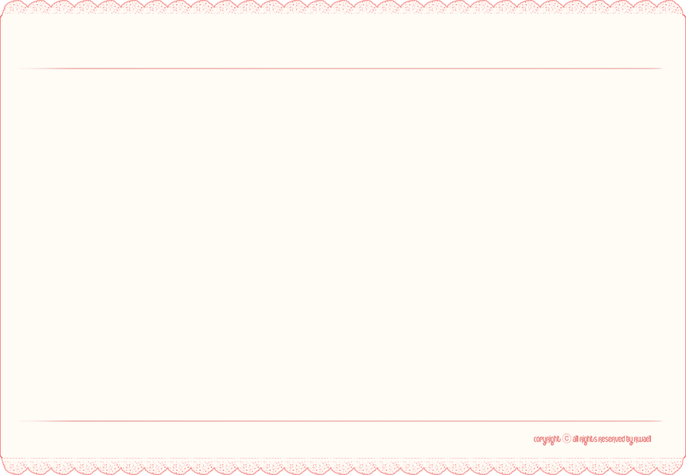
So you want to use an image for the border? This is not only possible but powerfully implemented. The following properties implement border image: border-image-source, border-image-slice, border-image-width, border-image-outset, and border-image-repeat. A border-image shorthand property border-image: strings all of the properties together: border-image-source, border-image-slice, border-image-width, border-image-width, border-image-outset, border-image-repeat. For example: border-image: url('image.gif') 20 30 40 20 repeat;. The url fetches the image, the next four numbers signify pixel values. Percentages get the percent sign but the pixel values do not get px added in behind the number. I’m not sure why. The last key words signifies how the middle section is treated.
For some reason border-image in Chrome, Firefox, and Edge only work when there is a border style or border shorthand property given first (it will be written over by the border-images property) as in border: 1px solid orange. You can use this property to select any one of the four sides: border-top: 1px solid orange. This does not work in Safari. Any of the four borders can be specified a size including “0” to make it disappear, so that border-top can be achieved by border-width: 20px 0 0;.

As a box has four corners and four sides, a referenced picture is divided into 8 parts (the ninth part, which is discarded by default, represents the fill). This is the picture used for the border, and it is 60px by 60px. The image was divided into thirds with 20 pixels for each corner and 20 pixels for the center section. Blue dividing lines are for demonstration and are not in the border image. If this seems complicated, there is an border image generator to help you prepare your border images.
CSS Code View

It is possible to repeat the middle image, as above, or to stretch it, as here. There is also a value called round, where the image is repeated to fill the area, and if it does not fill the area with a whole number of tiles, the image is rescaled so that it does. The value space is similar, only it distributes the extra space around the tiled middle. The corners remain the same. There is also the fillvalue and though it works. and fill in the content I don’t know if it is official as it is not in the speck.
Replacing a picture. First determined the width of the repeating section (34px). Create a square, combine 9 squares into a finished image, and positioned the parts accordingly. Copy the bottom from the top by rotating it 180°. That keeps the value at 34px. border-image: url(09-border.png) 28 34 repeat; It is possible to set each side, top, right, bottom and left with different settings.
The image border is 6K, 1/25 the size of the original and much more flexible.
Gradient Borders
CSS Code View
It used to be that Firefox had a dedicated border-gradient property. That is no longer the case. It is, however, unnecessary as a gradient can replace the picture in the border-image property. Setting the border-image-outset to 1 gives a smooth gradient when the border-image-repeat is set to smooth. Setting it to 200 changes the gradient. When set to repeat 1 gives solid colors, 20 generates a gradient and more than that starts to repeat the gradient all the way up to 200. The repeat is relative to the height of the box so a larger box requires numbers higher than 200. This number represents the border image outset, or how the image is to be divided and it can have up to 4 numbers following the traditional clockwise order. One number makes the outset the same for all four dimensions, two does top and bottom and so on.
CSS Code View
This border-gradient is almost identical to the previous one. The angle has shifted to left top the border-image-repeat has been set to repeat and the border-image-outset has been set to 90. The repeating gradients do something interesting as the way the colors distribute along the axis is reflected in the border-gradient. Increase to colors of the gradient to red, orange, yellow, purple, violet, blue and you’l get a colorful repeating gradient. Adding repeating-linear-gradient does not appear to do much of anything. You can also us a radial gradient. Play around.
CSS Code View
A double border using the clip feature to limit three overlapping gradients that show up in the content background, margin, and a transparent border.
CSS Code View
A partial border that uses a transparent white gradient that goes to transparent black. It create the effect of a gradient that feathers in the bottom left corner. This border gradient will composite into any background.