If HTML is for content and CSS for presentation, than Javascript is for behavior. It really takes mastery of all three to become a web designer. It is, unfortunately, too much for this coures to tackle all three, so we merely touch on Javascript and give you some idea of how it works. If you want to learn more, try Kahn Academy or Codecademy for Javascript or Jquery.
Javascript goes as far back as the origin of the web. You will recall that the web was inspired by Apple’s Hypercard, which had been implemented in a proto-web kind of way in the offices where the web was born. Well, hypercard had a scripting language called Hyperscript that inspired Javascript.
Javascript transforms the content of web pages in much the same way as HyperScript transformed the content of the hypercard stacks. Javascript scripts are executed upon loading or by a user action, and do something to the content of the web page. Much of the added functionality on the web is due to Javascript.
Where Javascript Enters the Picture
When the browser requests content from the server, the document is fetched or constructed by server side scripting, crosses the HTTP divide, and arrives at the client (the browser). The browser then parses the content, starting with the header, and constructs the document, including the requests for additional resources such as the CSS stylesheet, JavaScript scripts, fonts, and images, and organizes all of it into the web page we are all familiar with. In the case of Ajax, additional material can be requested and received without flushing the existing page, allowing the page to be updated asynchronously.
The DOM
The browser processes, or parses the information, transforming the tags, attributes, content, etc., into nodes that form a tree according to the document object model, the DOM. See the demonstration.
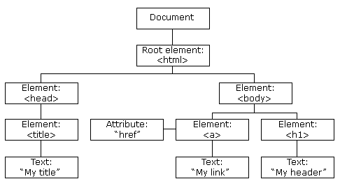
The browser attempts to heal any errors that come up as the document tree is constructed. Each browser does that in their own way, meaning that the tree structure of the document can be different from one browser to the next. Part of the HTML5 specification is to create a unified way for browsers to handle non-valid documents, making sure that all browsers create the same DOM for any given page.
JavaScript manipulates the properties and the elements in the DOM as soon as the page is loaded, or afterwards, if triggered by the user. Slight variations in how the different browsers handle JavaScript create big problems, which may or may not be the same from browser to browser. You can imagine that it used to be a real pain to program JavaScript.
This pain kept the more integrated Javascript implementations out of general usage, mostly relegating it to simple code snippets for much of its existence. The solution came with the development of cross browser JavaScript Libraries, which provide a simplified unified interface, or framework for implementing Javascript across the various browsers.
There are well over 50 of such open source libraries, of which jQuery is but one. They all simplify the task of creating highly responsive web pages, abstracting away browser specific features that let designers concentrate on design and user interactivity.
Then again, jQuery has won the hearts and minds of the web development community and has become ubiquitous since its release. It is the “write less, do more” library we all know and love.
The browsers have cleaned up their act and support a uniform DOM implementation, these days. While this alone does not make jQuery superfluous, it is possible to make the case to write Javascript instead of jQuery. If you wish to learn Javascript, you can read Eloquent Javascript (pdf) for free on the web.
jQuery
jQuery is one of the many JavaScript libraries created to ease JavaScript development. John Resig, the person who created the library, originally wanted to call it jSelect but the url was already taken, so it became jQuery. One of the most important things that jQuery does is provide a more uniform and easier to access ability to select DOM elements, removing the problems caused by different Javascript implementations and DOM error resolution.
jQuery is very flexible when it comes to selecting DOM elements with the jQuery function, and it works similar to the way selectors do in CSS.
In the same way that jQuery simplifies selecting DOM elements, it also makes manipulating the node objects much easier. It does not just return the DOM object but wraps each one of them with standard functions that make it really easy to manipulate them. You can show, toggle, hide, animate and otherwise manipulate and attach events to these objects with ease.
The Focus of jQuery
From a slideshow by John Resig:
In a nutshell:
- $(“div”).addClass(“special”);
- Find some elements — Better CSS Selector support than most browsers!
- Now that we’ve found the elements, let’s change them!
- Attributes (addClass, attr)
- CSS (css)
- Manipulation (append, prepend, remove, clone)
- Events (click, hover, toggle)
- Effects (hide, show, slideDown, fadeOut)
- Ajax (load, get, post)
jQuery is Magic
Many of jQueries perceived magic happens for designers, since many of its effects are visual whenever it manipulates the document’s HTML or CSS, which it often does. It’s also magic in the way it simplifies AJAX and the utilities jquery has are really useful but that takes us well beyond the scope of this lecture. Since it’s best to learn jQuery’s visual effects through examples, lets do that. I will use the following files in this basic tutorial.
Connect to the jQuery Library
jQuery is a collection of javascript routines stored in a library. You access those routines when using jQuery. You can host this library yourself but its more usual to let Google host it for you.
Download the compressed jQuery library to use on your site. It is one big jumble of words and symbols with everything not necessary for its execution having been removed. You can take a look at the uncompressed jQuery library if you like but unless you know Javascript, it will not make sense.
Save the compressed jQuery library in your “js” script folder with the name “jquery.min.js” and link to it:
<script src="js/jquery.min.js" type="text/javascript">
Or link to it using Google:
<script src="//ajax.googleapis.com/ajax/libs/jquery/1.9.1/jquery.min.js" type="text/javascript">
Where to Put the Code
Both JavaScript and jQuery need to be between <script></script> tags. Though these tags can be placed anywhere in the document, jQuery scripts are usually put in the head of the document using a function that takes care of the issue in Javascript where the code can run before the web page has been loaded, because it looks at the DOM.
Javascript code, on the other hand, is usually placed at the bottom of the document, so that the scripts runs after all the elements in the body have loaded.
If the scripts are used by other web pages on the site, it is common to create an external script.js file, in the same way that you would create a central external style.css file.
<script type='text/javascript' src=js/scripts.js></script>
In the head of the document a standard script tags links to the jQuery library served by Google:
<script src="//ajax.googleapis.com/ajax/libs/jquery/1.9.1/jquery.min.js" type="text/javascript"></script>
This works when your document is on the server but not if you are developing your files locally on your hard disk. In that case, you need to include “http:” in front of the href address that Google left out. It should work fine after that.
<script src="http://ajax.googleapis.com/ajax/libs/jquery/1.9.1/jquery.min.js" type="text/javascript"></script>
Why does Google leave “http:” out? That way the script will work for both http and https (http secure) sites but just know that this doesn’t work when you are developing on your desktop.
You can also download a copy of the “jquery.min.js” file and link to that.
Once you have connected to, or downloaded the jQuery library, you set up the open and closing script tags in which to embed the code:
<script type="text/javascript">

</script>
The Ready Event
Next comes the initialization function called the ready event which waits for the document to be ready before it executes the jQuery code. This does not mean that the document and all the linked elements are fully downloaded but only that the DOM is finished, which the browser creates before it starts to parse the web page.
<script type="text/javascript">
	$(document).ready(function() {

	});
</script>
The ready event starts with the dollar sign $ which stands for the jQuery object. If you want, you can replace the “$” with “jQuery” as I do in button #3 below. They are synonymous. This is where all of jQuery’s functionality is accessed from.
The jQuery object is passed a function that says, “when the document (DOM hierarchy) is loaded and ready to be manipulated, then fire off this function.” The ready event keeps jQuery from prematurely executing before the page DOM has loaded.
The Event
The jQuery library does not do anything by itself, it just enables us to do all kinds of stuff. From a designers perspective, it’s a way to capture events from the page, and then to do something, usually with CSS, like assign classes, removing classes, adding CSS to an object, or animating the CSS.
CSS does this in a limited way all by itself. The link element animates when we hover the mouse over it. You can use the hover event in jQuery but you can also use many other kinds of events. It’s able to capture that click or double click and do things other than open a link, as there are over 40 events that it can watch out for. That’s what makes it exciting.
For example, Inside the ready event, a click handler is added:
<script type="text/javascript">
	$(document).ready(function() {
		$(".jq-1").click(function() {
	});
</script>
The click handler selects the object that, when clicked, executes whatever is in its brackets. In this case, it is the effect toggle, which toggles the CSS display value.
<script type="text/javascript">
	$(document).ready(function() {
		$(".jq-1").click(function() {
		$("p").toggle();
		});
	});
</script>
Tutorial
The files for this basic tutorial.
You will want to put the following code into the header:
<style type="text/css">
section {width: 800px; margin: 0 auto; background: hsla(50,100%,50%,.5); padding: 40px; position: relative; left: 0;}
</style>
<script src="http://ajax.googleapis.com/ajax/libs/jquery/1.9.1/jquery.min.js" type="text/javascript"></script>
<script type="text/javascript">
$(document).ready(function() {
	$("li.one").click(function(){
		$("h1").toggle();
	});
	$("li.two").click(function(){
		$("article").slideToggle({
		});
	});
});
</script>
And in the body, have the following code:
	<section>
	<header>
	<h1>jQuery Tutorial</h1>
		<nav>
			<ul>
				<li class="one"><a href="#">Toggle Header</a></li>
				<li class="two"><a href="#">Slide Body Copy</a></li>
			</ul>
		</nav>
	</header>
	<article>
		<p>Lorem Ipsum is simply dummy text of the printing and typesetting industry. Lorem Ipsum has been the industry's standard dummy text ever since the 1500s, when an unknown printer took a galley of type and scrambled it to make a type specimen book. 		</p>
		<p style="display:none">Except the code itself.
		</p>
	</article>
	<footer></footer>
</section>
Functions
Functions are a way of reusing code. Much like the external style sheets are all referenced by the different pages. Functions can be called any number of times rather than having to repeat all of that code every time. Writing functions is easy:
function colorMe(){
	$("p").css("color","hsla(220,100%,50%,1)");
	$("h2").css("color","hsla(20,100%,50%,1)");
}
The empty parentheses signify to not pass it any parameters. We do not need to worry about that here. We need to call the function to use it, which we do as follows:
$("jq-1").click(function() {
	colorMe();
});
Four Buttons
The jQuery code is ready and watching the buttons to catch a click. When that happens, the corresponding code is executed. You execute the code by clicking the button.
By clicking the first button class="jq-1", all the paragraphs <p> will be toggled from visibility: default; to visibility: hidden; and vice versa, meaning that all paragraphs that are currently hidden will show.
Clicking the second button class="jq-2" toggles the site’s navigation, which is in a div with id="static".
Clicking the third button class="jq-3" will hide this slow, with this being the object being talked about in the click handler, which is the third button. It will not come back until the page is refreshed
Clicking the forth button class="jq-4" changes the CSS color value on a number of different elements. It does this by calling the function colorMe which contains the code that changes the CSS of the elements.
Test it out:
<script src="//ajax.googleapis.com/ajax/libs/jquery/1.7.0/jquery.min.js" type="text/javascript"></script>
<script type="text/javascript">
function colorMe(){
	$("p").css("color","hsla(220,100%,50%,1)");
	$("h2").css("color","hsla(20,100%,50%,1)");
	$("pre").css("color","hsla(120,100%,50%,1)");
	$("li").css("color","hsla(170,100%,50%,1)");
	$("h1").css("color","hsla(270,100%,50%,1)");
	$("h3").css("color","hsla(320,100%,50%,1)");
	$("#site-description").css("color","hsla(320,100%,50%,1)");
}
$(document).ready(function() {
	$(".jq-1").click(function() {
		$("p").toggle();
	});
	$(".jq-2").click(function() {
		$("#static").fadeToggle();
	});
	jQuery(".jq-3").click(function(){
		$(this).hide("slow");
	 });
	$(".jq-4").click(function() {
			colorMe();
	});
});
</script>
Oh oh, You just hid all of the paragraphs. Better click the button again.
Toggle P toggles between display: default; and display: none;. The paragraphs that show up here, including this one and the one above were styled display: none;. That is why they show up while the other disappear when you click the button.
Javascript Performs on the DOM in the Browser’s Memory
If the letters in the headline are red, you clicked the Toggle P button without clicking on the Color Text button or its reset, blue if you clicked the Color Text button before toggling the paragraphs or black if you clicked the reset for the color Color Text button before clicking the first button.
This happens because Javascript does all of its work in the DOM hierarchy that the browser keeps in memory. The changes to the page are done only in memory. Whatever changes in value that jQuery makes on the DOM stay that way until the page is refreshed, in which case it requests the original values from the server and resets the DOM.
The point to take away from this is that the Browser keeps the entire web page including all of its resources in memory, and that is where Javascript’s changes take affect, changing the DOM, and thus, changing the way the page looks.
You can reset the colors if you want.
Rethinking Website Design
Major design decisions can be based on interactive code, like what happens when the code is executed on this page when clicking the buttons above.
jQuery is a powerful way to manipulate your CSS and HTML. From a designers’s point of view, it’s an extension of HTML and CSS, an amazing expansion of what’s possible over using just HTML and CSS alone.
This introduction gives you a taste of what’s possible. It will take some time to redesign your web pages once you have the power of Javascript as harnessed by jQuery under your belt. My guess is that you’ll be egging yourself on to learn jQuery after this course has finished. Linda.com has good tutorials that will help you find your way.
Examples
Javascript and jQuery scripts can often by copied, and with a few tweaks, used to add behavior to your website. The follow examples give you a place to start.
Simple Javascript Random Image Slideshow. Copy the script, paste it between the body tag, replace the images and set the delay, to something other than 1 second.
JQuery develops a number of demos and a link to a complete jQuery Image Slider. Be forwarded. There are many default options and you will have to change the parameters to make it look good. The benefit is that this slider is fully documented.
Parallax scrolling is all the rage. This means that a number of elements scroll past at different speeds. The Nike website made this famous, and here is a tutorial of how to accomplish that. It is a great tutorial on GitHubwith source code.
If you find code you like but someone has compressed their Javascript into an unreadable form, you can use beautifier to made the code readable.
Smooth Scrolling Animation
Most people are attracted seeing their webpages scroll to a location on the page, which has led to a revolution in single page designs rather than multipage designs. A very simple solution is arbitrary anchor.
A much fancier single page website template is created by Peter Finlan. Another flavor is synthethica. While it is tempting to use these ready made templates as a starting point, try to understand how jQuery (and the many other technologies) are implemented so you can do something on your own instead.
Simple jQuery Slider
Everyone asks for an image slider. This one is simple. Download demo
Add CSS styles
#gallery {width: 601px; margin: 0 auto;}
#gallery li {display: inline; margin-right: 3px;}
Add link to jQuery
<script src="//ajax.googleapis.com/ajax/libs/jquery/1.9.1/jquery.min.js" type="text/javascript"></script>
or if on the desktop:
<script src="http://ajax.googleapis.com/ajax/libs/jquery/1.9.1/jquery.min.js" type="text/javascript"></script>
Add jQuery Code
$(document).ready(function() {
$("#gallery li img").hover(function(){
$('#main-img').attr('src',$(this).attr('src').replace('thumb/', ''));
});
var imgSwap = [];
$("#gallery li img").each(function(){
imgUrl = this.src.replace('thumb/', '');
imgSwap.push(imgUrl);
});
$(imgSwap).preload();
});
$.fn.preload = function() {
this.each(function(){
$('![]() ')[0].src = this;
});
}
')[0].src = this;
});
}
Add HTML
	<div id="gallery">
	<img src="gallery/img_1.jpg" alt="" id="main-img" />
	<ul>
	  <li><img src="gallery/thumb/img_1.jpg" alt="" />
	  <li><img src="gallery/thumb/img_2.jpg" alt="" />
	  <li><img src="gallery/thumb/img_3.jpg" alt="" />
	  <li><img src="gallery/thumb/img_4.jpg" alt="" />
	  <li><img src="gallery/thumb/img_5.jpg" alt="" />
	  <li><img src="gallery/thumb/img_6.jpg" alt="" />
	  <li><img src="gallery/thumb/img_7.jpg" alt="" />
	  <li><img src="gallery/thumb/img_8.jpg" alt="" />
	  <li><img src="gallery/thumb/img_9.jpg" alt="" />
	  <li><img src="gallery/thumb/img_10.jpg" alt="" />

</div>
Javascript is Back
Now that the browsers have cleaned up their act, it is possible to skip the need for jQuery and do everything in Javascript. You can try the Wallop Slider. The instructions for a slider are a little more complex but it does not use the jQuery library.
The next frontier would be to develop your web site interactivity using Javascript and jQuery but it is more important that you create good websites first. Javascript requires that the website you build is well designed. That is the focus of this class, so there is no Javascript or jQuery requirement for the final.
Want to know more about javascript? Try the WesBos Javascript for Designers and make sure you get the student discount. Here is beginner’s Essential Javascript Cheat Sheet and PDF version for those who know just enough JavaScript to get them into trouble.
If you want to learn more about jQuery?, do so but you are on your own. There are advanced courses that address programming. You can also look up videos on Linda.com or explore the web.
That should not stop anyone, however, from trying it out, once you have developed some solid HTML and CSS skills, and have a working website. So here are some code snippet that can help you create well designed web sites, as Aditi Timbadia demonstrates (she implements side navigation).
Useful Javascript Snippets from W3schools
Tabs
Dropdowns
Accordions
Hover tabs
Convert Weights
Animated Buttons
Side Navigation
Top Navigation
Navbar hides when scrolling
Navbar shrinks when scrolling
Sticky Navbar
Mobile Navbar
Parallax
HTML Includes
Google Maps
Tooltips
Slideshow
Filter List
Sort List