Developer tools are built into the browser for people who develop websites. The tools provide an inside look at the HTML markup, the CSS code as it is applied to each element, Javascript for debugging purposes, resources from the web page, and more, all to help you figure out what the story is.
The developer tools were originally created for Webkit. Since then Apple and Google have parted ways (are mortal enemies?) and differences between how they implement the browser Dev Tools have occurred. Most things are the same, like the ability to move tabs around. The tabs you’ll want to explore are the Elements tab, the Source tab, and Network tab.
How to open developer tools: In Chrome follow option menu -> more tools -> Developer Tools. In Safari, have the developer options checked in the preferences. In both, right-click and click inspect element to inspect it in dev tools or use the keyboard shortcut to both open and close the development tools: (command-option-i).
Elements Tab
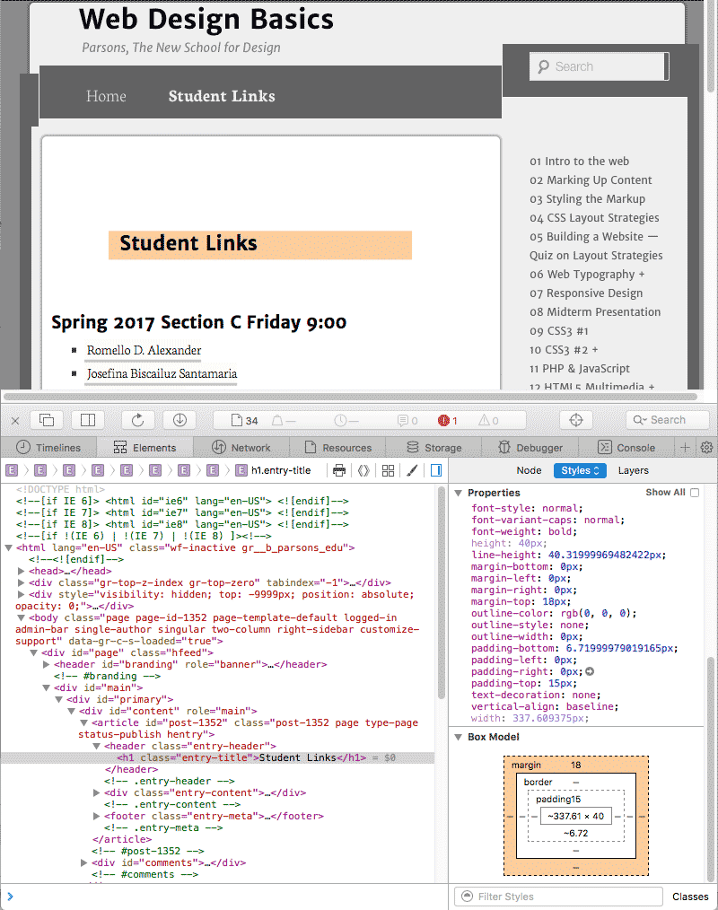
When right-clicking Inspect Element, you get the Element panel on the bottom with the HTML on the left side and CSS on the right.

What you see is a DOM or Document Object Model that parses the HTML code into a tree with a node for each element and attribute.
The element you right-clicked will be highlighted. The CSS for that element appears on the right. How often have I used this to figure out the CSS? Use this not only on your own website but anytime you see something and you want to know how it’s done.
Right-clicking on the elements in the DOM allows for live editing of HTML elements and attributes. Live edit your HTML and see the changes happen in real time. Click and drag elements around to reposition them on the page or even delete them. None of the changes are preserved when you refresh the page. If you go to the source tab and select the HTML page, you can right-click to save your Live edit changes (and even overwrite your original file).
Network Panel
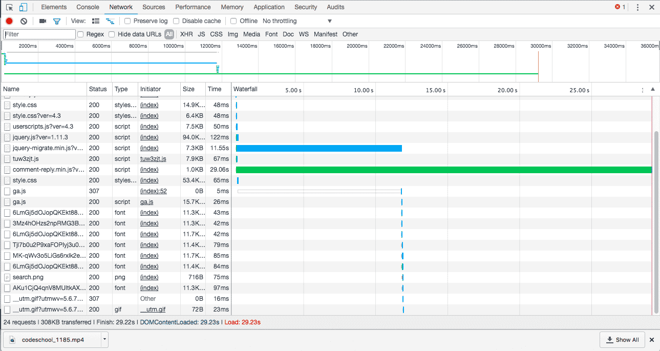
Every page you load is made up of network requests. The HTML page itself, external CSS, Javascript, images, fonts, etc. The faster they are loaded the more responsive the page feels. You can check how fast each of the elements loads by clicking on the Network Tab and refreshing the browser. Some of the resources may already be downloaded. Hold the shift key down to download all the resources.

Each network request is listed in order. The size of the source is listed fight before the timeline. In the timeline, the transparent part of the bar indicates how long it took for the resource to be requested before it starts to arrive. The solid part of the bar indicates how long the resource takes to download. The bars are color coded: HTML is blue, Javascript is orange, CSS is green and images are purple.
The blue vertical line signifies when the Chrome has finished parsing the DOM. The red vertical line tells us that all resources are downloaded.
Use the Dev Tools
Become familiar with how your website performs by looking into how the browser constructs the DOM, loads resources, renders the style recalculation and layout and finally paints the completed page. Catch any problems you have and fix them. Explore web pages and figure out how they are built.
Google’s Mobile Friendly Test
Is Your Page Mobile Friendly? Test your entire website in with one click using the at EXPERTE.com
Test to see if your website is mobile friendly according to Google’s test. Your website needs to pass this test with flying colors.
Supercharge Your Website
A free service called will speed up your website by cashing it. Sign up for free. Cloudflare’s services sit between a website’s visitor and the Cloudflare user’s hosting provider, acting as a reverse proxy for websites. This will become an issue when you have your own host and not the b.parsone.edu server.