05 AI for Layout

using artificial intelligence to help you create your website, is not as straightforward as asking a simple question. It will answer in code, but you will need to know how to place the code, and how to fill it in, so it looks like the website you’re hoping to make. That said, it’s easy enough to use it to create various examples of what you are trying to work with, and can be an incredible learning aid. That’s why I’m pushing you to use AI to help you, because, if you become a better coder, and understand what this all means, because of it, that’s the answer I’m looking for. Be liberal in the the questions you ask and request corrections, to get the code you want.

ChatGPT 3.5

I’ve had some luck with ChatGPT 3.5 and 4, but it’s a mixed bag. Not everything works, and you have to know what you are doing before you can understand what does and does not work, so use it, but beware. ChatGPT 4 is better than 3.5, but I let my subscription expire, and I can’t expect everyone to spend the $20 a month on the newer version, so this uses 3.5.

Open up a CodePen and put in the HTML, CSS, and Javascript that the program provides. My recommendations is to build modular, meaning first get the general outlines working, then ask it to build smaller things. It does not do well to put the whole thing together, so I am not worried about you not leaning how to code. You have to know enough about what you are doing, to make this work.

What follows are a number of prompts. The first one is pretty lame, but I remain too general. I try to tighten it up, and make it more interesting, but as you can see, I never get beyond a simple wireframe. This may help you get started, and I think that, by looking at the code it produces, you get a better idea of how the code works, but I think, in the end, you will have to code your website yourself, maybe with some AI, but it sure will not create your website for you.

First AI Example I need a really fantastic dynamite pulsating illustration portfolio website that can sell my illustrations to all kinds of audiences, from hip to corporate. Make it magical.

See the Pen
AI#3
by onno de jong (@onno)
on CodePen.

Second AI Example Can you create a responsive illustration portfolio website using CSS grid? I would like it to have 6 sections for different styles . Please color the background of each section a different color.

See the Pen
AI#2
by onno de jong (@onno)
on CodePen.

Third AI example Can you help me create a complete web page using different layout strategies. This is for an illustration portfolio and it needs to have several sections. I would prefer if the menu were fixed or used sticky positioning, and that the sections are animated and slide from one the next when I press the menu. Make each section’s background a different color.

See the Pen
Untitled
by onno de jong (@onno)
on CodePen.


.

02 Browser Dev Tools

Developer tools are built into the browser for people who develop websites. The tools provide an inside look at the HTML markup, the CSS code as it is applied to each element, Javascript for debugging purposes, resources from the web page, and more, all to help you figure out what the story is.

The developer tools were originally created for Webkit. Since then Apple and Google have parted ways (are mortal enemies?) and differences between how they implement the browser Dev Tools have occurred. Most things are the same, like the ability to move tabs around. The tabs you’ll want to explore are the Elements tab, the Source tab, and Network tab.

How to open developer tools: In Chrome follow option menu -> more tools -> Developer Tools. In Safari, have the developer options checked in the preferences. In both, right-click and click inspect element to inspect it in dev tools or use the keyboard shortcut to both open and close the development tools: (command-option-i).

Elements Tab

When right-clicking Inspect Element, you get the Element panel on the bottom with the HTML on the left side and CSS on the right.
dev tools

What you see is a DOM or Document Object Model that parses the HTML code into a tree with a node for each element and attribute.

The element you right-clicked will be highlighted. The CSS for that element appears on the right. How often have I used this to figure out the CSS? Use this not only on your own website but anytime you see something and you want to know how it’s done.

Right-clicking on the elements in the DOM allows for live editing of HTML elements and attributes. Live edit your HTML and see the changes happen in real time. Click and drag elements around to reposition them on the page or even delete them. None of the changes are preserved when you refresh the page. If you go to the source tab and select the HTML page, you can right-click to save your Live edit changes (and even overwrite your original file).

Network Panel

Every page you load is made up of network requests. The HTML page itself, external CSS, Javascript, images, fonts, etc. The faster they are loaded the more responsive the page feels. You can check how fast each of the elements loads by clicking on the Network Tab and refreshing the browser. Some of the resources may already be downloaded. Hold the shift key down to download all the resources.
dev tools

Each network request is listed in order. The size of the source is listed fight before the timeline. In the timeline, the transparent part of the bar indicates how long it took for the resource to be requested before it starts to arrive. The solid part of the bar indicates how long the resource takes to download. The bars are color coded: HTML is blue, Javascript is orange, CSS is green and images are purple.

The blue vertical line signifies when the Chrome has finished parsing the DOM. The red vertical line tells us that all resources are downloaded.

Use the Dev Tools

Become familiar with how your website performs by looking into how the browser constructs the DOM, loads resources, renders the style recalculation and layout and finally paints the completed page. Catch any problems you have and fix them. Explore web pages and figure out how they are built.

Google’s Mobile Friendly Test

Is Your Page Mobile Friendly? Test your entire website in with one click using the at EXPERTE.com

Test to see if your website is mobile friendly according to Google’s test. Your website needs to pass this test with flying colors.

Supercharge Your Website

A free service called will speed up your website by cashing it. Sign up for free. Cloudflare’s services sit between a website’s visitor and the Cloudflare user’s hosting provider, acting as a reverse proxy for websites. This will become an issue when you have your own host and not the b.parsone.edu server.

HTLM5 Doctor Element index


HTML5 Element Index. Once you click on the tag you want to investigate, click on the code snippet for code you can use or the W3 to go to the specification.

05 Building a Website

Week 5
2/23

Complete the Web Site. Styling navigation, site architecture, optimize site for search engines and implement Google Analytics to track users. Activity: Build website using HTML5 Boilerplate. Activity: Style navigation links. Activity: Open a Google Analytics account and apply the code to your web pages.

Homework

Develop your portfolio website. Read chapter 13. The Midterm Assignment is Due: Next week for review and midterm evaluation. Have it ready for in-class presentation two weeks from now.

Questions from Last Weeks Class or Homework?

QUIZ Next Week testing comprehension of CSS Layout Strategies.

Goals

The goals of this unit are to:

  • Be acquainted with information architecture (AI)
  • Create menus using lists and rollovers
  • Incorporate SEO into web page design.
  • Effectively troubleshoot documents.
  • Extoll the role of typography in communication and design.
  • Understand the basic rules of Typography.
  • Introduce embedded web fonts.
  • Be able to work the text and fonts in CSS.
  • To be inspired to push the Typographic boundaries in creating your own work.

    Outcomes

    At the end of this unit, students will have:

  • Created a menu using lists and image rollovers.
  • Can Optimize a web site for search engines.
  • Use HTML5 Boilerplate for your own website.
  • Troubleshoot a document when you get stuck.
  • A working knowledge of typography for use on the web
  • Access the many web fonts available
  • The ability to set type rather than rely on defaults.
  • Be conscious of what makes type legible.
  • know how to follow the rules, and when to break them for effect.
  • Find inspiration in Carson discussing his work.
  • A working knowledge of typography for use on the web
  • Access the many web fonts available
  • The ability to set type rather than rely on the defaults.
  • Be conscious of what makes type legible.
  • know how to follow the rules, and when to break them for effect.
  • Be inspired by Carson discussing his work.

Materials

Additional materials for this unit can be found by following these links (30 pages):

Step-by-Step

20 Review homework and answer questions.
10 Lecture: Information Architecture (IA)

55 Demo: Styling the Navigation
10 Break
15 Lecture: Search Engine Optimization
15 Demo: Google Analytics
20 Demo: The HTML5 Boilerplate (Watch the Video)
10 Demo: Print Style Sheet and 404 Page.
10 Lecture:Trouble Shooting
10 Demo:Adobe Browser Lab and video explanation (you need to sign up to use it)

Definitions

These are the terms that participants should be familiar with during this unit:

404 Page

The 404 or Not Found error message is aHTTP standard response code indicating that the client was able to communicate with the server but the server could not find what was requested. The web site hosting server will typically generate “404 – Not Found” web page, when a user attempts to follow a broken or dead link, hence the 404 error is one of the most recognizable errors users can find on the web.

Information Architecture

Information architecture (IA) is the art of expressing a model or concept of information used in activities that require explicit details of complex systems. Among these activities are library systems, Content Management Systems, web development, user interactions, database development, programming, technical writing, enterprise architecture, and critical system software design. Information architecture has somewhat different meanings in these different branches of IS or IT architecture. Most definitions have common qualities: a structural design of shared environments, methods of organizing and labeling websites, intranets, and online communities, and ways of bringing the principles of design and architecture to the digital landscape.

User Interface design

User interface design or user interface engineering is the design of computers, appliances, machines, mobile communication devices, software applications, and websites with the focus on the user’s experience and interaction. The goal of user interface design is to make the user’s interaction as simple and efficient as possible, in terms of accomplishing user goals—what is often called user-centered design. Good user interface design facilitates finishing the task at hand without drawing unnecessary attention to itself. Graphic design may be utilized to support its usability. The design process must balance technical functionality and visual elements (e.g., mental model) to create a system that is not only operational but also usable and adaptable to changing user needs.

Interface design is involved in a wide range of projects from computer systems, to cars, to commercial planes; all of these projects involve much of the same basic human interactions yet also require some unique skills and knowledge. As a result, designers tend to specialize in certain types of projects and have skills centered around their expertise, whether that be software design, user research, web design, or industrial design.

Principles of User Interface Design

Principles of User Interface Design are intended to improve the quality of user interface design. These principles are:

  • The structure principle: Design should organize the user interface purposefully, in meaningful and useful ways based on clear, consistent models that are apparent and recognizable to users, putting related things together and separating unrelated things, differentiating dissimilar things and making similar things resemble one another. The structure principle is concerned with overall user interface architecture.
  • The simplicity principle: The design should make simple, common tasks easy, communicating clearly and simply in the user’s own language, and providing good shortcuts that are meaningfully related to longer procedures.
  • The visibility principle: The design should make all needed options and materials for a given task visible without distracting the user with extraneous or redundant information. Good designs don’t overwhelm users with alternatives or confuse with unneeded information.
  • The feedback principle: The design should keep users informed of actions or interpretations, changes of state or condition, and errors or exceptions that are relevant and of interest to the user through clear, concise, and unambiguous language familiar to users.
  • The tolerance principle: The design should be flexible and tolerant, reducing the cost of mistakes and misuse by allowing undoing and redoing, while also preventing errors wherever possible by tolerating varied inputs and sequences and by interpreting all reasonable actions.
  • The reuse principle: The design should reuse internal and external components and behaviors, maintaining consistency with purpose rather than merely arbitrary consistency, thus reducing the need for users to rethink and remember.

05 Google Analytics

Google Analytics is a free service offered by Google that generates detailed statistics about the visitors to a website. Google Analytics gives you rich insights into your website traffic and marketing effectiveness.

How It Works

You add a JavaScript snippet onto every page of your website. This code collects individual visitor’s publicly available data, like which ISP they use and what kind of machine and browser, how long they stay on your site, which page they landed on, how they got there, etc., and sends it back to Google data collection servers for processing. It also sets a cookie on each visitor’s computer used to store anonymous information such as whether the visitor has been to the site before (new or returning visitor), what is the timestamp of the current visit and what was the referrer site or campaign the visitor came from e.g. search engine, keywords, banner or email.

Google Analytics does not work if the user disables its cookies.

Sign Up

Signup to Google Analytics using your Google account. You will need your Website’s URL to create an account.

Page Tag

Once you sign up, you will receive a javascript snippet to put at the bottom of each page on your site that will do all of the work. Do not copy this one, as each page tag is site specific, and you have to sign up to get your own. You will already have this set up in the HTML5 Boilerplate. All you need is the account number (highlighted in yellow).

<script type="text/javascript">

  var _gaq = _gaq || [];
  _gaq.push(['_setAccount', 'UA-XXXXXXXX-1']);
  _gaq.push(['_trackPageview']);

  (function() {
    var ga = document.createElement('script'); ga.type = 
    'text/javascript'; ga.async = true;
    ga.src = ('https:' == document.location.protocol ? 
    'https://ssl' : 'http://www') + '.google-analytics.com/ga.js';
    var s = document.getElementsByTagName('script')[0];
    s.parentNode.insertBefore(ga, s);
  })();

</script>

Paste the code right above the closing </head> tag.

The DashBoard

Once you have signed up, and have inserted the page tag at the bottom of each of your web pages, you can watch how many visitors come your way (there is a 12 hour delay, or so). The program was originally developed to track ads, but it can do a lot more than just look at who is visiting your site. You can use the service to see which pages perform and are catching the users’ attention, and which pages do not, allowing you to optimize the web site according to real world usage feedback.

google analytics pictureTo make it easier, Google Analytics has a dashboard to see the most pertinent statistics like site usage, visitor information and where they came from.

You can track if the visitor is new or returning, how long they spend on each page or the site as a whole, what browser they are using, who their provider is, which page they enter and exit and from where they came from, and if a search engine was used, which one and what the search query was.

You can tell what language does the visitor uses and their country of origin. Check out the list of keywords and drill down to see how effective they are. With the interactive In-Page Analytics, you can see the statistics as they relate to individual pages of your website.

It is possible to isolate and analyze subsets of your traffic, and compare segment performance side by side in reports. You can save reports that present the information you want, and it even tracks changes in usage data patterns, but all of that is beyond the scope of this introduction.

Google Analytics is a great tool and needs to be explored in depth by everyone creating web sites. Though Google is ubiquitous, there are alternatives, like Woopra or Piwik. Microsoft has a somewhat similar service.

05 Search Engine Optimization (SEO)

Your best chance of gaining top honors in google’s site ranking is creating a high quality web site. In a Google Search release for the panda algorithm, Google provided guiding questions that helped them shape how their search engine should work. It’s only logical that these questions also work as a guide to how to built the web site that ranks well in the first place. Here are those questions:

  • Would you trust the information presented in this article?
  • Is this article written by an expert or enthusiast who knows the topic well, or is it more shallow in nature?
  • Does the site have duplicate, overlapping, or redundant articles on the same or similar topics with slightly different keyword variations?
  • Would you be comfortable giving your credit card information to this site?
  • Does this article have spelling, stylistic, or factual errors?
  • Are the topics driven by genuine interests of readers of the site, or does the site generate content by attempting to guess what might rank well in search engines?
  • Does the article provide original content or information, original reporting, original research, or original analysis?
  • Does the page provide substantial value when compared to other pages in search results?
  • How much quality control is done on content?
  • Does the article describe both sides of a story?
  • Is the site a recognized authority on its topic?
  • Is the content mass-produced by or outsourced to a large number of creators, or spread across a large network of sites, so that individual pages or sites don’t get as much attention or care?
  • Was the article edited well, or does it appear sloppy or hastily produced?
  • For a health related query, would you trust information from this site?
  • Would you recognize this site as an authoritative source when mentioned by name?
  • Does this article provide a complete or comprehensive description of the topic?
  • Does this article contain insightful analysis or interesting information that is beyond obvious?
  • Is this the sort of page you’d want to bookmark, share with a friend, or recommend?
  • Does this article have an excessive amount of ads that distract from or interfere with the main content?
  • Would you expect to see this article in a printed magazine, encyclopedia or book?
  • Are the articles short, unsubstantial, or otherwise lacking in helpful specifics?
  • Are the pages produced with great care and attention to detail vs. less attention to detail?
  • Would users complain when they see pages from this site?

Now you know what Google thinks a quality site is. Most of the questions have to do with the copy, and not the pictures. Though search engines are not completely blind to pictures, they do not evaluate your fabulous pictures and designs. Take that into account and judiciously use the alt attribute to translate pictures into words.

Submit Your Site To Google, Yahoo and Bing

    Submit it to search engine tool:

  • Google with 90% market share in 2020.
  • Bing with 7% market share in 2020.
  • Yahoo with 2% market share in 2020..
  • Yandex in Russia.
  • Baidu in China.

Current Web Analytics (world)

How Search Engines Work

The search bots crawl links, essentially discovering the link structure of the web that binds all pages. The search engine then analyses the code and stores selected pieces of the pages in massive hard drives, to be recalled when you make a search.

The search engine does two things for the user: it returns only those results that are relevant or useful and ranks those results in order of importance, usually according to popularity.

Search Engine Optimization

The best advice that Google gives is to build the web page in a standards complient and semantically correct way. Search Engine optimization, or SEO means to build web pages so they are optimally structured for search engines.

Indexable content: Search Robots used to only read text. IT is still a good idea for non-text items to have detailed descriptions, as in alt attribute for pictures, descriptions for Flash and Java plug-ins and video files should have transcripts between the audio and video tags. Search engines also need to access the crawlable link structure to find all of the pages on a website.

Video Ranking Factors

Keywords

Keywords used to be the building blocks of SEO. Iit is no longer the case that all search is based on keywords. As the engines crawl and index the contents of pages around the web, they keep track of those pages in keyword-based indices. Search engines have millions and millions of small databases, each centered on a particular keyword term or phrase. This makes it possible for the engines to retrieve the data they need in a mere fraction of a second.

Though keyword usage and targeting are only part of the search engines’ ranking algorithms, effective keyword usage will go far to make pages SEO “optimized.”

  1. The keyword, ideally, it should be in the URL.
  2. Use the keyword in the title, twice if possible, and at the beginning is better. Keywords in the title is the most important place to achieve high rankings.
  3. Use the keywords in the h1 header tag.
  4. Use the keywords least three times in the body copy of the page.
  5. Use bold or strong to place emphasis on the keywords (the bots like that).
  6. Use the keyword in the alt tag of pictures (good for image searches).
  7. Use it at least twice in the meta tags.

Meta tags

Meta tags provide information about a website’s content. You can use the following meta tags: index/noIndex, follow/noFollow and noArchive if you want to talk to the bots directly. The meta description tag draws readers to your site from the results and is an important part of search marketing. This is what gets posted in the description.

The meta keywords tag had value at one time but is no longer valuable or important to search engine optimization.

URL Structures:

Your universal resource locator, or web address, is of great importance from a search perspective.

No Follow

If you do not want a bot to follow a link, you can include the attribute: rel=”nofollow” after the href, <a href="#" rel="nofollow">link</a>.

Banning Bots All Together

If you do not want to be in the search engines, you can place the robots.txt file with the content: User-agent: * Disallow: /in your directory. The * means all user agents, and applies to all bots that search engines use to comb the net. All major search engines respect this convention.

The Landing Page Optimization Guide You Wish You’ve Always Had

Follow the link to an extensive list of resources that can be applied specifically to landing page optimization.

Step Zero – Really Understand Your Target Market

Step 1 – Set Up Actionable Analytics

Step 2 – Make Sure Your Ad’s Message Matches The Landing Page

Step 3 – Evaluate Your Landing Page’s First Impression

Step 4 – Does Your Page Have Emotional Resonance?

Step 5 – Craft A Clear & Compelling Value Proposition

Step 6 – How Will Images Reinforce The Message?

Step 7 – Should We Create an Explainer Video?

Step 8 – The Importance of Social Proof, Authority & Testimonials

Step 9 – Does The Copywriting Make You Want To Read More?

Step 10 – Does Your Call To Action Communicate Clearly?

Step 11 – Start A/B Testing

So much of a visitor’s landing page experience happens in less than a second & most of focus on the entirely wrong side of that experience.

If you think of your landing page as a way to tell the story of how your prospect’s life gets better, and use what you know about how the brain processes text and images, you can create a “hook” that gets them wanting more.

In that case, Landing page optimization is just a way to make the story better every time it’s told.

SEO resources

Much of this information has come from SEOMOZ, Google’s SEO Starter guide (pdf), Google’s webmaster tools and help and Search Engine Land web site. Visit these to learn perfecting keyword targeting on-page optimization..

Another great resource is the SEO plugin for WordPress Yoast and the site itself has lots of information as well. With all of these resources, there is no reason that your site is not SEO friendly.

Google’s Publisher’s Plugin for WordPress

Visit the Google search algorithm changes chart for 2013 to give you an idea of how a search engine remains a moving target.

05 Print Stylesheets

We take for granted that we are styling the web site for the screen, but we should not forget that its also important to create a style sheet for when a user prints the web site. You can imagine that a potential client can print out a page from your portfolio to show to someone else at a meeting for a potential treatment of whatever project they are working on.

Clean It Up

The most useful thing is to remove some of the clutter. When a user prints a page, they do so for the content. Do them the favor and hide all that is not necessary. The footer, navigation and other unnecessary elements can be set to display: none; . The remaining elements often need their screen styles neutered, and the properties have to be rewritten to clean up the print style. The browser itself applies a print style to the page, removing the background, etc, and the HTML5 Boilerplate has print stylesheet, but you still may need to tweak it yourself.

Add your additions to the print styles at the bottom of the page in the boilerplate:

/* ================================================
   Print styles.
   
   ================================================ */

Fonts are often larger on the screen than in print, so set the font to serif 12points in size: p { background: white; font: 12pt/14pt "Times New Roman",Georgia,Serif; } and h1, h2, h3, h4, h5, h6 to appropriate sizes.

Rearrange It

It is likely that the page is horizontally laid out for a screen. You may want to rearrange the elements vertically for the printed page.

Adding Information Using CSS

Information can be added by using the content attribute before the header, for example, so you can customize the printed page: header:before { content: "Contact artist for more info, telephone number, email and website, etc"; } or anything else you want the printout to have.

It’s possible to print out the actual link address after the links using a:link:after, a:visited:after { content: " (" attr(href) ") "; } but that prints out all links, so you may want to limit that to to the article tag. This is already taken care of for you in the boilerplate.

Check to see how your page prints out, and add styles to the print section of your CSS style sheet if needed.

05 Styling the Navigation

Anchors make the Word Wide Web. These hyperlinks are the essence of the web, and styling them is no small matter.

The anchor element <a >contains the href attribute that specifies the hyper reference (address). It can also contain a target atribute, which can target the link so it opens in a new window: target="_blank". The link text comes next. This could just as well be a picture. The link element is closed with a </a>.

The link element plays a central roll in information architecture and user experience design; everything depends on the navigation and what it looks like, and that’s what we look at here.

Styling the <a> Pseudo Classes

Pseudo-classes affect the document as if — and this is what makes them pseudo — they add a class to the document. The document will display that whether or not a a:link has been a:visited or not, based on the browser history.

The other three pseudo links indicate interactive feedback. The a:hover link applies while the user is over the element with the cursor, the a:active pseudo-class applies while an element is being clicked on by the user.

Notice that a:hover and a:activehave be placed after a:link and a:visited otherwise the cascade can hide their color property. To avoid that, make sure to write them in the order you see here, for it makes a difference.

CSS Code View

<a href="#key" accesskey="a">Click Me or press Control-Option-a</a> anywhere in the document.


Keyboard Focus

The a:focus pseudo-class applies to an element that accepts a keyboard event. It is not widely used. There is no feedback in Safari, but Firefox and Opera show that you have pressed the key before executing the link. In Safari you hold down both control and option and the key, in Firefox, just the control button and the key, in Opera, you press shift escape and then select the key and in Internet Explorer, the alt key. In case you want to include keyboard access, you need to add the attribute and the key to the link element, like this: accesskey="a".

Using Lists for Navigation

It was decided a long time ago that menus are really lists, and should be wrapped in a list to be semantically correct. The code for most of these demonstrations use the following code:

<ul>
<li><a href="#">Home</a></li>
<li><a href="#">Topic 1</a></li>
<li><a href="#">Topic 2</a></li>
<li><a href="#">Topic 3</a></li>
<li><a href="#">Topic 4</a></li>
</ul>

Which, when it has no CSS styling, takes the default look:

  • Home
  • Topic 1
  • Topic 2
  • Topic 3
  • Topic 4

The remaining sections will use CSS to style what are otherwise lists of menu choices.
     

Using Display: Block and Inline-Block

The most obvious CSS changes to the menu are to give it a color (color: white;), to remove the underline (text-decoration: none;), to give it a background (background: orange;), a border (border-left: 5px solid a00;), padding (padding: 42px 0px;), and margins (margin: 5px 5px;). You can use the pseudo classes to target the hover, active and visited states with different attributes, so that the user gets feedback when they go over, click or have visited that link.

You can change the list item li that creates the menu to be either vertical or horizontal by changing its display from display: block which is the default and renders the list vertical to display: inline-block;. This creates a horizontal menu.

CSS Code View


Using Display: Table to Make Horizontal or Vertical Menus

If the <ul> is displayed as a table, then the <li> can be displayed as a table-cell. That also creates a horizontal menu. Changing the display to table-row makes the menu vertical.

CSS Code View


Using Floats to Layout the List

Floats can also be used to layout the list. Just float all of the <li>s left. You have to remember to clear: left the element that follows the list, but otherwise it works well. To make this horizontal, reduce the width of the <ul> to 100px. If you want two rows going down, change the width to 185px.

CSS Code View

Image Rollovers

Now buttons with the CS3 goodness have come a long way, but when the menu needs more pizzaz than even CSS3 can provide, you turn to pictures, so when you hover over a link, the picture changes. This is easily accomplished in CSS using a single image divided into three, where the first part is what you see as a link, the second part is what you see when you hover over, and the third part is what you see when you click the link. The picture looks like this:    

rollover folder icon

    
The picture is simple enough, with a folder in three colors. The strategy is to show only the first icon, and with each state, move the picture so that it shows a different icon. That way, its blue, red when rolled over and green when clicked. If you want to tell the audience that they have clicked the link before, you can add a forth icon. The HTML is an empty anchor tag <li><a href="0"></a></li>.

CSS Code View


Making the Links Accessible

Because screen-readers cannot read anything from a picture, it’s necessary to put in a title. You get a popup after a second or so of hovering, with the title on it. <li><a title="link to Home" href="#"></a></li>

CSS Code View

Image Sprites

To have three pictures on an image and to seamlessly move between them is called an image sprite. It works very well for one link, and it works even better when there are more links, as in the following example with three variations per link for four links on one image file. Each pseudo class calls up the same image but at a different position, using the background-position: no-repeat 0 0 property to easily indicate where the pictures are on the image. The first number after no-repeat is the horizontal (x) offset, and the second is the vertical (y) offset. You can easily get this information from PhotoShop or Illustrator, but that still quite a chore.

To make this process even easier is Sprite Cow, which can take an image with lots of sprites on it, and easily provide you with the code containing the coordinates that makes this process a snap. Take the following image, load it into Sprite Cow, click on each image and copy and paste the coordinates into your stylesheet. Once you get the idea, you’ll never go back.

rollover sprites for menu

Since it is necessary to target each link individually, every link gets its own id.     

CSS Code View

Sprites Save Time

Every time that the browser has to request an image from the server, it takes time, not only for the image to download, but for the server-request. In fact, the server request can take more time than the downloading of the image. The ability to gang up all of your web pictures into one image is for that reason, a real time saver and significantly speeds up the loading of a web page.

As the process for doing so is exactly the same, using Sprite Cow, we do not need to go into a sprite / background image demonstration, as we have covered a lot of ground already, but be prepared to combine all of the smaller pictures into one large image like this for your final web site.

Pseudo Classes: not

A collapsable guide to the layout modes. All of the work is being done by the last CSS rule using the pseudo class not, as in not target or hover li:not(:target):not(:hover) .

CSS Code View

Live Demo

Here you will find links to the layout modes article, including the document flow, the positioning of the elements within the document flow and display, z-index and overflow properties.

HTML

  <nav>
    <ul>
      <li id="nav-about"><a href="#nav-about">Layout Modes</a>
        <ul>
          <li><a href="#layoutModes" target="_blank">Layout Modes</a>
          <li><a href="#block" target="_blank">Block Display</a>
          <li><a href="#inline" target="_blank">Inline Display</a>
        </ul>
      <li id="nav-projects"><a href="#nav-projects">Positioning</a>
        <ul>
          <li><a href="#positioning" target="_blank">Normal</a>
          <li><a href="#relative" target="_blank">Relative</a>
          <li><a href="#absolute" target="_blank">Absolute</a>
          <li><a href="#fixed" target="_blank">Fixed</a>
          <li><a href="#floats" target="_blank">Floats</a> 
          <li><a href="#tables" target="_blank">Tables</a>
        </ul>
      <li id="nav-interact"><a href="#nav-interact">Other</a>
        <ul>
          <li><a href="#display" target="_blank">Display</a>
          <li><a href="#zindex" target="_blank">Z Index</a>
          <li><a href="#over-flow" target="_blank">Overflow</a>
        </ul>
    </ul>
  </nav>
  <div>
   Here you will find links to the <a href="http://b.parsons.edu/~dejongo/04-the-layout-modes" target="_blank">layout modes</a> article, including the document flow, the positioning of the elements within the document flow and display, z-index and overflow properties. 
  </div>
</div>

Drop Down Menus

While drop down menus are not really appropriate for small web sites of the kind that you will build here, I include a demonstration of a CSS only drop down menu just in case you do not feel complete if you do not have one, or better yet, build a really big site.

CSS Code View

The HTML Code

<ul id="nav"> 
	<li class="current"><a href="#">Home</a></li> 
	<li><a href="#">Menu_A</a> 
		<ul> 
			<li><a href="#">Menu_A-1</a> 
				<ul> 
					<li><a href="#">Menu_A-1-a</a></li> 
					<li><a href="#">Menu_A-1-b</a></li> 
					<li><a href="#">Menu_A-1-c</a></li> 
					<li><a href="#">Menu_A-1-d</a></li> 
				</ul> 
			</li> 
			<li><a href="#">Menu_A-2</a> 
				<ul> 
					<li><a href="#">Menu_A-2-a</a></li> 
					<li><a href="#">Menu_A-2-b</a></li> 
				</ul> 
			</li> 
			<li><a href="#">Menu_A-3</a> 
			<li><a href="#">Menu_A-4</a> 
		</ul> 
	</li> 
	<li><a href="#">Menu_B</a> 
		<ul> 
			<li><a href="#">Menu_B-1</a> 
				<ul> 
					<li><a href="#">Menu_B-1-a</a></li> 
					<li><a href="#">Menu_B-1-b</a></li>
					<li><a href="#">Menu_B-1-c</a></li>
				</ul> 
			</li> 
			<li><a href="#">Menu_B-2</a> 
			<li><a href="#">Menu_B-3</a> 
			<li><a href="#">Menu_B-4</a> 
				<ul> 
					<li><a href="#">Menu_B-4-a</a></li> 
					<li><a href="#">Menu_B-4-b</a></li>
					<li><a href="#">Menu_B-4-a</a></li> 
					<li><a href="#">Menu_B-4-b</a></li>
				</ul> 
			</li> 
		</ul> 
	</li> 
	<li><a href="#">Menu_C</a> 
		<ul> 
			<li><a href="#">Menu_C-1</a> 
			<li><a href="#">Menu_C-2</a> 
			<li><a href="#">Menu_C-3</a> 
				<ul> 
					<li><a href="#">Menu_C-3-a</a></li> 
					<li><a href="#">Menu_C-3-b</a></li>
				</ul> 
			</li> 
			<li><a href="#">Menu_C-4</a> 
			<li><a href="#">Menu_C-4</a> 
				<ul> 
					<li><a href="#">Menu_C-4-a</a></li> 
					<li><a href="#">Menu_C-4-b</a></li>
					<li><a href="#">Menu_C-4-a</a></li> 
					<li><a href="#">Menu_C-4-b</a></li>
				</ul> 
			</li> 
		</ul> 
	</li> 
</ul> 

05 Troubleshooting

Everyone of you will run into problems, and more than likely, lots of problems, and you have to tackle them one by one, for usually becomes a mess if there are too many problems all at once. The solution, then, is to solve the problems one by one, until they’re all gone. In part 1 of this document shows how to isolate the problem so that you can solve it, and in part 2 provides some clarification on confusing issues in CSS.

Creating a Problem Free Document

The first step is to copy and paste the basic HTML5 code into your text editor and to give it a page a name that contains no spaces and ends with .html. You add a link to an external CSS style sheet in the header of the document and include the CSS reset at the top of your external CSS style sheet.

In an ideal world, you add code and validate every few minutes, staying on the strait and narrow path. This is a lot better than running into a problem and finding out that you have 153 errors because you forgot to validate regularly. Yes, using HTML and CSS is really problem solving. You follow the rules, and each one of them is very simple, but add them all together to create a complicated layout, and that is were the trouble begins.

One way to keep trouble from your door is to organize your document into regions, like a wireframe, diving up your page into independent locales. That way, if there is a problem you know where it is.

It is a good idea to use comments <!-- comments --> or inside of the external style sheet /* comments */ to identify what the code is doing. It is amazing how much we forget when asked to redo something on a job that was done a year ago.

It is also possible to “comment out” parts of the code you temporarily want to suppress, which means that you use this comment code to remove the HTMl markup and CSS rules that you want the browser to ignore.

Troubleshooting When You Have Problems

There are times when you have been busy coding and whatever you are trying to do just does not work. When a document becomes complicated enough, fining an unclosed div can be a problem. That’s when you have to troubleshoot the document.

Troubleshooting comes into play when you have trouble but you do not know the cause of that problem, so you have to figure out where in the code the trouble is, and then fix the problem.

Unfortunately the problem is not blinking on and off so as to attract your attention. Instead, you have to hunt it down.

This becomes more difficult if you have not been validating regularly. It can even happen with pages that do validate, though that is much less likely, so I ask you to validate your documents regularly.

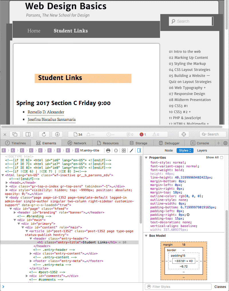
Tools like Firebug, Web Developer and the Inspect Element in the Safari and Chrome browsers can be very helpful. In the last two browsers, right-click on an element and inspect element is the last item in the popup menu. You can activate this inspection and debugging tool in the preferences.

These tools allow you to inspect your CSS, but that does not always indicate what is causing the problem. You might have written the HTML markup or CSS rule incorrectly somewhere else.

Process of Elimination

If you think that your problem is with one or another CSS definition, start testing them by adding something obvious, like background-color: red;, outline: 1px solid green or something like that.

If you still cannot locate the problem, start removing the rules one at a time, until you find where the problem is. The same is true of the HTML, in case you cannot find the tag that’s not closed, misspelled, etc. You sometimes have to remove a lot, and you can speed up the process by eliminating half, testing it, and if the problem goes away, test the other half, and so on.

Once you have found what causes the problem, you can fix it, circumvent it, etc.

Validate!

Key to working on the web, especially as you are starting out, is to validate often, as it will let you know as soon as you have gone off track, so please use this service often!

Unicorn Validator for HTML5 and CSS3 and the Regular Validator

Clearing Up a Number of Confusing Issues in CSS

This is taken from CSS-tricks.com, one of the great websites to go to.

If you’re a pro, it’s easy to forget the confusion you felt when you just started learning CSS. Just for fun, let’s try and remember some of those little weird confusing moments. I’ll start us out by listing some random ones I remember and have picked up on while helping others recently. Then you folks take it from there in the comments.

These aren’t huge big things like broken layouts in IE or which vendor prefixes should you be using. It’s the little fundamental stuff, like tiny differences in syntax that change meaning in a big way.

Tag qualifying

What’s the difference between these two things?

.class { }

p.class { }

The first one will select any element with that class name. The second one will only select paragraph elements with that class name.

The first is more generically useful. The styling you apply with that class may be useful to multiple types of elements. Even if it’s not today, it might be tomorrow. It’s also faster for the browser to understand and apply.

It’s a fairly rare case that you’d want to use the second example. It would only be if you wanted to re-use the same class name for multiple elements but have them to different things.

p.stand-out { background: yellow; }

span.stand-out { font-weight: bold; }

Selector order matters

Why are these so different?

.class div { color: red; }
div.class { color: green; }

The first example there is very different because of the space character between .class and div. The stuff before the space and the stuff after the space select different elements. The first part is “select any element with this class name” and the second part is “select any div”. Put them together with a space and you get “select any div that is a descendant of any element with this class name”.

The second doesn’t involve any of that descendant business. It’s a tag-qualified selector like discussed above.

If the above CSS was the only CSS on the page, the results would be like this:

<div class="class">

<h2>

<div>Would be red</div>

</h2>

<div>Would be red</div>

Would be green

<div>

<div>Would be black</div>

Why use ID’s at all?

It seems like as far as CSS is concerned, using classes and using ID’s is the exact same thing.

#id { color: red; }

.class { color: green; }

It’s just an attribute and it’s a seemingly arbitrary difference in syntax depending on which one you use. The results are predictable:

<div id="id">Would be red</div>

<span id="id">Would be red</div>


<div class="class">Would be green</div>

<span class="class">Would be green</div>

You might have learned ID’s are “supposed” to be unique, as in, only have one element per page that uses it. But you’ve slipped up before and it doesn’t seem to matter, the CSS applies just fine.

Then you start getting conflicting information. Some tools and philosophy) teach that ID’s aren’t good for styling. Some articles tell you they are the most efficient. Perhaps you work with a JavaScript developer who tells you they need ID’s on everything because it makes their job way easier.

Confusion abound here. Turns out, everybody is kinda right. Here are the facts:

  • CSS doesn’t care much which you use, as far as actually applying styling. ID’s are technically faster for a browser rendering engine, but other than the most extreme of circumstances you’ll probably never notice a speed difference.
  • JavaScript cares very much about ID’s. It can be noticeably faster for JavaScript to find an element by an ID. And this is where the “uniqueness” is very important. JavaScript will only find the “first” element with that ID, so if you have multiple on the page, confusion may ensue.
  • ID’s have an infinitely higher specificity value than classes. If there is an element with an ID and a class and they both apply styles, the styles applied by the ID will take precedence over the styles applied by the class. This can be useful, this can be a hindrance.

My personal philosophy is to use ID’s on stuff that I absolutely know there will only ever be one of and will not benefit from properties from a class name shared with other elements.

Buried hovers

What’s going on here?

div { color: red; }

div:hover div { color: green; }

:hover is a selector which only applies itself when the mouse is over a particular element. What is weird here is that you don’t necessarily have to apply styles to that element being hovered over. In this case, we are applying styling only to descendant divs when the parent div is hovered. So:

<div>


I will be red all the time


<div>

I will be red, unless that top

div is hovered (but not necessarily me)

and then I'll be green.

</div>


I will be red all the time


</div>

Whitespace doesn’t matter

This:

div{color:red}

Is the exact same as:

div {

color : red


}

You do need spaces in selectors to make decendent selectors (e.g. ulli { } is absolutely not the same as ul li { }) but other than that you should use whitespace however makes looking and working with your CSS comfortable.

Notice the missing semicolon on that property in the example above. You can omit that if it’s the last property in the group. Personally I never do as if you add more property/values later and forget to add the semicolon to the previous line, that’s a problem. Because whitespace is so free, it will continue to read the next line as part of the value of the previous line.

Example of the problem:

div {

-webkit-border-radius: 10px

-moz-border-radius: 10px

border-radius: 10px

}

The whitespace is fine. The no-semicolon on the last one is fine. But the first two property/value pairs don’t have semicolons and will totally screw up and not work.

Property overrides

What font-size is the div going to have?

div {

font-family: Sans-Serif;

font-size: 18px;

font-weight: bold;

font-style: italic;

color: red;

margin: 0 0 20px 0;

font-size: 21px;

padding: 10px;

}

It’s going to be 21px. You’ve accidentally listed it twice and the second one is going to win.

Order in CSS file matters

If you have two selectors that have the exact same specificity like this:

.red { color: red; }

.green { color: green; }

And then they apply to the same element, the selector later in the CSS will always win. Class name order in HTML doesn’t matter:

<div class="red green">Will be green</div>
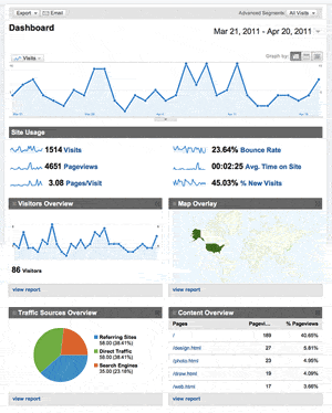

05 HTML5 BoilerPlate

We started out the semester with a plain HTML5 template. It used to be that not all browsers would interpret HTML or CSS the same way, and there was a need for a boilerplate that normalized all the differences, but those days are gone. Google’s rendering engine Chromium split from Apple’s Webkit, and the only other rendering engine is Firefox’s Mozilla, and its future does not always look secure, which is unfortunate. Slim pickings compared to the way it used to be. Competition and diversity are good, but no one misses Explorer’s many exceptions.

Using a boilerplate will make your life a little more complicated, but it takes care of any contingencies that make building a professional website more challenging.

The HTML5 Boilerplate

The HTML5 Boilerplate helps you build fast, robust, and adaptable web apps or sites. Kick-start your project with the combined knowledge and effort of 100s of developers, all in one little package.

We are using the most recent HTML5 boilerplate. I expect everyone to use it as the basis for the midterm and final. Head on over to the Support Documents

The boilerplate is everything for everybody, from the novice to the professional, so it’s stacked with goodies that you would not be able to incorporate on your own at the level you are at.

Features

  • HTML5 ready. Use the new elements with confidence.
  • Cross-browser compatible (Chrome, Safari, Firefox).
  • Designed with progressive enhancement in mind.
  • Includes [Normalize.css](http://necolas.github.com/normalize.css/) for CSS normalizations and common bug fixes.
  • The latest [jQuery](http://jquery.com/) via CDN, with a local fallback.
  • The latest [Modernizr](http://modernizr.com/) build for feature detection.
  • Placeholder CSS Media Queries.
  • Useful CSS helpers.
  • Default print CSS, performance optimized.
  • An optimized Google Analytics snippet.
  • Apache server caching, compression, and other configuration defaults for Grade-A performance.
  • Cross-domain Ajax and Flash.
  • “Delete-key friendly.” Easy to strip out parts you don’t need.
  • Extensive inline and accompanying documentation.

Documentation

Take a look at the table of contents. This documentation is bundled with the project, which makes it readily available for offline reading.

If You Want To Know More

There is comprehensive documentation. Learn more about HTML5, browser compatibility, javascript libraries and all the other goodies that make up this boilerplate.

Instructions in a Nutshell

Implementing the HTLM5 Boilerplate is easy. Transfer your CSS to the external CSS style sheet provided, and the HTML markup to the index.html file where indicated.

Where to put the CSS

Enter your CSS code on the external style sheet provided. It is already linked to the index.html page.

The CSS style sheet normalizes the browser in a more nuanced way than the browser reset. These have to come before your own user styles, which are entered in the middle of the document after these instructions:

/* ==========================================================
   Primary styles
   Author: 
   ============================================================ */

If you put your declarations in these commented-out instructions, your code will also be commented-out. I’ve seen that happen before, and the student came up to tell me that the template does not work. I’ve also seen students use the index.html page by itself. That also does not work. Keep the folder intact.

After the user styles there are a number of preset styles that can be called to perform a number of tasks. You want these to remain intact after your styles.

All you have to do is create your styles in this middle Primary Styles Author section. and ignore the rest of the style sheet if you do not understand what it does.

Where to put the HTML

Once again, ignore everything that you do not understand.

put the title of the page between the title tags:

<title></title>

Next enter a description of the page/site:

<meta name="description" content="">

Fill in the author:

<meta name="author" content="">

As long as you did not change this name of the style sheet, the default link should work.

<link rel="stylesheet" href="css/style.css">

Enter all of your HTML replacing the code below

Ignore everything else that you do not yet understand.


Hello world! This is HTML5 Boilerplate.

Google Analytics code is already in place. You already have an id if you signed up and followed the instructions . You need to replace “UA-XXXXX-X” with your account number. This way the page is tracked by google’s analytic software, and you can check up on who visits you, how long they stayed, which pages they navigated and more.

            var _gaq=[['_setAccount','UA-XXXXX-X'],['_trackPageview']];

Turning a Single Page Into a Website

Work on the index file till you have made it just like your Photoshop comp / wireframe, with everything as you want it.

Include in this file a styled navigation with links to all of the files that you wish to target. Examples are about.html or bio.html, drawing.html, etc.

When you feel you have achieved this to the point of perfection, duplicate the index.html file and rename each copy to the appropriate page name that you specified in the navigation. This way the site is almost already build as soon as you finish the first page.

The Boilerplate is for Your Own Good

This is not much more complicated than before, as long as you can ignore some of the extra code.

Just know that your HTML5 and CSS3 will be more compatible with other browsers than if you did not use this template. That said, if anyone wants to learn this stuff, I recommend going through this boiler plate carefully, read the documentation, and follow all of the links, for you will learn a lot.

Adding Google Analytics and SEO

Follow the instructions in Google Analytics to get a google analytics account number. Place that number in the index.html file.

Building a standards compliant website with good content is best for search engine optimization. The problem many of you will face is that all your work is composed up of pictures. Search engines prefer words. Make sure that you describe your pictures will in accompanying text or use the alt tag to let the people who use search engines reach your pictures.