Responsive design started with the May 25, 2010 article Responsive Web Design by Ethan Marcotte discussing media queries. Flexible layouts and responsive images are two additional components necessary for responsive web design to function effectively. Prior to the advent of responsive design, flexible layouts were achieved using em units.
EM as a basis for Web Design
An em is a unit of measurement in typography, equal to the currently specified point size. It’s believed to be derived from the width of the capital “M” in a specific typeface. Today, it represents the height of a font. This unit remains consistent across all fonts at a given point size. For instance, 1em in a 16-point typeface corresponds to 16 pixels, which is the default font size for browsers.
CSS allows one to measure everything in em units and some consider it a best practice to do so. (In case you are wondering, Bert Bos is the original author of CSS) This practice originated at a time when browsers only enlarged the fonts when zooming the page in or out, leaving all other elements the same size. To make the whole web page scale, the other elements had to be built with ems.
You define the reference size of the text on the page in the body tag by setting the size of the em. When zooming in or out at the time when browsers only enlarged fonts, all elements specified in ems would change proportionally with the font, preserving the layout.
Flexible Layouts using EM
To calculate a size in ems: divide the desired size by the reference em or rem — 960px / 16px = 60em.
Because percentages are often used to resize elements including fonts, it is possible to accidentally add a percentage on top of a percentage. When the font size of both a child and its parent are set at 80%, the child ends up being 80% of 80% of the em. This can lead to unexpected results. To avoid that, CSS3 introduced a rem, which stands for reference em. Unlike the em, the rem is not affected by inheritance and reflects the percentage of the font as specified in the body tag.
I don’t recommend using the em as a relative measurement for anything other than specifying font size. The need for using it to create responsive or scalable websites has vanished, and I don’t see any advantage to using the em, despite some people still advocating for its use.
Flexible Layouts using %
Flexible websites resize automatically with the size of the window or the device, which is known as the viewport. To design elements effectively, use relative measurement units such as percentages. This ensures that all elements with relative sizes change proportionally when the viewport changes.
Figuring out the percentage isn’t hard: target divided by context equals the result, where the target is the parent element and the context is the child element(s). This formula is used to calculate the correct percentages and is illustrated below in the creation of a fluid layout. The following example begins with a pixel-based layout, similar to a Photoshop comp, and transforms it into a percentage-based layout without using any absolute values.
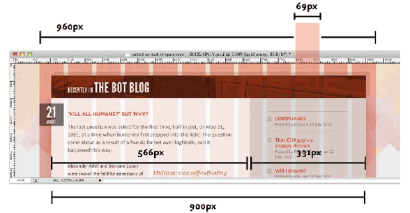
The conventional standard width for web pages used to be 960px. That number can be evenly divided in many columns: by 2 (480), 3 (320), 4 (240), 5 (192), 6 (160), 8 (120), 10 (96), and 12 (80). This makes it easy to create columns and facilitate design.
A 960 pixel wrapper div can be divided up into a grid of 12 columns, each measuring 68 pixels across and separated by regular 12px-wide gutters. Taken together, those columns and gutters are a total width of 960 pixels.
If the main article were 6 grid columns and the side column were three grid columns with a column between them, that would fit in a container 900 pixel wide, leaving around a half column on either side. Break this into pixel width and the main column width is 566p pixels while the side column is 331 pixels wide.
To give the wrapper div a little padding on either side, instead of 960pixels, make it 90%. That is 90% of the viewport. That width is then used to define all other widths.
Figuring out the percentage of a 900px container in a 960px parent, plug it into the formula target ÷ context = result, dividing 900 by 960 gives us 0.9375. Since 100% is equal to 1, .9375 is equal to 93.75%. That makes the container that holds the two columns 93.75% of the page size.
The two columns fit inside the 900 pixel container. The width of the column is divided by 900. The large column is 62.8888889% and the small column is 36.7777778%. Don’t round the numbers off, as the browser uses the information to make the layout more accurate.
All of the padding and margins need to be translated to percentages using the formula target ÷ context = result, dividing the child into its parent to get the right percentage.
The layout will be problematic when the window becomes too small or too large. Use min-width and max-width to keep it from doing that. This is where media queries come in handy.
Flexible Images
The img element by convention is a child of a figure element. Set the image width to 100% img {width: 100%}. The set the figure width to a percentage of the parent element to control the size of the image. figure {width: 50%}
Background images can be sized in percentages, or they can be tiled to fill the background, or cropped.
Utopia (2024)
Responsive design has been updated using Utopia, a comprehensive support system that simplifies the creation of fluid responsive designs. Utopia employs CSS frameworks to seamlessly achieve fluid design for fonts and spacing across the range of smartphones and large screens. Unlike @media queries, Utopia eliminates the need for jumps or surprises, and it scales better than relying solely on viewport width. Additionally, Utopia offers tools for designing a layout grid. While these tools may seem complex at first, they’re worth checking out in a week or two as you begin coding and developing your website.