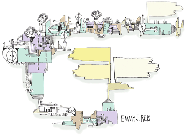
Beyond the standard inclusion of images, few websites rely on illustration or photography to drive the design. That provides illustrators and photographers an opportunity to integrate their art into the design and user experience. Incorporating images will develop a signature look that is unique and stands out.
Designing with Pictures
The most common approach for a photographer or illustrator is to place one large illustration on a page with a few links. The illustration may attr attention, yes, but the objective here is to sell something other than the artwork.
Good web design has to be much more flexible than one large image. Flexibility is gained by breaking the illustration(s) into modular parts. Use these parts in the background of layout elements.
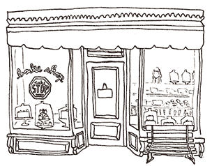
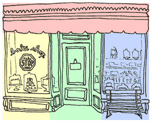
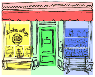
Take a store front design. This is the kind of illustration that can easily be divided up into a classic three column layout with a header.
Great! Then all you have to do is create areas in each column for the content. The menu could go into the header and the two windows and the door could contain all kinds of products.
Or is it that great? What happens if there’s more text than can easily fit into the required space? Is the design flexible enough to adapt to the additional content?
Is the design responsive? What happens to the design if it is seen on an iPhone or a 30inch monitor?
A single picture quickly feels like it’s not flexible. Being flexible is a key component of web design. Design with this flexibility in mind. Use your illustrations or photographs in a more modular fashion.
Attaching the art to the background
CSS Code View
The first step is to place your image in the background. That’s simple enough! Use the background property and specify the URL() as in the h2 above that’s targeted by this demonstration. It uses the illustration at the top of the page. Change the padding on the top and bottom to show more of the image. Move the image around by changing the x and y positions or use left, center, right, top, center and bottom keywords. Ad in the same image more than one. The second image is positioned so the bottom of the illustration shows up on top of the header.
Careful with how you write the CSS because it’s not tolerant of mistakes. If it turns out that you are not able to see your image, simplify the code till you see it working, and then add in the x and y positioning properties. One misplaced character and the background disappears.
Sprites
Once you become familiar with placing background images, it’s easy to imagine that you’ll do it often, for no other reason that to include all the social media icons.
It turns out that the penalty for initiating the connection that retrieves each image from the server is often greater than the penalty it takes to actually retrieve the image. If you have a lot of images, it’s recommended to turn them all into a sprite. This means to combine them into one file, with enough empty space around each picture, and to call them up by using the x and y coordinates.
This would be a cumbersome if it were not for Sprite Cow (and similar web applications). We used it earlier in the article on Styling the Navigation. It provides you with the coordinates and the size for each picture within the page of pictures, and this is then called a sprite.
If your images are small, you can use the 24bit PNG format, which includes a nice alpha channel that allows you to layer background images on top of one another. The size of 24bit PNG images grow pretty quickly, however, and if you are not going to layer the images, use JPEG compression. The “Pick Background” button in Sprite Cow will isolate the background. Use proper technique to prepare the images.
After placing all of your images in photoshop in separate layers, save each layer as a file for the web. Load it into Sprite Cow. Click on each image. If several images belong to one sprite, drag the pointer to select them all.
The code for the sprite appears at the bottom left-hand side. Copy this code and paste it into your stylesheet, update the location of the image, and you have a background sprite ready to use in the layout. Do this for each sprite. Ganging up many pictures into one image saves on the time it takes to load all of the pictures individually.
Using Background Images
A layout can be thought of as boxes stacked one on the other, and then, however, many to the right of one another. This down and across movement is how to build out the layout of the web page in the word processor-like environment of the default document flow.
Chances are the layout is developed in Photoshop or Illustrator, where it’s easy enough to figure out where the boxes should be to hold the graphics, text and other design elements. Develop those boxes first, and that becomes your wireframe. Plugging in your picture, or multiple pictures are then as easy as assigning the code produced by Sprite Cow to any box.
Adapting Background Images for Responsive Layouts
Working with sprites is all great when working on a single layout, but what about responsive layouts? This can be a little more complicated. Responsive design means that you have to develop several photoshop comps to represent what the web page will look like on the iPhone or Android and tablet, where it can appear either horizontally or vertically, or a small to large computer monitors, which tend to stay horizontal.
The great thing bout background images is that they can change depending on the device targeted. Create a layout for each device. That way the mobile device does not attempt to download huge images.
Changing the background image is easy enough, using the CSS property background-size: 66%; for the vertical and background-size: 100%; for the horizontal layout. But this means that the entire sprite is sized, and the original coordinates need to be multiplied by 1.5 to locate the image on the sprite.
One way to make this easier is to place the images on a grid of even intervals so the coordinates can be easily multiplied. If each image is on a grid of 300 pixels, it’s easier to calculate this difference.
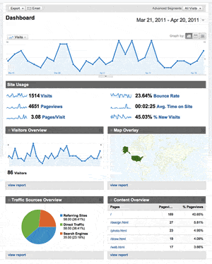 To make it easier, Google Analytics has a dashboard to see the most pertinent statistics like site usage, visitor information and where they came from.


