04 Layout Strategy

Web design layout strategies continues to change, from what it was at its inception to today, and from where it is today into the future. You have to go along with those changes. It started out as a presentation language for static documents written by scientists. That changed when the general public got a hold of it, but for the first twenty years, the size of the page was pegged to the size of a computer screen.

The iPhone revolution changed web design, and a web page is expected to perform equally well on many different devices, from smart phones and tablets to computer screens, car entertainment devices, and more.

Design for the web today has to cover all the differs devices with the same content and CSS. Think of web content as a flexible material that automatically adapts to different sized devices. Each device has its own characteristics, from the small pointer on a computer screen to the large finger on a smartphone.

It means that you cannot design for your laptop screen and hope it works on the other devices. You need to address the target audience for each device. This takes some time. You’d want layout functionality that automatically arranges the content in different ways, depending on size and function. You can trust that a person behind a desktop will sit there, but the person with a smartphone is probably on the go. You need to put your head in the right place when you design for the web.

There are automated formatting systems available that make it easier to place things in the right position for different user experience based on device size. Flex-box was introduced to create a more flexible layout experience. While flexbox allows you to choose both horizontal and vertical directions, it is most appreciated for its ability to organize content going across the page.

Nesting flex boxes allows for great horizontal or vertical placement using the margin:auto; property. This automatically places content at the top, bottom, left, right, or center of the parent object. Flex Grow, Shrink, and Basis provide controls that dynamically determine the proportion between the content items. It fits the flex-items to the remaining space, or lack of space as determined against a reference basis width, using grow, shrink and basis controls.

CSS grid does that flex box does, but in both horizontal and vertical directions at the same time. Grid is very flexible in laying out content and can automatically lay out content. It is actually possible to build a responsive website using CSS grid without using media queries.

The History

The CSS working group is finally addressing layout. For 20 years layout in CSS was an afterthought and designers had to be creative with the tools they had. Those days are behind us. New tools change the way we lay documents out.

The new tools and techniques augment the old layout strategies, superseding many of them. That does not mean these older properties and techniques disappear. They will have less to do, perhaps, in the grand layout scheme of things. As the new tools gain traction there will be a divergence from layout techniques before 2018: the Layout Modes, Floating Layouts, and Beyond Floats.

Tables were used in the prehistoric age before 2003. This admixture of form and content locked in the structure of a web page with its content and was never flexible. That may not have been a problem in the early days of the web when the computer screens were all pretty much standard but it would be a problem today. I recently stumbled on an old legacy table based website: Muhammad, Legacy of a Prophet on PBS. It is an example of a page designed in Photoshop and cut up into a table layout. This no longer happens.

Between 2003 and 2007 there was an attempt to develop the holy grail of web design, a CSS based perfect three-column layout using floats. The NY Times created its layout using CSS floats instead of table and pictures. Floats are less intuitive and more fragile than tables but they are more flexible as they separate form from the content. Who could have guessed that floats, originally conceived to run text around images and other elements would be used to power grid systems like Bootstrap constructing the majority of the web pages from 2007 to 2017. Bootsrap has been updated to use CSS flexbox instead.

The idea for Flex Box has been around since before 2008. By 2009 it was a working draft. Changes in the syntax kept it from becoming mainstream till after 2015. Flexbox is flexible, but it’s still just one dimension, either horizontal or vertical. For two dimension, both horizontal and vertical, you need the CSS Grid module released in 2017. Browsers adopted grid just a month after the standards committee released it, paving the way for era of modern web layout. Layout will become more automated, moving away from absolute and relative measurements toward flex spaces that automatically fit the content into whatever liquid layout may present itself.

The Basics

The different parts of CSS layout are tools. The better you know these tools, the more effective your layouts will be. The basics have to be understood before using flex and grid so we cover them first.

Inline

Inline follows the text flow inside the block element. Depending on the language, it can flow from left to right, right to left, top to bottom, or bottom to top.

Block elements: Down is Easy

Block elements automatically extend to the width of their parents and push content down. This is called Normal Flow. Normal Flow is how the browser lays out HTML pages by default when nothing is done to control page layout. Documents are built as if stacking building blocks upside down. Starting at the top, you work your way down. Each block automatically fills to the width of the parent.

The normal flow is used throughout the layout process and should be respected no matter what layout strategies used.

Horizontal Layout is More Problematic

New York Times

All of the traditional layout strategies work to build elements horizontally by limiting the width of one element to something smaller than the parent element , and then using one or another strategy to place boxes (blocks) next to one another. It is necessary to limit the width of elements that would otherwise automatically fill up the entire width of the parent element, to something that fits within the parent element.

An exercise we will do in class is to look at the NY Times using Web Developer’s outline feature (this works only in Chrome or Firefox). You will see the following methods being used to determine the horizontal layout, starting with floats:

Layout Demonstrations

Each of these layout methods is demonstrated below. Try them out. Combine them in various strategies to create layout.

Floats

Applying a float value such as left can cause block level elements to wrap alongside one side of an element, like the way images sometimes have text floating around them in magazine layouts.

CSS Code View

Live Demo

Box A:

It is a testament to the creative problem solving of the CSS community that refined these techniques to the point where they will remain current for a long time.

This paragraph will either join the one above or clear: left; will clear the float.

Relative Positioning (using negative margins)

Positioning allows you to move an element from where it would be placed when in normal flow to another location. Positioning isn’t a method for creating your main page layouts, it is more about managing and fine-tuning the position of specific items on the page.

CSS Code View

Live Demo

Box B:

Box C: This box is positioned relative using negative margins.

Box D:

Absolute Positioning (with Margins)

CSS Code View

Live Demo

main content

Display Property Interactive

Display property is assigned by default to different elements making them inline, block, list, or table. Using the display property you can resign the display value of any element, from block to inline, for example.

CSS Code View

Live Demo

Box A:

Box B:

Box C:

Box D:

Creating layouts

Horizontal and vertical techniques are combined to create more complicated layouts. You will use one strategy to get the box to the side, another to populate it with content, and so on.

The inline content itself fills out the layout and expands the box (block) that its in.

The placement of elements is manipulated through relative and absolute positioning, floats and the display property, and given padding and margins so they fit the layout.

Absolute positioning, as used by Indesign and Illustrator, for example, is not a good layout strategy when it comes to the main elements of the website. It works well for print because, once a job is printed, that’s the end of the story. Web sites are continually viewed in different viewports and require a much more flexible approach. That is the key word here: flexibility.

That’s why the word processor is a better metaphor, as the content starts at the top of the page and is pushed down the page. Absolute or fixed positioning can be used to nail down details of the design but not the main parts of the layout.All elements need to be flexible enough to go along with the flow.

Positioning the Page in the Window (ViewPort)

The first decision is to place the document in the window. Does it take up the whole window? What if the window is 2400px wide? Does it take up a 1000px width in the middle of such a large screen? or does it stay to one side, ignoring the size of the window once it passes 1300px?

This requires a solution with at least two blocks; the first is a div with a class called wrapper, and the second is the sections tag. The div is needed to limit the maximum width of the window to 1300px, and the section determines the width of the page as well as horizontally centering itself inside of the wrapper. This is the strategy used in the HTML5 template and gone over step by step in setting up the page in the demonstration.
Page Layout in Window

With the width of the page decided, the process now goes from the top of the section. First comes the header, then the navigation (the navigation is often nested inside of the header) then comes the main article with usually an aside to the right or left of it, and finally, a footer to define the bottom of the page.

If all of these are in the document flow, and determined by the size of the content, then the document is flexible, meaning that if something were to be added somewhere in the middle, it would be accommodated in the document flow, and everything else would adjust accordingly.

Building flexible documents is the ideal. Please aim for that, as it will make your documents much easier to manage. We have not yet covered responsive design using media queries but when we do, the document has to remain flexible so it can adapt to different size viewports, or window sizes, from the tiny screen of the iPhone to the largest monitors.

If you think it is hard to manage a static page, just imagine how much more difficult it would be to manage various states of the same document. Lets make our documents flexible for now, and worry about responsive layouts after the midterm.

Fixed Layouts

A fixed layout has pixel-based widths for the whole page and for each column of content. Its width doesn’t change when viewed on smaller devices like mobile phones and tablets or when a desktop browser window is reduced.

Fixed layouts are easiest when first learning CSS but are limited in addressing the many variable viewports.

Fluid Layouts

A fluid ( or liquid) layout uses percent-ages for widths, allowing the page to shrink and expand depending on the viewing conditions.

Elastic layout can use ems for both width and all other property sizes, so the page scales according to a user’s font-size settings.

There is no single layout strategy that is right for every circumstance, and you will find yourself using all of the CSS layout tools at one time or another.

01 Absolute and Relative Addresses and Other Necessary Things

Listed below are a number of issues you need to be aware of when coding for the web.

Absolute and Relative Addresses

The difference between a relative addresses or paths and an absolute address can be confusing.

The short answer is that you should build your website using relative paths. That way you can build it on your local disk and copy it to your web server and it will still work. It also allows the site to be moved from the Parsons’ A server to your own hosting service when you get around to making it part of your identity.

An absolute web address is unique on the web. That way you can go to that address when you click it, no matter where it is located on the web, hard disk, thumb drive, etc. Relative links, on the other hand, indicate locations relative to the file itself.

Anchor href and Image SRC attributes

Anchor tags <a> use the href="hyper_reference-location" attribute to hyper reference or link to another page. Images use source, the src="image-location" attribute for the image that will replace the code when the page is displayed. All attributes use an equal sign and put the value in double quotes.

Absolute References

An absolute reference or address would be the complete address, all the way back to the root. An absolute address on your computer will look something like this: file://localhost/Users/onno/aWork/Parsons_Fall_2012/03-absolute-positioning.html.

This says that the file 03-absolute-positioning.html is located in the Parsons_Fall_2012 folder, located in the aWork folder, located in the onno folder, located in the Users folder in the root directory of my computer, called localhost.

In the same way, the absolute address for this page on the World Wide Web is: http://b.parsons.edu/~dejongo/01-absolute-and-relative-addresses/. Some browsers hide http:// and there may or may not be a wwwdepending on the way the hosting service is set up. Browsers can also hide that information, so all you may see is b.parsons.edu/~dejongo/01-absolute-and-relative-addresses/.

Relative References

Relative addresses originate from the page on which it is written. Relative address directions you would give someone who asked how to get to the store a few blocks away. You would say, “Walk this way for two blocks, make a right turn, walk another block, and the store is on the left.” The directions are relative from where you are standing and giving directions.

Relative addresses are relative to the file in which they occur. If only the name is given, it assumes that a file or folder with that name is in the same folder as the file in which the link appears.

Connecting to Resources in Different Folders

If the file is located in a folder (directory), or even buried several folders down, each of the folder/directory names would have to be spelled out with a slash between each of the names. <a href="down-two-blocks/right-one-block/store-on-left"> directions to the store </a>. You get the idea.

This allows you to drill down to any and every folder or file on the website.

But what if the file itself is enclosed in a folder, and it has to go back up the directory structure?

The way to go up the directory structure to the parent folder that’s holding the file is done with two periods and a slash (signifying a change in directory/folder)../. <a href="../../index.html"> two folders up </a>.

An external CSS file located in its own CSS folder that references a picture in an image folder located in the parent directory will need to go up one level and then go into the image folder before it can access the file. The url would look something like: url(../images/file.jpg).

The ability to move up and down the directory/folder hierarchy is crucial to building web sites. Make sure you understand this before you continue.

Upper and Lower Case: Careful: the Internet Bites Back

If you do not name your files correctly, you cannot expect the internet to fix your problem. The links just do not work.

You should be made aware that the computer does not see a difference between an upper and lower case letter, a and A but to the server, they are two completely different letters. This can result in your website working correctly on your computer but when you move it to the web, the links break.

The computer also sees the space as a completely different character, so do not use any spaces when naming web files. You can use the underscore and the dash. The underscore links words together when you double click, while the dash separates them.

The space is an example of a reserved character and is changed to a percent-encoding. It also effects:   "   %   ,   .   <   >   \   /   ^   `   {   |   } so do not use these reserved characters when you name a folder or file.

The Slash at the End of the Address

An address that ends in a slash instead of a file name often means to go to that folder, though it could also signify a custom permalink. In content management systems like WordPress, a database query like ?p=123 is replaced with a custom URL structure to improve the aesthetics, usability, and forward-compatibility of the links.

The Default Index

When a link does go to a folder, it will default to the index.html file. If there is no index.html file, it will show the contents of the folder, if the server has not disallowed that. It is recommended that you have an index.html file in every folder, as that will keep people from exploring files you may not intend for public consumption.

Refresh Does Not Update After Changes

For expedience sake the browser does not always go back to the server and shows you what is in its cache. To force the browser refresh to go back to the server, hold down the shift key while clicking on the refresh icon.

Target A New Blank Window or Browser Tab

Another oft used attribute is to target a new window if you do not want the visitor to leave the page when clicking on the link. The target attribute usually takes the new page value: or <a href="" > new window </a>.

Email Address

You can also address an email using the format <a href="mailto:dejongo@newchool.edu"> email Onno </a>.

01 HTML & CSS Primer

code

The biggest hurdle when first coming to web design from other design fields is how to relate the process of design to coding. Hand coding is completely different from the design interfaces that you are used to. The intention of this article is to explain how to think about code so that you can design with it.

The design process in Illustrator, InDesign and some aspects of Photoshop allows for the creation and positioning of objects anywhere on the page, and in any order.

Anyone familiar enough with how these programs work will know that behind the scenes, there is a long list of instructions that make up the document.

Code looks like this linear sequence of instructions without the interface. Unless you are familiar with coding, it is hard to tell how code relates to the objects on the page. This makes it difficult to apply your design experience.

What one has to understand is that each of these lines of code is a potential design object, and can be given form.

Preparing the Content: HTML

code Close-up

There are two parts to this process. The first is marking up the content. HTML stands for hypertext markup language. This entails tags, or instructions, for the browser to interpret. These tags are placed at the beginning and the end of each discrete part of the content, like a <h1>for headline, <div> for division, <p>paragraph and <li> for list item. Just to make it confusing, there is also a <header>tag for headers.

For example, a header represents the area of a page, and is designated by using the header tag: <header> Header content </header>A headline has six levels, for the main one, represented by <h1> to the least important, <h6>. The paragraph: <p>paragraph content</p> and the code for a list contains both the ordered list tags and the list item tag, and looks like: <ol><li>list item</li></ol>.

Some tags are replaced by the content they represent. These are self-closing tags. They do not require an end tag. The image tag is replaced by the image itself: <img src="address of picture" alt="description of picture for screen readers, etc."> and the line break tag <br> is replaced by the line break itself. Read about the other HTML tags.

As you can imagine, the first step in the web design process, after all of the design development has taken place, is to mark up all of the content. Once the content has been marked up, it is possible to start giving the content form.

Turning the code into design elements

assignment

The opening and closing tags and the content sandwiched between creates an element or object.

All of the content must be marked up in this way and turned into objects before the design process can begin. What looks like lines of code to the uninitiated ends up being many objects, one after the other.

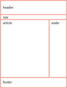
Without intervention, content itself merely follows the default document flow, like a word processor. It starts at the top left hand corner, moves to the right till it runs out of room and then returns to the next line, like this.

Specifying the content in paragraphs forms block level elements that simulates what happens when the return key is hit on an old fashioned typewriter or word processor. It initiates a new paragraph to start below the existing paragraph. All paragraphs stack vertically down the page.

We have just described two ways that content can flow on a page: The horizontal or inline direction is a lot like characters in a line of text. The vertical or block direction has each object come one below the other, like paragraphs.

In coding, this is done by inserting the tag for a paragraph <p> in front of the paragraph and a closing tag </p> at the end of the paragraph. Each paragraph acts just like the paragraphs in a word processor, proceeding vertically down the screen, one below the other.

In Illustrator or InDesign this paragraph could be in its own box and moved anywhere on the screen just by clicking and dragging, independent from all of the other elements or objects. This is also possible by styling the code, which becomes possible to do once you have marked up a document in to discrete elements.

CSS: Giving Form to the Content

CSS stand for cascading style sheets. Giving form to the elements in an HTML document is done by writing rules that specify a quality of the object.
InDesign Toolbar

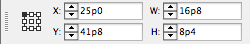
In Indesign, a box is drawn by first selecting the Text Creation Tool and then clicking and dragging the mouse. It can be filled with a paragraph of text.

If it were moved to the lower right hand of the document, that would be reflected in the status boxes of the tool bar, which would provide the distance from the top left corner on the x, or horizontal axis, and the y, or vertical axis. It would also provide the width (W) and height (H) of the box.

Used the mouse to create the box, it might say X: 25p0, Y: 41p8, W: 16p8 and H: 8p4. If it doesn’t, you could tweak the dimensions of the box by changing the numbers in the toolbar.

Clicking and moving the mouse to create code is not an option if you are writing code. There are programs that will change a click-and-drag into objects that you can then move around, but we are learning how to actually do this without the help of such programs.

The same effect is done by writing a rule that specifies that the paragraph is to be absolutely positioned, allowing it to be moved so many pixels along the x and y axis irrespective of whatever else is in the document, and that it should be so many pixels wide and high.

The language used to specify the rule uses properties and values that are similar to the way we speak. We can write the code for that paragraph into the <p> using the style attribute style="position: absolute; left; 300px; top: 500px; width: 200px; height: 100px;". This specifies the paragraph just as Indesign specifies the box using numbers.

I could stroke the box with a 1 point line and add some Inset Spacing in InDesign to keep the content from butting up against the border of the box. Using the Text Frame Options Dialog Box available under the Object Menu in InDesign provides the ability to add Inset Spacing to the top, right, bottom and left.

The same border and inset spacing can be applied to the paragraph by adding the following properties to the rule: border: 1px solid black; padding: 6px;.

It is possible to select words within the paragraph. In Indesign, you select a word and give the command to make it bold. In HTML, you surround the word with inline code <em> like this: <em>word</em>.

You then define a rule that makes the inline selected content bold with the property font-weight: 700; where the weight of a character is determined from 100 to 900 in jumps of 100. It could also be specified by the keywords bold or normal. In the style sheet, the rule would look like: strong {font-weight: 700;}. It should be noted that this does not create font weights, but only specifies fonts that are available to be used.

Though it is possible to write the rules in the element tags themselves, <strong style="font-weight: 700"> that is not a good idea. CSS is designed to apply the rules at a distance. That way, all of the rules that inform how the web page is to look can then be collected in one place, an external style sheet, and all the pages of a web site can reference that external style sheet, and be styled by just one set of rules.

This is done by providing a selector in front of each rule that seeks out the element it is to style. In the example above, the name of the tag itself came before the rule. That way the rule would be applied to all <em> elements wherever they are used in the website.

Putting it All Together

blocks

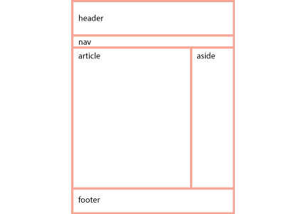
The content is marked up by the hypertext markup language as discrete blocks that can be manipulated by cascading style sheet language.

These blocks can be treated as separate elements or objects, removed from the document flow, the way Illustrator or InDesign treats objects. This is not the way it is usually done, however.

That is because the web requires flexibility. Chances are that a page has to adapt to various formats, from tall and skinny to fat and wide.

To maintain that flexibility, the design elements on the page need to be organized more like a word processor rather than a page layout system used for preparing documents for print.

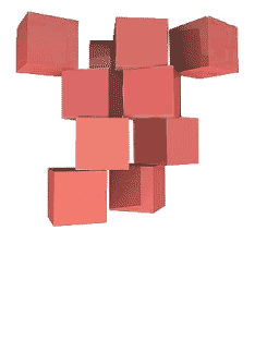
Think of a child stacking blocks. Now turn those blocks upside down, as if they were staking them onto the ceiling.

Instead of being fixed in their position as they are for print design, they need to be flexible and able to change hale and location, and even what they look like, depending on the context.

The word processor model allows the blocks to reflow depending on the size of the window. The window is called the viewport.
blocks upside down

All of the elements originate from the top left hand corder of the page and moves down. They form a chain of boxes that act much like a word processor.

When one word is deleted, the rest of the sentence fills the gap. So it is with the elements in the document flow. This is what is means to be chained together from the top of the document.

Since block elements move downward by default, the challenge is how to move objects horizontally. This is like having two paragraphs next to one another. This can be done by floating one of paragraphs.

There is a lot to learn.

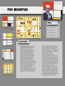
So Where is the Design in designing a Web Page?

Page Layout

The design of the layout happens before the coding begins. There is little design in the actual creation of the web page. All of the design happens before, just as it does with InDesign.

To be fair, the coding can be likened to preparing an image for print, in which the creative design has already been executed, and now the image is prepared so that it prints correctly.

The process is as follows.

Using paper and pencil to create thumbnails, develop the equivalent of stick figures in a wireframe, and then use photoshop to render it so you have something to aim for when you code. Only then do you start to code.

Coding is more like solving puzzles than designing. Unlike print, the interactivity of web pages requires a continual back and forth between designing the way it looks and coding the design.

We spend two weeks on learning how to mark up documents, two weeks on CSS, and the rest of the semester learning how to use them in a way that is professional and standards compliant.