Week 4
9/28
Responsive Design. The web is on display on iPhone and iPad screens to desktop computers. CSS media queries allow you to target each of these devices in one style sheet. Activity: Using media queries to target different devices.
Homework
1) Design midterm to be responsive and use media queries to target different devices. 2) Publish midterm for midterm grade. Read chapter 12. Due: The following week.
Materials For Responsive Design
Additional materials for this unit can be found by following these links:
- Designing for the Future
- Responsive Design
- Media Queries
- Accessibility
- Print Stylesheet
- In Class Demonstration
- Answer to Exercise
- Clean CSS: A CSS Formatter and Optimizer
- Homework
Materials For Building a Website
Additional materials for this unit can be found by following these links (30 pages):
- Information Architecture (IA)
- Styling the Navigation
- The HTML5 Boilerplate
- Browser Development Tools
- Search Engine Optimization
- Google Analytics
- Trouble Shooting
- 404 page
- Print Style Sheet
- Visual Literacy
- Homework
Materials for Fonts and Typography
Additional materials for this unit can be found by following these links (29 pages):
- Type on the Web
- Typographic Resource
- Formatting Text
- Web Fonts
- Character Encoding and entities lookup
- Midterm Evaluation: Peer Review
- Midterm Evaluation: Assessable Tasks
- Midterm Evaluation: Grading Rubric
- Visual Literacy
- Homework
Goals
The goals of this unit are to:
- Incorporate media queries into web design.
- To design around the challenges that media queries create when layout out a page across dissimilar devices.
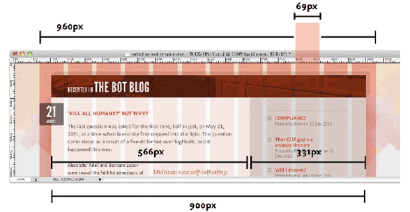
The future of the web is not necessarily tied to the browser window that you have been using. Chances are that it’ll be mobile. Spanning screens from large to small requires a complete separation between content and form, so that the content can be rearranged to fit the different viewports.
Outcomes
At the end of this unit, students will have:
- Been prepared for a much more expansive web of the future
- Incorporated media queries as the basis for future-proofing their own designs.
- used the various layout strategies that CSS offers in conjunction with media queries.
- Applied these skills to their Portfolio site.
Step-by-Step
| 15 | Review homework and answer questions. |
| 40 | media queries |
| 20 | practice: media queries |
| 10 | break |
| 70 | Hands on in class: making the portfolio responsive |
Talking Points
Topics covered in the reading:
Chapter 12: Style Sheets for Mobile to Desktop
- Mobile Strategies and Considerations 328
- Understanding and Implementing Media Queries 333
- Building a Page that Adapts with Media Queries 340
Current Practices
Responsive Web Design is all over the web. In its short existence, no big site has not been redesigned to take advantage of it, and many do it very well:
News and External Resources
Inspirational Links to help you explore in preparation for the final.
- Smashing Magazine’s Mobile Content Strategy article.
- Google’s Friendly Mobile Test. Does your site pass?
- Google’s Page Speed Test. This test (and recommendations on how to fix the problems) are a great way to make sure your site is as good as it can be.
Definitions
These are the terms that participants should be familiar with during this unit:
- Responsive Web Design article from Wikipedia
-
Responsive Web Design (RWD) is an approach to web design in which a site is crafted to provide an optimal viewing experience—easy reading and navigation with a minimum of resizing, panning, and scrolling—across a wide range of devices (from desktop computer monitors to mobile phones).