This will have happened before many of you were born, though I remember it well. In the late 1980 and the early 1990’s desktop publishing was born with programs like PageMaker, a program whose reincarnation would be named InDesign.
What liberated the designers was the ability to put content anywhere. Be it text or pictures, the content is always contained in a box. PageMaker and Indesign can position these boxes anywhere on the page.
Those who knew how these programs worked would make sure that they used the numerical coordinates to accurately position the boxes, and not just rely on guides or to do it by eye. It was easy to see how many inches a box was from the upper left corner of the document that represented the default 0 point.
Each box in InDesign (or Illustrator, for that matter) has four numbers associated with it: the horizontal distance (x) from the point of origin, the vertical distance (y), the width and the height. This is the same for each element that is absolutely positioned in HTML and CSS. We are going to use that to layout the bio.
The Document’s Default Behavior
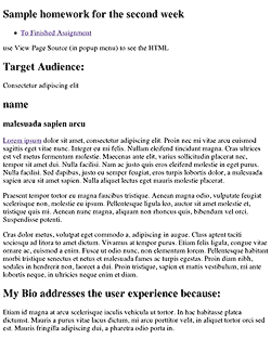
In the first homework assignment you marked up content using heads <h1>–<h6> and paragraphs <p>, added links <a> and images<img>, and grouped certain content together using the generic <div> or the more semantic HTML5 tags like <header>, <nav>, <section>, <article>, <figure> and <figcaption>.
At this time you did not nest too many tags inside of other tags, but know that every tag you created was already nested as a child of the body tag. As you develop the layout, you will increasingly nest tags inside of one another, usually to define and group an area of the layout, like the header, right column, main content, navigation or footer.
When you look at the first assignment, you see the browser’s default style at work. The content vertically lines up, one below another, while the text flows left to right.
To better understand this structure, change the embedded style included in the HTML5 template, which currently looks like this:
<style type="text/css">
.example {
}
</style>
To an embedded style that puts an outline or border on all elements, like this:
<style type="text/css">
	body, section, header, nav, article, p, h1, h2, footer, nav, figure, figcaption, ol, ul, li {
	outline: 2px solid red;
}
a, img, span, em, strong, a {
	border: 2px solid green;
}
</style>
A red outline is put on the elements that are displayed according to the block mode and a green border is put on the elements that are displayed according to the inline mode.
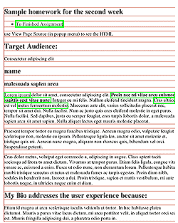
Each element of the assignment now has an outline or border.
Take a moment and explore the way the red outlined block elements stack below one another. Each element’s width extends all the way out to the parent by default.
Inline elements with green borders styles the content (type) in block elements, flowing from insertion point to the end of the box. It then start over on the next line. Not all languages flow horizontally or left to right, though english does, so we can say that type starts left and flows horizontally.
The default display of the content is that the block elements flow down one below the other from the top of the page The absolute display mode radically changes this by completely removes elements from the default document flow.
There is no need to keep this style, so you can remove it by commenting it out using the CSS commenting convention: /* comments */. That way it is still there is you ever want to see the block elements outlined in red.
It is also possible to just break a property inside a CSS rule by misspelling it, as it will just be ignored. Insert a special letter combination, and be consistent in your used of it, like -break-, as in out-break-line: 2px solid red;. It is the possible to quickly searched for -break- and find them. This is handy when stylesheets become big and need to be more carefully managed.
Styling the Elements
I use an embedded style sheet for this example, but you should use an external style sheet. You then need to write selectors that select all the elements on the page. You could do this by giving each element an id or class, but we want to be more efficient, and so first try to select the elements using type and pseudo selectors if possible.
The best selectors to use are type selectors. They select the element by its type, i.e. p for selecting all paragraphs. You can combine them to get more specific, like article div p, which targets only those paragraphs in the div in the article. If that doesn’t work, you can use the pseudo class selectors like :nth-child(N) or use class selectors if you want to target certain elements.
Avoid using ids, as they are much stronger than classes and tend to dominate the cascade hierarchy. To great a reliance on ids takes away a lot of the flexibility built into the CSS cascade.
Select each of the elements in the document and change the background color to know that you have successfully targeted that element with a CSS rule.
Altering the Default Layout Order
The block elements are like a child stacking playing blocks one on top of the other, only upside down, starting from the top with one box below the other. This is the normal document flow mode, and it is similar to how a word processor works. The difficulty of laying out a document using the normal document flow is that you have to build your way to every part of the document. The benefit is that if one thing changes, everything else adapts, if it’s done right.
Most Design students layout their documents using Indesign (Illustrator, or even Photoshop). The activity of creating and moving design elements where you want them is what layout is all about.
Forget the normal document flow! Click on an object and move it to where you want it to be.
A What You See is What You Get editor can do that, but the code it creates is messy. The best way to do this is coding the layout by hand. Go through the creative process, with thumbnails, mood boards etc., and develop a Photoshop comp before starting to code the layout.
There is not much spontaneity in coding the layout, but then, there is little spontaneity in prepping an Indesign document for print. The creativity and spontaneity of web design happens in the early planning stages. To encourage that I ask you to show me your creative development in the worksheet. After that it’s mostly creative problem solving as you execute the layout. You are ahead of the game if you can see this as a puzzle to be solved.
Homework Assignment Using Absolute Positioning
To get started, we want to remove all of the background properties from the selector demo, so we can start with a clean slate.
Next, we want to center the layout in the middle of the window. That forces us to use a relatively positioned element as the containing element that wraps the website. So much for using only absolute positioning.
The way to horizontally center an element in CSS is to set the right and left margins on auto , and by giving the element a width. The width is subtracted from the width of the parent element, and whatever is left over is split into two so that equal side margins automatically center the element in the middle.
Absolute Position based on Relatively Positioned Parent
We also position this element as relative. This is an important step, for a page element with relative positioning gives you the control to absolutely position children elements inside of it. If we were to skip this step, the absolutely positioned elements would position itself to the body element, and not the automatically centering element just created.
The section element is made 960 pixels wide, and if the window is bigger than that, the margins are evenly divided, centering it in the window, or viewport, as it is technically called.
section {
	position: relative;
	margin: 0 auto;
	width: 960px;
	background: #888;
	height: 900px;
}
Grouping Elements
The absolutely positioned elements inside of the section element will all stay centered in the window. This has the effect of grouping all of the enclosed elements. We will continue to use this technique to simplify our layout into the main HTML5 divisions, each one of which will be turned into a group: header, nav, aside, article and footer.
Header
All of the elements inside of the header element function as a group, allowing me to move them all by moving the header element.
Overlapping Elements
There is a shadow under the header element, but unlike most shadows, it does not stick out on one side. If it were to stick out, it would flatten the overall look by unifying the background and the page. I didn’t want that, so I made the element with the shadow property shorter. But that does not look right either.
To solve the problem I covered up the header element which has the shadow. The div inside of the header extends beyond its boundaries and covers up the shadow on the right side, as this picture demonstrates.
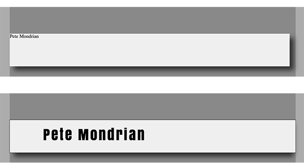
There is no need to position the div element, since it is already where it is suppose to be. It has to be made the same height and just a little longer. To calculate the length of the div, add the 112px of padding on the left to the 848px in length. I took out the 1 px border on the sides, but left it in on the top and bottom. That makes it 960px wide, or 20 pixels longer than the header.
To calculate the height, add the 20 pixels of padding to the 90px in height, in addition to the 1px border on top and on the bottom. The div’s padding is what positions the title, which is then 112 pixels from the left and 20 pixels from the top of the header element.
Google Fonts are used, and the link to them has to be included in the header.
<link href="http://fonts.googleapis.com/css?family=Anton:regular&v1" rel="stylesheet" type="text/css" >
The fonts can be called by using the font-family property. A shorthand version is used to combine the five font properties:
	font-family: 'Anton', serif;
	font-size: 48px;
	font-style: normal;
	font-weight: 400;
	line-height: 1.2;
To its shorthand equivalent:
font: normal 400 48px/1.2em 'Anton', serif;
The picture of Piet is placed via absolute positioning from the right of the header div, its parent, and not the left. Since it sticks out above the header, it requires negative number for the top position. Here is the CSS:
header {
	position: absolute;
	top: 90px;
	left: 0px;
	width: 940px;
	height: 110px;
	background: #eee;
}
header div {
	width: 848px;
	height: 90px;
	padding: 20px 0 0 112px;
	background: #eee;
	border-top: 1px solid black;
	border-bottom: 1px solid black;
}
header h1 {
	color: #000;
	font: normal 400 48px/1.2em 'Anton', serif;
	font-family: 'Anton', serif;
	letter-spacing: 0.108em;
	word-spacing: 0em;
}
header figure {
	position: absolute;
 	top: -70px;
 	right: 20px;
	width: 280px;
	height: 260px;
}
And the HTML:
<header class="shadow_1">
	<div>
	<h1>Pete Mondrian</h1>
	<figure class="shadow_2">
		<img src="images/Mondrian.jpg" alt="MONDRIAN himself" />
	</figure>
	</div>
</header>
That takes care of the header as a group. If we were to move it up or down, we could do so by changing only the header values.
Aside
The pictures on the left side make up the aside. The aside is pretty straight forward, as the pictures, which are 160px wide, fall into place once a width of 160px is specified. The figcaptions align up below the pictures. The HTML is as follows:
<aside>
	<figure>
		<img src="images/mondrian2.jpg" alt="Composition with Red, Yellow and Blue" />
		<figcaption>Composition with Red, Yellow and Blue</figcaption>
	</figure>
	<figure>
		<img src="images/mondrian3.jpg" alt="Composition No. III" />
		<figcaption>Composition No. III</figcaption>
	</figure>
	<figure>
		<img src="images/mondrian4.jpg" alt="Composition No. II" />
		<figcaption>Composition No. II</figcaption>
	</figure>
	<figure>
		<img src="images/mondrian5.jpg" alt="composition No. 10" />
		<figcaption>Composition No. 10</figcaption>
	</figure>
</aside>
and the CSS is:
aside {
	position: absolute;
	top: 200px;
}
aside figure {
	width: 160px;
	margin: 40px 0 40px 40px;
}
figcaption {
	font-size: 80%;
	color: #444;
	text-align: right;
}
Nav
The navigation is absolutely positioned from the top of the page to just below the header picture. Though nothing was obstructing its view, the links were not working. Using the z-index property to raise it just off of the default layer exposed the link’s functionality. The anchor elements, or links, are displayed as block elements, and styled accordingly. The CSS:
nav {
	position: absolute;
	top: 300px;
	right: 80px;
	width: 120px;
	height: 140px;
	padding: 40px;
	background: #bbb;
	z-index: 1;
}
nav a {
	display: block;
	width: 100px;
	height: 25px;
	text-decoration: none;
	background: #ccc;
	padding: 5px 10px;
	margin: 3px 0;
	color: #333;
}
nav a:hover {
	text-decoration: none;
	background: #eee;
	color: #000;
}
nav a:active {
	text-decoration: none;
	background: #fcc;
	color: #000;
And the HTML:
<nav>
	<h2 class="shadow_2">WORK</h2>
	<ul>
		<li><a href="http://b.parsons.edu/~dejongo/12-fall/stuff/work_sheet_assignment-1.html">Assignment 1</a></li>
		<li><a href="#">  placerat nec</a></li>
		<li><a href="#"> tempor amet</a></li>
		<li><a href="#"> varius sollici</a></li>
	</ul>
</nav>
The navigation header and the article header are styled separately with the following CSS:
nav h2, article h2{
	position: absolute;
	top: -20px;
	left: 10px;
	height: 30px;
	width: 140px;
	padding: 8px 10px 10px;
	font: normal 400 24px/1.2em 'Anton', serif;
	letter-spacing: 0.108em;
	background: #ddd;
}
Article
The article is composed of one large picture and a div element that contains two columns. The figure falls into place. The figure is given extra padding on the bottom to push the div down. The div is given a background color, height, and padding to push the text of the first column both down and to the left. The width of the column is defined by the paragraph.
The second column is absolutely positioned so it sits beside the first. The title is given the same treatment as the nav title above.
article {
	position: absolute;
	top: 240px;
	left: 240px;
}
article figure {
	padding-bottom: 30px;
}
article div {
	position: absolute;
	margin-top: 10px;
	text-align: left;
	width: 620px;
	height: 400px;
	background: #ccc;
	line-height: 1.2;
	padding: 60px 0 0 60px;
}
article div p {
	Width: 260px;
}
.column2 {
	display: absolute;
	left: 320px;
	top: -10px;
	Width: 260px;
}
And the HTML:
<article>
	<figure>
		<img src="images/BroadwayBoogie.jpg" alt="Broadway Boogie Woogie" />
		<figcaption>Broadway Boogie Woogie</figcaption>
	</figure>
	<div>
		<div class="column1">
			<h2 class="shadow_2">EXPERIENCE</h2>
			<p><a href="http://www.lipsum.com/">Lorem ipsum</a> dolor sit amet, consectetur adipiscing elit. Proin nec mi vitae arcu euismod sagittis eget vitae nunc. Integer eu mi felis. Nullam eleifend tincidunt magna. Cras ultrices est vel metus fermentum molestie. Maecenas ante elit, varius sollicitudin placerat nec, tempor sit amet dui. Nulla facilisi. Nam ac justo quis eros eleifend molestie in eget purus. Nulla facilisi. Sed dapibus, justo eu semper feugiat, eros turpis lobortis dolor, a malesuada sapien arcu sit amet sapien. Nulla aliquet lectus eget mauris molestie placerat.</p>
		</div>
		<div class="column2">
			<p>Cras dolor metus. Proin diam nibh, sodales in hendrerit non, laoreet a dui. Proin tristique, sapien et mattis vestibulum, mi ante lobortis neque, in ultricies neque enim et diam.</p>
			<p>Etiam id magna at arcu scelerisque iaculis vehicula ut tortor. In hac habitasse platea dictumst. Mauris a purus vitae lacus dictum, mi arcu porttitor velit, in aliquet tortor orci sed est. Mauris fringilla adipiscing dui, a pharetra odio porta in.</p>
			<p>Etiam id magna at arcu scelerisque iaculis vehicula ut tortor. In hac habitasse platea dictumst. Mauris a purus vitae lacus dictum, mi arcu porttitor velit, in aliquet tortor orci sed est. Mauris fringilla adipiscing dui, a pharetra odio porta in.</p>
		</div>
	</div>
</article>
Footer
All that is left is the footer. Because absolutely positioned elements do not interact with the document flow, the footer cannot be positioned by the content itself. The last element is absolutely positioned, just like all the rest. The CSS:
	position: absolute;
	top: 1100px;
	width: 960px;
}
footer a {
	display: block;
	width: 100%;
	padding: 5px 0;
	text-decoration: none;
	text-align: center;
	color: #444;
	background: #ddd;
}
footer a:hover {
	background: #222;
	color: #ddd
	}
And the HTML:
<footer>
	<p> <a href="http://validator.w3.org/check?uri=referer"> Validate your page.</a> </p>
</footer>
The finished product. Absolute position of the elements works for print, because once the printed page is determined, the size no longer changes. That is not true of web design, and the next period will introduce a number of additional strategies to deal with layout out pages for the web.