Visual Formatting Model
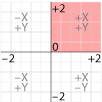
The web browser lays out the page according to a coordinate system that, by default, is expressed in pixels and has the X and Y Zero point in the upper left hand corner of the parent object, like InDesign. Illustrator places it on the lower right hand corner, the way you learned it in geometry.
2D Transform
The transform property modifies this coordinate space, so that elements can be translated, rotated and scaled in this two dimensional space. When you create a value for the transform property, a new local coordinate system is established by which the position of the element is calculated. The 2D transforms add up, meaning that if you rotate the parent element, and then rotate the child element, the child will be rotated in addition to the parent’s rotation. The coordinate system then calculates the cumulative transformation matrix (CTM) for the element.
You can apply two different transforms to the X and Y axis with the transform property values transform: <transform-function for X> <transform-function for Y>; where the 2D transform functions are listed in length or percentages and angles in degrees, grads, radians or turns (according to the CSS3 values and units):
- matrix(number, number, number, number, number, number)
Matrix specifies a 2D transformation in the form of a transformation matrix of six values. matrix(a,b,c,d,e,f) is equivalent to applying the transformation matrix [a b c d e f]. - translate(value for x, value for y)
translate specifies a 2D translation by the vector [tx, ty], where tx is the first translation-value parameter and ty is the optional second translation-value parameter. If <ty> is not provided, ty has zero as a value. - translateX(value)
Translate X specifies a translation by the given amount in the X direction. - translateY(value)
Translate Yspecifies a translation by the given amount in the Y direction. - scale(value for x, value for y)
Scale specifies a 2D scale operation by the [sx,sy] scaling vector described by the 2 parameters. If the second parameter is not provided, it is takes a value equal to the first. - scaleX(value)
Scale X specifies a scale operation using the [sx,1] scaling vector, where sx is given as the parameter. - scaleY(value)
Scale Y specifies a scale operation using the [1,sy] scaling vector, where sy is given as the parameter. - rotate(angle)
Rotate specifies a 2D rotation by the angle specified in the parameter about the origin of the element, as defined by the transform-origin property. - skewX(angle)
Skew X specifies a skew transformation along the X axis by the given angle. - skewY(angle)
Skew Y specifies a skew transformation along the Y axis by the given angle. - skew(angle, angle)
Skew X and Y specifies a skew transformation along the X and Y axes. The first angle parameter specifies the skew on the X axis. The second angle parameter specifies the skew on the Y axis. If the second parameter is not given then a value of 0 is used for the Y angle (ie. no skew on the Y axis).
If your object is small, it is not a problem to establish its position on the default coordinate system, and tweaking its relative position if need be, but for some objects, it is better that you control the point of the transformation, which by default is the midpoint of the object.
You can set the 0,0 point to determine the point of transformation using percentage, length, or keyword like left, center and right for the X axis and top, center and bottom for the Y axis: transform-origin: left top
If only one element is is specified, the second value is assumed to be center.
Transform can be used locally or global. First, it is a local way of turning objects that does not involve the structure of the layout itself. The second way is to transform large parts of the document, and since the children inherit the parent’s transforms, all the children will take on that transformation.
Local Transforms
CSS Code View

The content (children) of the transformed element inherit the altered coordinate space, and transform with it, such as this text and image.
global Transforms
Here you will transform the entire content element on this page from the center, with everything on it. Every child element gets transformed with the parent.
Change the values for both the transform origin and the transform scale, rotate, transform and skew. Careful, for you can lose the ability to edit this if you make too radical a change, and will need to refresh the page to reset it. Try rotating the element by 90°, 180° or 360 degrees.
CSS Code View
Use Cases
See the Pen
Diagonal Layouts in 2020 by Nils Binder (@enbee81)
on CodePen.
Front End Interfaces
A lot of activity is happening with these tools, and you can expect Illustrator-like drawing programs at the front end that use CSS and HTML as the backend language. Check out this text on a path generator and don’t forget to look at his explanation of Natural Object-Rotation with CSS Transform 3D and pop-up book example.
Transition and Transform Animations
It’s possible to animate the transformations using the psudo class hover. Much like the transition effect applied to the alpha of the overlying picture to make it fade upon hover, using transformations enhance the effect.
3D Transform
Add to the X and Y axis a z axis, and you go from 2D to 3D. There are a number of additional 3D functions addressing the 3D space:
- matrix3d(number, number, number, number, number, number, number, number, number, number, number, number, number, number, number, number)
Matrix 3D specifies a 3D transformation as a 4×4 homogeneous matrix of 16 values in column-major order. - translate3d(value for x, value for y)
Translate 3D specifies a 3D translation by the vector [tx,ty,tz], with tx, ty and tz being the first, second and third translation-value parameters respectively. - translateZ(value)
Translate Z specifies a 3D translation by the vector [0,0,tz] with the given amount in the Z direction. - scale3d(value for x, value for y, value for z)
Scale 3D specifies a 3D scale operation by the [sx,sy,sz] scaling vector described by the 3 parameters. - scaleZ(value)
Scale Z specifies a 3D scale operation using the [1,1,sz] scaling vector, where sz is given as the parameter. - rotate3d(value for x, value for y, value for z, angle)
Rotate 3D specifies a 3D rotation by the angle specified in last parameter about the [x,y,z] direction vector described by the first three parameters. A direction vector that cannot be normalized, such as [0,0,0], will cause the rotation to not be applied. Note that the rotation is clockwise as one looks from the end of the vector toward the origin.
rotateX(angle) is the same as rotate3d(1, 0, 0, angle).
rotateY(angle) is the same as rotate3d(0, 1, 0, angle).
rotateZ(angle) is the same as rotate3d(0, 0, 1, angle), which is also the same as rotate(angle). - perspective(value)
Perspective specifies a perspective projection matrix. This matrix scales points in X and Y based on their Z value, scaling points with positive Z values away from the origin, and those with negative Z values towards the origin. Points on the z=0 plane are unchanged. The parameter represents the distance of the z=0 plane from the viewer. Lower values give a more flattened pyramid and therefore a more pronounced perspective effect. For example, a value of 1000px gives a moderate amount of foreshortening and a value of 200px gives an extreme amount. The value for depth must be greater than zero, otherwise the function is invalid.Change the perspective on the example to 200 and see how extreme it becomes, or 500, which is much more normal. Change the rotation, and see the browser render the element as if it were in 3D space.
CSS Code View
The content (children) of the 3D transformed element inherit the altered coordinate space, and transform with it, such as this text and image.
Working in 3D is inherently complex and to do it right requires some calculation and knowledge of 3D. For a better primer check out understanding CSS3D transforms and Natural Object Rotation in 3D by Eleqtiq, who also gave us the CSS3 Text Warping used above. For a 3D matrix transfom tool, check out the Matric Contruction Set by Zoltan. That should get you started.
In the mean time, more browsers are supporting transforms, so it looks like you can use it sooner than later, as long as your design falls back to something presentable on older browsers.
Pong. Remember Pong? I’m sure that most of you only know it as a museum piece. It has been resurrected by Alex Walker as a strictly HTML and CSS3 (no javascript) exercise that works.
See the Pen CSS3 Pong by Alex (@alexmwalker) on CodePen.
Take a look at these 3D animated demonstrations.
 , Newly Available
  is when the feature becomes supported by all the core browsers, and is therefore interoperable, and finally, Widely Available
  , when the features is robustly supported in all three browser engines. These features can be APIs (Application Programming Interface), Javascript, CSS, or HTML, and are often esoteric enough to mean little at this stage of web development, but professional web developers rely on the status of features to implement them. Expect the pace of web development to continue speeding up in the coming years as AI becomes mainstream.

