using artificial intelligence to help you create your website, is not as straightforward as asking a simple question. It will answer in code, but you will need to know how to place the code, and how to fill it in, so it looks like the website you’re hoping to make. That said, it’s easy enough to use it to create various examples of what you are trying to work with, and can be an incredible learning aid. That’s why I’m pushing you to use AI to help you, because, if you become a better coder, and understand what this all means, because of it, that’s the answer I’m looking for. Be liberal in the the questions you ask and request corrections, to get the code you want.
ChatGPT 3.5
I’ve had some luck with ChatGPT 3.5 and 4, but it’s a mixed bag. Not everything works, and you have to know what you are doing before you can understand what does and does not work, so use it, but beware. ChatGPT 4 is better than 3.5, but I let my subscription expire, and I can’t expect everyone to spend the $20 a month on the newer version, so this uses 3.5.
Open up a CodePen and put in the HTML, CSS, and Javascript that the program provides. My recommendations is to build modular, meaning first get the general outlines working, then ask it to build smaller things. It does not do well to put the whole thing together, so I am not worried about you not leaning how to code. You have to know enough about what you are doing, to make this work.
What follows are a number of prompts. The first one is pretty lame, but I remain too general. I try to tighten it up, and make it more interesting, but as you can see, I never get beyond a simple wireframe. This may help you get started, and I think that, by looking at the code it produces, you get a better idea of how the code works, but I think, in the end, you will have to code your website yourself, maybe with some AI, but it sure will not create your website for you.
First AI Example I need a really fantastic dynamite pulsating illustration portfolio website that can sell my illustrations to all kinds of audiences, from hip to corporate. Make it magical.
Second AI Example Can you create a responsive illustration portfolio website using CSS grid? I would like it to have 6 sections for different styles . Please color the background of each section a different color.
Third AI example Can you help me create a complete web page using different layout strategies. This is for an illustration portfolio and it needs to have several sections. I would prefer if the menu were fixed or used sticky positioning, and that the sections are animated and slide from one the next when I press the menu. Make each section’s background a different color.
CSS takes a source document, organized as a tree of elements and text nodes, and renders it onto a canvas(such as your screen, a piece of paper, or an audio stream). To do this, it generates an intermediary structure, the box tree, which represents the formatting structure of the rendered document. Each box in the box treerepresents its corresponding element (or pseudo-element) in space and/or time on the canvas, while each text run in the box tree likewise represents the contents of its corresponding text nodes.
Then, for each element, CSS generates zero or more boxes as specified by that element’s display property. Typically, an element generates a single box, the principal box, which represents itself and contains its contents in the box tree. However, some display values (e.g. display: list-item) generate more than one box (e.g. a principal block box and a child marker box). And some values (such as none or contents) cause the elementand/or its descendants to not generate any boxes at all. Boxes are often referred to by their display type—e.g. a box generated by an element with display: block is called a “block box” or just a “block”.
A box is assigned the same styles as its generating element, unless otherwise indicated. In general, inherited properties are assigned to the principal box, and then inherit through the box tree to any other boxes generated by the same element. Non-inherited properties default to applying to the principal box, but when the element generates multiple boxes, are sometimes defined to apply to a different box: for example, the border properties applied to a table element are applied to its table grid box, not to its principaltable wrapper box. If the value computation process alters the styles of those boxes, and the element’s style is requested (such as through getComputedStyle()), the element reflects, for each property, the value from the box to which that property was applied.
Similarly, each contiguous sequence of sibling text nodes generates a text run containing their text contents, which is assigned the same styles as the generating text nodes. If the sequence contains no text, however, it does not generate a text run.
In constructing the box tree, boxes generated by an element are descendants of the principal box of any ancestor elements. In the general case, the direct parent box of an element’s principal box is the principal box of its nearest ancestor element that generates a box; however, there are some exceptions, such as for run-inboxes, display types (like tables) that generate multiple container boxes, and intervening anonymous boxes.
An anonymous box is a box that is not associated with any element. Anonymous boxes are generated in certain circumstances to fix up the box tree when it requires a particular nested structure that is not provided by the boxes generated from the element tree. For example, a table cell box requires a particular type of parent box (the table row box), and will generate an anonymoustable row box around itself if its parent is not a table row box. (See [CSS2] § 17.2.1.) Unlike element-generated boxes, whose styles inherit strictly through the element tree, anonymous boxes (which only exist in the box tree) inherit through their box tree parentage.
CSS3 provides several new ways to do layout. The easiest is multiple columns within an element. It’s easy to create multi-column layouts using the new CSS3 multiple columns property. The document flow can create more columns inside a box than is visually pleasing, so change it to one, two, three or four columns, depending on the size of the screen. Using media queries a small screens gets one column, tablets get two and computer monitors get three or more columns.
Multi-Columns Interactive
CSS Code View
Live Demo
What is “Fun?”
“I’ll know it when I see it.”
As designers, we get a lot of similarly elusive adjectives from clients, as they tell us what they want their sites to be: “The site needs to be ‘cool,’” “It should be ‘exciting,’” “I want it to ‘pop.’” When we ask them to clarify, the answer we get back sounds a lot like “I can’t tell you what it is, but I’ll know it when I see it.”
“Fun” is a particularly difficult concept to define. And we’re starting to hear it a lot more from clients as we design for different contexts of use.
CSS Grid is revolutionary. Up to 2018, the exploration of web layout strategies has been along the lines of a word processor. You start at the top and create content vertically as elements stack like blocks, which is easy, and horizontally, by limiting the width of the elements so you can go from left to right. The activity of designing web pages as if one were designing in Microsoft Word has come to an end! CSS Grid is here! You create the grid and then populate it in any way and in any order you see fit, creating white space wherever you deem esthetically pleasing or communicatively correct.
Allow Massimo Vignelli to introduce grids.
Grids
For us Graphic Design is “organization of information.” There are other types of graphic design more concerned with illustration or of a narrative nature. Nothing could be more useful to reach our intention than the Grid. The grid represents the basic structure of our graphic design, it helps to organize the content, it provides consistency, it gives an orderly look and it projects a level of intellectual elegance that we like to express.
There are infinite kinds of grids but just one – the most appropriate – for any problem. Therefore, it becomes important to know which kind of grid is the most appropriate. The basic understanding is that the smaller the module of the grid the least helpful it could be. We could say that an empty page is a page with an infinitesimal small grid. Therefore, it is equivalent to not being there. Conversely, a page with a coarse grid is a very restricting grid offering too few alternatives. The secret is to find the proper kind of grid for the job at hand. Sometimes, in designing a grid we want to have the outside margins small enough to provide a certain tension between the edges of the page and the content. After that, we divide the page in a certain number of columns according to the content, three, two, four, five, six, etc. Columns provide only one kind of consistency but we also need to have a horizontal frame of reference to assure certain levels of continuity throughout the publication. Therefore, we will divide the page from top to bottom in a certain number of Modules, four, six, eight, or more, according to size and need. Once we have structured the page, we will begin to structure the information and place it in the grid in such a way that the clarity of the message will be enhanced by the placement of the text on the grid. There are infinite ways of doing this and that is why the grid is a useful tool, rather than a constricting device. However, one should learn to use it so as to retrieve the most advantageous results.
Vignelli has plenty to say about grids, margins, columns, and modules in his book The Vignelli Canon (pages 40 to 53) He provides a clear illustration of how to use a grid. Grid for the web is similar enough, except it is not just an organization principle but a layout tool. You will learn to use the CSS grid by using it.
Massimo Vignelli concludes his Canon with the power of white space.
WHITE SPACE
I often say that in typography the white space is more important than the black of the type. The white space on the printed page is the correspondent of space in architecture. In both situations space is what qualifies the context. Naturally, the organization of information needs a structure to hold together, but one should not underestimate the importance of white space to better define the hierarchy of every component. White space, non only separates the different parts of the message but helps to position the message in the context of the page. Tight margins establish a tension between text, images and the edges of the page. Wider margins deflate the tension and bring about a certain level of serenity to the page. Tight type setting transforms words into lines just as loose type settings transform words in to dots. Decreasing or increasing the letter spacing (kearning) confers very distinctive character and expression to the words. All this is space manipulation and it is this device that is used in layouts to achieve a desired expression. The relationship between the size of type and the space around it is one of the most delicate and precious elements of a composition. I must say that the masterful handling of white space on a printed page is perhaps the most peculiar attribute of American graphic design. Just like space is the protagonist in Frank Lloyd Wright’s architecture. Somehow, it relates to the epic grandeur of the American landscapes.
For many artists white space is the essential element of the composition. It is the fundamental qualifier and protagonist of the image. Almost all the great American graphic designers have used white space as the significant silence to better hear their message loud and clear.
CSS2.1 provided basic layout modes, from inline and block and tables to positioned layout, which is either based on normal flow or a relative position from that flow, or absolute and fixed positioning, which avoids the flow all together. Add floats and the ability to change the display mode of objects, and that was what designers had to create their pages.
CSS3 adds a number of layout modules, but most are still in the process. Check the Can I Use? website and make sure the properties are well supported before using. Some of these layout strategies are Positioned Floats, Exclusions, Grid Alignment/Grid Layout, Template Layout Module and Regions, which has recently been proposed by Adobe. These new CSS modules will significantly change the Layout and Design landscape for the better.
CSS3 Multiple Column Layout
This property is mostly supported with the exception of the break before, break inside and break after properties. Mozilla is not able to span columns and it is not supported on the older IE browsers, most significantly, IE 9.
It is easy enough to create multi-column layouts using the new CSS3 multiple columns property. The document flow runs though any number of columns inside a box. In the demo, you can change the property to show a number of columns, depending on the size of the screen. A good use of multiple columns is in media queries, where small screens get one column, tablets get two and computer monitors get three columns.
Multi-Columns Interactive
CSS Code View
Live Demo
What is “Fun?”
“I’ll know it when I see it.”
As designers, we get a lot of similarly elusive adjectives from clients, as they tell us what they want their sites to be: “The site needs to be ‘cool,’” “It should be ‘exciting,’” “I want it to ‘pop.’” When we ask them to clarify, the answer we get back sounds a lot like “I can’t tell you what it is, but I’ll know it when I see it.”
“Fun” is a particularly difficult concept to define. And we’re starting to hear it a lot more from clients as we design for different contexts of use.
So what’s a designer to do?
Flexible Box Layout Module
Where multiple columns is a one trick pony for layout, flex box is a serious problem solver. It automatically adjusts boxes to fit horizontally or vertically. It is almost ready for prime time. There are issues with Webkit but time will iron this out.
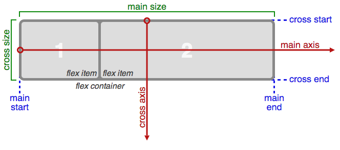
Flexbox is a module. That means it relies on a relationship, in this case, of a parent box and sibling boxes. Flex controls how the children behave as they align along the two axis. Depending on the direction, the main axis is horizontal or row, and the secondary axis is perpendicular to that.
Flex-Box Interactive
CSS Code View
Live Demo
I’m Centered!
This box is both vertically and horizontally centered. Even if the text in this box changes to make it wider or taller, the box will still be centered. Go ahead, give it a try. Just click to edit the text.
CSS Grid was finalized in the spring of 2017 and was available within a month on most browsers.
Where Flexbox is for only one dimension, either horizontal or vertical, grid is for two dimensional layouts, both horizontal and vertical.
CSS Grid and Flexbox are changing layout. It will take a while for the changes to settle in and for best practices to arise. Play around with ready made interactive examples. You will be required to create layouts using CSS grid and flex.
There are many resources to better understand how css grids work.
Rachel Andrew’s Grid by Example / Patterns is good too. She is a CSS grid ambassador and has various layouts prepared on CodePen. You can use them to start your layout.
Smashing Magazine ran a CSS Grid contest and came up with some great examples. The demonstration has lots of cutting edge CSS features in addition to using grid. For other examples using CSS grid, check out this restaurant menu or a modern blog . Looking through the code will provide you with ideas on how to implement your own CSS grid.
In the FireFox browser use the Inspect Element on the grid item and click on the grid features for visual aids in understanding how the grid is implemented. The other browsers have not followed, open up inspector and click to activate.
Occupy only the cells of the grid you want to fill. Create white-space! Designers Rejoice!
Grid introduces the fr unit which stands for fraction of available space.
Jen Simmons, a designer advocate at Mozilla is a great resource, with examples and explanatory videos.
CSS Tricks has a complete guide to CSS grid. It is well organized and clearly explained. It also has an interesting article: Hexagons and Beyond: Flexible, Responsive Grid Patterns, Sans Media Queries. A fully responsive hexagon grid made without media queries, JavaScript, or a ton of hacky CSS.
The grid lines that define the grid: they can be horizontal or vertical, and they are numbered starting at 1.
The grid tracks, which are the rows (horizontal) or columns (vertical) defined in the grid.
The grid cells, the intersection of a row and a column.
A grid area, one or more adjacent grid cells that define a rectangle.
CSS grid defines the behavior of the children of a parent block display: grid; or inline-block display: inline-grid; element. The parent element is intersected by invisible horizontal and vertical grid lines that form potential Grid Cells. Grid Tracts are spans that cover horizontal rows or vertical columns. Grid Areas are conjoined Grid Cells. Grid Gaps create space around grid lines. grid-gap: 50px 100px; is shorthand for 50 pixel column gap and 100px row gap.
By default the grid lines are named from 1 to whatever both down and up. Negative numbers designate the order in reverse, starting from the far sides and counting back toward the near side (negative numbers are not shown in the figure above).
Grid definitions position the content in Grid Child items on the grid. The grid is a flexible layout system designed to automatically fill out the space. It works in conjunction with flexbox in adapting layouts to available space.
Defining The Grid: Intrinsic or Extrinsic
The grid is intrinsic if you let the machine define the grid. Extrinsic grids are defined through CSS. Intrinsic grids automatically determine the content. Extrinsic grids determine the grid first, and then allows one to specify where the content goes through column and row properties. The following from the spec is an example of an extrinsic grid with four named areas: H, A, B, and F. The first column is sized to fit its contents (auto), and the second column takes up the remaining space (1fr). Rows default to auto (content-based) sizing; the last row is given a fixed size of 30px.
Design a responsive HTML email that will adapt to varying screen sizes and render correctly in over 30 different email clients, including Gmail, Outlook, and Yahoo.
Build a to-do list widget with an editable field so users can easily create tasks and delete them as they are completed, and a drag-and-drop version that allows for quick and easy sorting.
Learn to build a scalable backend with Azure Mobile Services and connect it to an existing app, add user profiles and roles, store data in the cloud, and set up an API service.
Use open technologies (HTML5, jQuery, and CSS) to create a slideshow that responds to mobile and desktop layouts, and learn to customize the slideshow to fit your next project.
Explore Flexbox, the Flexible Box Layout model, how it compares to other CSS layout techniques, and why it’s an important part of the evolution of CSS layout.
Discover how to use the complete Edge Animate toolset to lay out and animate motion graphics for your website, mobile devices, digital magazine, iBooks, and more
Teaches how to use jQuery to build web pages that today’s users (and clients) are looking for, from complex animation effects to professional user interface controls.
Join Grant Skinner at work and at play, designing cutting-edge interactive experiences, games, applications, and frameworks with technologies like HTML5 and Flash.
Learn what Dreamweaver CC has to offer you, including the new, intuitive CSS Designer pane, a new streamlined interface, updated HTML5 and jQuery integration, and more.
Learn how to ensure the data submitted to your web forms is complete, accurate, and nonmalicious with HTML5, JavaScript, jQuery, and PHP form processing and validation.
Presents a short series of CSS animation techniques, such as looping, playing, pausing, and more, and puts them together in a small project: an animated infographic.
Take advantage of the HTML5 geolocation feature by using the recently released Google Store Locator Utility Library, and include directions and feature filtering in your web apps.
Set up a video blog using WordPress and three different free themes—Twenty Twelve, Origami, and Sundance—and get three completely different looks for your site.
Learn to install and configure WordPress locally on Windows with BitNami, the multiplatform, open-source server/database/scripting language and WordPress combo for Windows and Mac.
Learn to install and configure WordPress locally on Windows with Microsoft WebMatrix, the free server/database/scripting language combo that sets the stage for more serious WordPress development.
Learn to install and configure WordPress locally on a Mac with MAMP, the open-source server/database/scripting language combo that sets the stage for more serious WordPress development.
Learn to install and configure WordPress locally on Windows with WAMP, the open-source server/database/scripting language combo that sets the stage for more serious WordPress development.
Shows you how to use clipping masks to create interesting design effects in Photoshop, while leaving the original images unharmed and ready for further edits.
Takes you through the process of making a Drupal website that automatically tailors and sizes content for a wide range of displays, from desktops to mobile devices.
Build a custom Joomla! 3 template that automatically tailors and sizes content for a wide range of displays, from desktops to mobile devices, leveraging Bootstrap, which ships with Joomla! 3.
Discover how to create a user experience that embodies utility, ease of use, and efficiency by identifying what people want from websites, how they search for information, and how to structure your content to take advantage of this.
Gain an understanding of variables, types, objects, arrays, operators, control structures, loops, and functions, then work through a series of hands-on examples that put these ideas into action.
Walks you through the process of analyzing, planning, and managing different types of content—from blog posts to videos—so you can develop a content strategy for any website.
Build features that allow visitors to your online store to filter their selections interactively via sliders, drag items onto wish lists, and automatically save them locally.
Introduces the LESS and Sass tools—dynamic CSS style sheet preprocessors that add features like variables, conditionals, and functions to the CSS language and can accelerate complex CSS implementations.
Introduces the concepts behind responsive design, covering concepts like screen density, fluid grids, and responsive images, as well as actual design strategies that guide you from mock-up to testing.
Discover Bootstrap, a free web development tool from Twitter that, with a little bit of CSS and JavaScript experience, makes building websites quick, intuitive, and fun.
Explains the nuts and bolts of HTML (HyperText Markup Language), the programming language used to create web pages, and provides an introduction to HTML5 and CSS.
Learn how to use media queries and the new Fluid Grid Layout feature in Dreamweaver to create a single web site that delivers different layouts to desktops, tablets, and other mobile devices.
Demonstrates different design strategies, best practices, and actual code examples for creating a web site that can adapt to multiple devices, screen sizes, and browsers.
Learn how to install and configure a local Linux server optimized for web application development with the LAMP (Linux/Apache/MySQL/PHP) software stack.
Understand where Fireworks fits into the workflow for digital media projects ranging from simple web page prototyping to interface design for rich Internet applications.
Discover how to set up a portfolio of your work using WordPress and three free themes that result in three unique looks for your site—all without writing code!
Covers the major workflow elements of creating mobile web applications with jQuery Mobile, from building the components of a basic app to extending it with themes and data feeds.
Explores the possibilities of the new coding options, which animate well over 50 different properties automatically or interactively, and how they open the door to enhanced user experiences.
Focuses on the theories behind web fonts: showing what makes a good font, why different fonts look the way they do, and how they affect the look of your web page.
Shows how to install the latest version of PHP, the popular web application server, and reviews the performance enhancements and language improvements in the 5.4 release.
Take a first look at Edge, a new tool from Adobe for creating interactive motion graphics, which utilizes the latest web standards including HTML5, JavaScript, and jQuery.
Ten-minute projects on intermediate and advanced web design topics, covering technologies such as HTML, PHP, jQuery, and CSS, as well as content management solutions like WordPress and integration with Twitter, YouTube, and more.
Learn CSS positioning concepts like the CSS box model, floats, and clears and gain a deeper understanding of how HTML and CSS work together to create the look of your web page.
Covers the key enhancements in the latest version of Adobe’s web design and development software, such as improved FTP transfer, Fluid Grids, and jQuery Mobile integration.
Shows how to create an FAQ section for a web site with questions that have expandable and collapsible answers, using an adaptable combination of HTML, CSS, JavaScript, and jQuery.
Shows how to use Joomla! to build a web site from scratch—no programming required—and guides site designers through the process, from installation to launch.
Walks through moving a typical Joomla! 1.5 site to Joomla! 2.5 using two different tools, jUpgrade and SP Upgrade, including migrating a custom template.
Offers two approaches to implementing ecommerce functionality in Dreamweaver: adding a shopping cart to an existing site or building a stand-alone solution with PHP and MySQL.
Introduces Automata Studios cofounder and CEO Branden Hall, a software architect and programmer who pushes the limits of the web, and teaches others how to do the same.
Introduces basic layout concepts, gives advice on how to create properly structured HTML based on prototypes and mockups, and goes into critical page layout skills such as floats and positioning.
How to build a web site that automatically adapts its layout to various screen sizes, orientations, and resolutions on desktop browsers and mobile devices.
Provides the core knowledge to begin programming in any language, using JavaScript to explore the syntax of a programming language, and shows how to write and execute your first application and understand what’s going on under the hood.
Prevent page refreshes when updating parts of a page, and make navigation more efficient using the enhancements to the Session History API provided with HTML5.
Shows how to develop an interactive video gallery for the web in a coding environment, using HTML5 with a Flash fallback, CSS, and the open-source JavaScript library jQuery.
Shows how to develop an interactive video gallery for the web in Dreamweaver using HTML5 with a Flash fallback, CSS, and the open-source JavaScript library jQuery.
Make just about any web page element draggable with a combination of JavaScript and HTML5, a technique that has increased browser support and that eliminates the need for external libraries such as jQuery.
Explains how to build eye-catching banner ads in Flash that achieve design goals and satisfy the requirements of search engines and the sites where the ads will display.
Gives designers a deeper understanding of HTML5 and shows how to create richer, more meaningful web pages with structural tags and descriptive attributes.
Helps designers build their power user skills with an array of timesaving tips, tricks, and techniques that work in multiple versions of Flash Professional.
Unlock the powerful capabilities of Unix that underlie Mac OS X, teaching how to use command-line syntax to perform common tasks such as file management, data entry, and text manipulation.
Use Flash Professional CS5 to create a game to play on iOS devices, utilizing device hardware like the accelerometer and integration with a local database.
In this Creative Inspirations documentary, we meet Second Story, creators of award-winning interactive projects for clients that include the Getty Museum, National Geographic, the Museum of Modern Art, and the Smithsonian Institution, just to name but a f
Make a dynamic web site in Flash Professional CS5 complete with a gallery and contact form that includes smooth transitions, audio, video and much more.
Demonstrates how to build add Web 2.0 style and functionality to existing applications using the complete set of AJAX controls and workflow tools in ColdFusion 9.
Explains the fundamentals of Flash CS5, the industry standard for creating animations and interactive applications for the web, desktop, and mobile devices.
An inspiring look at the Internet and media experience through the eyes and mind of Ze Frank, one of the most enigmatic and creative people working in digital media. He’s also just plain funny.
Shows developers how to get the most from ColdFusion Builder, Adobe’s first dedicated development environment for creating ColdFusion-based Internet applications.
Reviews the dozens of new features added to the Flex 4 SDK and Flash Builder 4 toolset, explaining critical information for building rich internet applications.
Gives a working knowledge of CSS to web developers and coders who already have a firm grasp of XHTML/HTML and want to take their web sites to the next level.
Shows how to create a web site design that integrates with a content management system (CMS) like WordPress, Drupal, or Joomla!, using open-source software.
With web sites, online games, Facebook apps, and iPhone apps for major films and consumer brands, Trigger has mastered the integration of creative and technology.
Explains the configuration and implementation of a ColdFusion 9 environment, including everything necessary for full implementation of ColdFusion in a web development.
Shows how to use Dreamweaver to create basic web pages, add text and image content, use Cascading Style Sheets, and make a final site search engine-friendly.
Demonstrates scheduling and expected output for good prototyping, from wireframing to storyboarding to creating multi-page mockups for design feedback.
Shows print designers how to use InDesign, in conjunction with Acrobat and Flash Professional, to lay out and design a wide range of digital documents.
Walks through the essential features of Flash MX, including drawing tools, importing bitmaps and vectors, animation, masking, and ActionScripting basics.
Flex Box display: flex; makes it easy to distribute elements within a containing element, — either as a row or as a column. Flex box aligns both the elements and the space within a parent container. This happens even when the parent ’ or children’s size are unknown or dynamic. The child items’ width, height, and order can be set to best fill the space that they take up.
Flexbox is good at taking a bunch of different sized things, and returning the most readable layout for those things. It avoids squishing a big thing into a small column, and leaving big gaps round a small thing. If you want to control the size of your columns precisely, use Grid.
Initiate the parent as flex container. The container can be a block display: flex;or inline display: inline-flex .
Only the direct children of the parent flex container are effected.
Flex Direction
The flex container has a main axis, either horizontal or vertical, the primary direction along with flex items are laid out.
Use flex-direction: horizontal; or flex-direction: horizontal-reverse; to specify the main direction as horizontal, from left to right or right to left.
Use flex-direction: vertical; or flex-direction: vertical-reverse; to specify the main direction as vertical, from left to right or right to left.
The numbers in the demo reverse when the direction is reversed.
Justify Content
Content is justified by setting the justify-content: property to the following values: flex-start, center, flex-end, space-between and space-around.
The values space between collapses the padding between the flex container and the first and last item while space-around adds some padding.
Flex Box Demo
CSS Code View
Live Demo
1
2
3
Using Margin: Auto
Using margin: auto creates automatic space that allows for useful relationships, like in a menu along the main axis, where some menu items are on the left, and others are on the left. Insert a margin: auto and the content splits to the end of the main axis leading a gap in the middle.
Activate the demo by removing the /* from the CSS rule below that targets the third column of the demo above and witness the power of margin: auto to push children around in the flex box parent. Change the target to the second or first columns to see the content rearrange.
CSS Code View
Flex-Wrap
Flex does not automatically wrap its children into multiple lines within the container. If there are too many flex-items, they will extend beyond the flex container’s boundary. Wrapping the flex items will wrap them into multiple lines below (or above with wrap-reverse). The demonstration below uses the setting from the previous demo.
Cross Axis Flex Item Align
The cross axis is perpendicular to the main axis. Flex items can be aligned at the start, center or end, or can span the axis.
CSS Code View
Live Demo
content
more
content
less
content
enough
content
Flexbox Item (children)
The flexbox items (children) are all the elements that are direct children of the flexbox container, and they can be controlled independently from the flexbox container controls. It is possible to align, order, and determine the proportional size of any of the flex items. This has been made into a separate module that also works for CSS Grid item control.
Order
The display order of the flex items follows the order in which the HTML is written. That can be changed by specifying how many items forward or backward the flex item is to move.
Align
Align flex item can be applied to any element. Here the third flex-item is flex-end , where the others are flex-start . Put them all on stretch, and you have the perfect equally long shaded columns. That is the aim of the Holy Grail Layout below.
Proportion
Width of the boxes can be determined proportionally and is specified for each flex-item by the flexproperty.
CSS Code View
Live Demo
1
Different amount of text in these boxes shows how the cross-axis align function works. There is control for how the boxes align or stretch to all be the same hight no matter how little or how much content. The flex value for this box is 3. Remove the align self and set the align items to stretch and all the flex items will span the cross axis.
2
Box 2 has not as much text as box 1 but more than box 3. The flex value for this box is 2 and order is -1 which places it before box 1.
3
Flex value for box 3 is 1 and it’s self-aligned.
Flex Grow, Shrink, and Basis
Rather than specify a fixed ratio between the flex elements, the proportion can be given parameters by the Flex Layout Algorithm and the fit is dynamically determined. This is because the default is flex-shrink: 1, meaning that each element will shrink such that all elements fit in the parent. Change the default value to 0 and all the magic of flexbox disappears, as the flex items will grow beyond the parent. Flexbox is set up to automatically fit the content within the parent. The fit of the flex-items to the remaining space, or lack of space is determined against a reference basis width using grow, shrink and basis controls.
Grow
The Flex layout Algorithm defines the ability for a flex item to grow, starting from the basis number, if the content requires it (when the parent’s width expands). It calculates the proportion for each flex item inside the flex container. Flex growth is the amount a flex item can grow in proportion to the other flex items. If all items have flex-grow set to 1, every child will have an equal potential to expand if their content requires it. If one of the children has a value of 2, that child would take up twice the growth as the others.
Shrink
Flex-shrink does the opposite, with a higher number defining how much greater the shrinkage of an item (when the parent’s width shrinks). In the following example, watch what happens when you cut the width of the parent flex box by 50%. The box with the highest flex-shrink number shrinks the most.
Basis
Flex-basis is the starting or default size of an element before the remaining space (shrink or expand) is distributed. The default is auto. Any value for width or height properties are accepted. If using 0 use units to avoid being interpreted as a flexibility.
settings
The flex property may use up to three values.
If there is only one value a number without units is interpreted as flex-grow or with a unit as flex-basis. You can also use the keywords none, auto or initial.
If there are two values the first value must be a number without units and is flex-grow. If the second number is without units it is flex-shrink or if it has units it is flex-basis.
If there are three values the first is flex-grow, the second is flex-shrink, both without units, and the third has units and is the flex-basis or the value auto.
In auto the item is sized according to its width and height properties, but grows to absorb any extra free space in the flex container, and shrinks to its minimum size to fit the container. Auto is flex: 1 1 auto.
Initial is the default value. The item is sized according to its width and height properties. It shrinks to its minimum size to fit the container, but does not grow to absorb any extra free space in the flex container. Initial is flex: 0 1 auto.
In none the item is sized according to its width and height properties. It is fully inflexible: it neither shrinks nor grows in relation to the flex container. None is flex: 0 0 auto.
By default flex items don’t shrink below their minimum content size. To change this, set the item’s min-width or min-height.
The demo evaluates the content and proportions the boxes automatically according to content shrink from 50% and grow to 150%. Flex box item number, the red box, will expand and shrink more than the others.
CSS Code View
Live Demo
Different amount of texts in these boxes shows how the cross-axis align function works as there is control of how the boxes align or stretch to all be the same hight no matter how little content. The flex value for this box is 1 0 8rem.
When there is not much text but more than in the last row. The flex value for this box is 1 0 6rem.
The flex value for this box is 1.5 0 5rem.
Page Layout Demonstration
Once upon a time, a very long time ago, there was a Holy Grail Layout with a three column body, a header and footer. This was accomplished without tables. This was long before mobile changed everything so the layout was not even responsive. How the times have changed. A responsive Holly Grail, so when the viewport shrinks the columns stack.
CSS layout strategies. Block, inline, relative and absolute positioning, floats and floating layouts and CSS3 Flex property and grids. Activity: Begin translating Photoshop Comps into HTML/CSS using multiple layout strategies.
Using different layout strategies build your portfolio following your Photoshop comp. Read chapter 11. Due: The following week. First Quarter Assessment: Have your landing page, first two assignments and portfolio up.
Questions from Last Weeks Class or Homework?
Goals
The goals of this unit are to:
Understand how the native document flow works, and how to alter the normal flow for layout purposes.
Effectively use absolute positioning, float, and display properties.
Investigate flex and gid.
Be comfortable applying various options to solve the problems layout presents.
Materials
Additional materials for this unit can be found by following these links (52 pages):
Cheat Sheets that list all of the different HTML5 and CSS3 tags you can use. Print them out, use them. Explore and get to know them. You can use these during the quiz next week:
HTML5 Cheat Sheet all of the different tags and the attributes they can have.
CSS3 Cheat Sheet all of the different properties and all possible values or value types they take.
CSS Tricks Almanac A reference guide to the many features of CSS from CSS-Tricks .
Install these Plug-ins if you use Firefox or Chrome. They will facilitate your web development. Do not forget to activate the Show Developer menu in menu bar under the Advanced tab in Safari’s Preferences. Detailed help pages are available for Safari Web Developer are available.
There are many frameworks that allow you to build your websites using preexisting CSS. They arose because layout in CSS is neither intuitive nor easy, and go from simple grids to complete font-end frameworks.
There are many services that allow you to build your own websites, and you can use the HTML and CSS skills you learn here to modify them. This can give you the best of both worlds, for you can use their platform and templates but modified so that they look unique in ways that goes beyond template options.
build your own
WordPress Build your own with lots of templates to choose from.
Or use a pre-made platform. Note that there are limitations imposed, like Wix depends on absolute positioning to give it flexibility in designing the site but that end up curtailing the flexibility in other ways.
Tumbler Customize the experience with HTML and CSS.
Lynda.com is a resource for instructional videos. She has been at it for a long time, and there are a lot of videos on HTML (34) and CSS (36). They can be a great resource, and in addition to my performance in class, the class notes and portal, the good and the web itself, there are no reason for not knowing. That said, there are too many titles to intuitively know what to do, and this section will appear whenever there are supporting videos at Lynda.com
CSS (Cascading Style Sheets) describes the rendering of documents on various media. When textual documents (e.g., HTML) are laid out on visual media (e.g., screen or print), CSS models the document as a hierarchy of boxes containing words, lines, paragraphs, tables, etc. each with properties such as size, color and font.
This module describes the basic types of boxes, with their padding and margin, and the normal “flow” (i.e., the sequence of blocks of text with margins in-between). It also defines “floating” boxes but other kinds of layout, such as tables, absolute positioning, ruby annotations, grid layouts, columns and numbered pages, are described by other modules. Also, the layout of text inside each line (including the handling of left-to-right and right-to-left scripts) is defined elsewhere.
Boxes may contain either horizontal or vertical lines of text. Boxes of different orientations may be mixed in one flow. (This is a level 3 feature.)
This CSS3 module defines properties for text manipulation and specifies their processing model. It covers line breaking, justification and alignment, white space handling, text decoration and text transformation.
Floats. In the float model, a box is first laid out according to the normal flow, then taken out of the flow and shifted to the left or right as far as possible. Content may flow along the side of a float.
Absolute positioning. In the absolute positioning model, a box is removed from the normal flow entirely (it has no impact on later siblings) and assigned a position with respect to a containing block.
A float is a box that is shifted to the left or right on the current line. The most interesting characteristic of a float (or “floating” box) is that content may flow along its side (or be prohibited from doing so by the ‘clear’ property). Content flows down the right side of a left-floated box and down the left side of a right-floated box. The following is a (non-normative) introduction to float positioning and content flow; the exact rules governing float positioning are given in the next section.
A floated box is shifted to the left or right until its outer edge touches the containing block edge or the outer edge of another float. If there is a line box, the top of the floated box is aligned with the top of the current line box.
If there isn’t enough horizontal room for the float, it is shifted downward until either it fits or there are no more floats present.
Since a float is not in the flow, non-positioned block boxes created before and after the float box flow vertically as if the float didn’t exist. However, line boxes created next to the float are shortened to make room for the margin box of the float. If a shortened line box is too small to contain any further content, then it is shifted downward until either it fits or there are no more floats present. Any content in the current line before a floated box is re-flowed in the first available line on the other side of the float. In other words, if inline boxes are placed on the line before a left float is encountered that fits in the remaining line box space, the left float is placed on that line, aligned with the top of the line box, and then the inline boxes already on the line are moved accordingly to the right of the float (the right being the other side of the left float) and vice versa for rtl and right floats.
(This is a more advanced development of floats to exploit their wide usage in layout. It is one of the layout strategies coming out of the W3.org) CSS Floats and Positioning Level 3 allows authors to have text and other inline content wrap around specified elements, thereby allowing for the creation of more intricate layouts than is currently possible with existing CSS floaters. Specifically, CSS 3 Floats, also known as “positioned floats”, can be absolutely positioned on a web document, while still affecting the document flow. Authors can individually specify whether intersected block elements surrounding a positioned float (e.g. paragraphs, divs, etc.) overlap with the positioned float, and if so how they overlap with it. Positioned float can also be styled with a wrap-shape property, which specifies both how text within the positioned float is laid out and how content outside the positioned float wraps around the positioned float. It is also possible to define a shape based on transparency values within an image.
A typographic grid is a two-dimensional structure made up of a series of intersecting vertical and horizontal axes used to structure content. The grid serves as an armature on which a designer can organize text and images in a rational, easy to absorb manner.