Watch the videos in the Don’t Fear the Internet series on traditional layout. They cover the basic but necessary layout tools, and though CSS continued to evolve beyond these basics, they are still necessary. There will be one last one covering type in the homework for week 6. If you have reached this point and are not 100% sure of these basics, go back and watch the whole series.
Open up the worksheet, right-click and show page source. Select all. Copy and paste into a blank Brackets document. Save as quiz-2.html and follow instructions. You will be writing CSS. Do not change the HTML.
Rachel Andrews on CSS Grids
Rachel Andres is a prominent spokes person for CSS Grid. She has done much to popularize it, and has created a CSS grid by example website with many explanatory videos. This is another video by Rachel Andrews as she talks her way through creating a news website from scratch using CSS.
The following links provide smashing magazine articles she has written with detailed information on CSS flexbox and grids:
Implement @media break points for SmartPhone and tablet if you designed your website for your laptop screen. @media styles are placed at the bottom of your stylesheet.
Apply @media queries to the section element of the portfolio that you marked up last week, and change the border or background color to test out if the @media queries work. If they work, target the next biggest element, like header, to make sure it also changes. Do so for the navigation, main article, and footer elements, and create a wireframe.
Tweak the elements so they show correctly for each media. The wireframe should update to best display the contents on each medium. When the wireframe works smoothly, it and link it to the portal.
Fill out each part of the wireframe with pictures and text as rendered in step 8.
Heads Up
In 2018 The New School spent the week on DISRUPT CLIMATE INJUSTICE. Create a five page website highlighting one or another aspect of climate change and build a convincing website. State your case, back it up with facts and tell the world what you are going to do about it. I do not expect you to write so much as express your opinion with the facts and pictures that you gather.
This semester the school has the Climate Emergency Teach-In on March 2, Monday, from 11:00 to 3:00. I will be there. One possibility is to attend and do your website on the climate emergency teach-in.
Grading Criteria
I am looking to see how well you can juggle these boxes, and it takes a while to move them around through the document flow.
It is a lot like when you were a kid, playing with blocks, only here that world is upside-down, as you start on top, and build your way down. You will get the hang of it by doing it.
Validating your work often is a good technique to keep you on the strait and narrow path. Once you get better, you need not check so often but right now, check every few lines of code.
I will be grading you on levels of confidence, consistency, creativity, innovation, precision, accuracy, efficiency and the ingenuity as you manipulate the elements in the document flow to build your page.
Going over how everything works does not mean you understand it. This demonstration will help you understand how to lay out a page. It explains step by step how to lay out a page using no floats, and then explains how to use floats to create the same page. It assumes familiarity with the information contained in these other pages in this section, and with the previous sections:
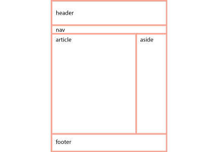
In the first homework assignment you marked up content using heads <h1>–<h6> and paragraphs <p>, added links <a> and images<img>, and grouped certain content together using the generic <div> or the more semantic HTML5 tags like <header>, <nav>, <section>, <article>, <figure> and <figcaption>.
At this time you did not nest too many tags inside of other tags, but know that every tag you created was already nested as a child of the body tag. As you develop the layout, you will increasingly nest tags inside of one another, usually to define and group an area of the layout, like the header, right column, main content, navigation or footer.
When you look at the first assignment, you see the browser’s default style at work. The content vertically lines up, one below another, while the text flows left to right.
To better understand this structure, change the embedded style included in the HTML5 template, which looks like this:
<style type="text/css">
.example {
}
</style>
To an embedded style that puts an outline or border on all elements, like this:
A red outline is put on the elements that are displayed according to the block mode and a green border is put on the elements that are displayed according to the inline mode.
Each element of the assignment now has an outline or border.
Take a moment and explore the way the red outlined block elements stack below one another. Each element’s width extends all the way out to the parent by default.
Inline elements with green borders styles the content (type) in block elements, flowing from insertion point to the end of the box. It then start over on the next line. Not all languages flow horizontally or left to right, though english does, so we can say that type starts left and flows horizontally.
The other display modes besides block and inline are tables, which are not to be used for layout purposes, and the absolute display mode, which completely removes elements from the document flow.
Styling the Elements
I use an embedded style sheet for this example, but you should use an external style sheet. Because the rules act at a distance, you need selectors placed in front of the rules to target the elements.
The best selectors to use are type selectors, that select the element by its type, i.e. p for selecting all paragraphs. You can combine them to get more specific, like article div p, which targets only those paragraphs in the div in the article. If that doesn’t work, you can use the pseudo class selectors like :nth-child(N) or use class selectors if you want to target certain elements, but avoid using ids, as they are much stronger than classes and tend to dominate the cascade hierarchy.
Select each of the elements in the document and change the background color to know that you have successfully targeted that element with a CSS rule.
Altering the Default Layout Order
The block elements are like a child stacking playing blocks one on top of the other, only upside down, starting from the top with one box below the other. This is the normal document flow mode, and it is similar to how a word processor works. The difficulty of laying out a document using the normal document flow is that you have to build your way to every part of the document. The benefit is that if one thing changes, everything else adapts, if it’s done right.
Most Design students layout their documents using Indesign (Illustrator, or even Photoshop). The activity of creating and moving design elements where you want them is what layout is all about. Forget the normal document flow! The absolute display mode is similar to the layout mode of Indesign, but be careful. The web is a much more flexible environment than print, and the layout has to accommodate that. You need to be judicious in the way you use absolute positioning.
The flexibility of the web as a medium means the layout is much more likely to be determined by the normal document flow, whose default behavior we’ve just looked at, than the rigid absolute positioning used for print. This means that you can’t just pick up any item and move it to where it looks best. Instead, you have to figure out how to best position it where you want, using all of the previous elements in the normal document flow. This is possible with planning. That’s why the emphasis on the creative process with thumbnails, mood boards, wireframes and a Photoshop comp before starting to code the layout.
Yes, there is not much spontaneity in coding the layout, but then, there is little spontaneity in prepping an Indesign document for print. The creativity and spontaneity of web design happens in the early planning stages. After that it’s mostly creative problem solving as you try to execute the layout. You are ahead of the game if you can see this as a puzzle to be solved.
Homework Assignment Not Using Floats
The following step by step tutorial is meant to explain the homework assignment and uses the techniques explained in the Beyond Floats article.
You start by opening up an HTML5 template and pasting into a blank document. Paste in the CSS reset at the beginning of the style tags in the head. This prepares your document for coding.
Setting Up the Page
While we want the page to center in the window, if the window becomes too wide, it looks kind of funny, so we put in a wrapper div with a max-width: 1300px to keep the page from centering when the window gets wider than that. It’s tradition to call that first div “wrapper,” though you could just as easily select it with the selector body>div, which selects any immediate child div tags of the body tag.
<div class="wrapper">
with the style being:
.wrapper {
	max-width: 1300px;
}
If some of your pages have enough content on them that they force a scroll bar, the entire content shifts 8 pixels to the left. The web site then moves to the left as you move from a page that does not require a scroll bar to one that does and vice versa. If that annoys you, force a vertical scroll bar to appear by making the page 1 pixel more than the height of the window:
html {
	min-height: 100%;
	margin-bottom: 1px;
}
This page is long enough to force a vertical scroll bar, so it’s not an issue, but if you were to use this technique on your web site, it very well might be an issue.
Next comes section tag to create the actual page for us. We want to center the page inside of the wrapper div, so we need to specify its width (960px) and set the left and right margins to auto. I set the background color for the page to middle grey, create a margin on top to push the header element down 70px, and finally, set the positioning to relative, so that any absolute positioning will be in relation to the page and not the body.
The first element is the header. This is the bar with the name and picture on it. The position of the bar is taken care of by the padding-top (90px) of the section element. The width is a little tricky. I want to put a shadow on the header element (shadow 1), but do not want the shadow to bleed out over the right edge of the page. The solution is to shorten the header to just 930px so that the shadow looks good. Had I not restricted the width of the element it would have expand to 100% of the parent window, and the shadow would have fallen outside of the header, and the page as well.
Nested inside the header is div that is given a width (848px) plus padding-left (112px) that equals 960px, the same width as the page. Because the div comes after the header in the way the computer reads the page, it is drawn on top. The HTML5 code for the header is:
Since the vertical relation between boxes is pretty much taken care of, most of the strategies concern how to place boxes horizontally next to one another. The relation between name and the picture provide us with an opportunity for using one of these strategies. I could choose to float the name to the left. That would put the picture on the right next to the name. I could also change the display from the block to inline, and vertically center the two, but I use absolute positioning instead.
The h1 element falls into place because of the padding added to the parent. As you can see, the header div has 20px of padding added to the top and 120px of padding added to the left padding: 20px 0 0 112px;.
I then apply absolute positioning to the figure that holds the picture. The figure no longer occupies any space in the document flow and floats above that layer by default. I’m free to move the figure up 70px, which is specified as top: −70px, and either 640px to the left or 40px to the right of the parent element. (640px + 280px (width of the figure) + 40px = 960px). It does not matter whether I go from the left or right side of the parent element since its width is fixed.
I’ll also use absolute positioning to horizontally layout the aside, and nav elements. The potential problem this creates is a lack of flexibility, so I have to be careful, and be prepared to adjust things manually if there are changes. Some problems are avoided by using it only for horizontal placement, but I still need to be careful. Additional links would require a larger image or more space to push down the text box, for example, otherwise the navigation would overlap. This is the HTML with the content removed:
The nav is positioned absolutely to the right (0px) with a top margin of 130px and a right margin of 80px. This removes it from the document flow and positions it below the picture. Adding padding moves it down and over to the left, correctly placing it according to the comp. I could just as well have positioned it from the left side of the document. Flexibility is increased by not invoking absolute positioning for vertical positioning (by using top:), leaving that up to the document flow. That would have locked in the vertical position of the navigation to the page, causing a problem if I were to change the height of the header.
The navigation is targeted by three classes, first the anchor itself, which is made to act like a block so it will act like a box, the second is a:hover, which changes the style when you roll over, and lastly a:active, which changes the style when you click on the button.
Though the aside has no width, the figure that make up its content is 200px in total (160px for the figure and 40px for the left margin). Giving the article a left margin of 200px and a padding of 40px creates a place in the layout for the article.
The article content has a width of 960px −80px −200px, or 680px. Because the navigation is absolutely placed you have be aware of keeping content out of its way. This is the downside of absolute positioning, but it’s taken care of in this layout by the large picture in the figure tag.
There is no need to go over absolute positioning once again, and so I use table-cell to position the columns. The enclosing div has a 40px margin on top that separates it from the figure above and a background of #ccc. The two columns are layer out horizontally by divs whose display has been changed from the default block to table-cell. Here is the CSS:
The headline on the navigation and the article use relative positioning, but with a trick. Relative positioning leaves a space in the document flow. By creating a negative margin, its possible to erase that space, which makes it possible to insert an element in the document flow without it taking up its normal space. This is the case with the headline, which is located above the insertion point by 60px. I set it for the navigation, but that turned out to be slightly off for the column, so I had to adjust that with two declarations. This is a useful trick if you want to include an aside that stays with the main text while you are editing it, for example.
Floats are used to put boxes side by side which does not happen in either the header or the footer, so we only change everything in between. The page is divided into three columns: the aside, the article and the nav and the main content has two columns. Relative positioning is no longer need and is removed from the section and it gets overflow: auto; instead, to force the parent to recognize its floated children, a trick discussed in floating Layouts.
If you look at the HTML, you can see a few changes. The nav is now inside of the article and the h2 is now before the first column in the div.
The aside and the article are floated left. This places the article to the right of the aside. There is no need for the 200px left margin on the article. As there is no need to change the figure in the aside and article, I do not list them in the CSS below:
The nav and the picture are children of the article. Floating the nav to the right places the picture to the left of the article. The margins and padding of the nav are updated to place it in the same place.
As long as the combined total width does not exceed the width of the containers, the elements will float next to one another: 200px for the aside, the plus the 550px of the article (260px for the figure (plus 80px margin) and 120px (plus 50px padding and 40px margin) for the nav) equals 750px, far less than the 960px of the section.
The div that follows the is given a clear: right, forcing it to position itself under the nav. That way it will be responsive and move down if additional links are added. This was not possible using the absolute positioning method. Chances are, however, that the layout would require fixing if that were to happen, so the difference is not so great from the work required to facilitate the absolutely positioned layout.
The Challenge with Floats
I also want to float the two columns, but ran into a problem with the h2 header. It got clipped by the floated column, but when I moved it to the div, it still got cut off because of the overflow: auto;. For that reason, an older solution to the problem was used to force the parent to recognize the floated children, using the pseudo object div:after to create an object after the last column that can be cleared using CSS alone. Clearing the last child forces the parent to recognize all of the children. Here is the CSS:
What this pseudo element does is place a period after the article div. It then forces the period to display like a block element instead of the inline element that it is, and gives it height: 0; so it does not actually change the document flow. It then clears the floating children, which is the reason we are doing all of this. That is another way that the parent element can recognize its children. The final declaration makes sure that the period’s visibility remains hidden. OK, that’s a lot to comprehend for a technique that has been superseded by the overflow: auto; method, but its good to know that it’s still useful when overflow does not work. The rest of the CSS looks like this:
The first column is floated to the left and the second column appears to the right of it. All that’s left to do is to align the h2 header for both the nav and the div. Because both of them are in the selector of the h2 in the div selector has to be further specified as article div h2{}.
Learning the traditional layout modes developed for CSS2.1.1 offers several advantages. Firstly, they provide a structured approach, ensuring that you begin with a solid foundation. Secondly, they serve as essential tools for securing the layout through manual or mechanical means. While newer layout strategies automate many aspects, they do not replace these fundamental tools but rather enhance their capabilities, making responsible layout easier and more automated. Moreover, many newer CSS features aim to expand the power of CSS to automate layout, allowing designers to maintain better control over changes in size. Additionally, some features facilitate data dumps, as designing for variable content with the same parameters becomes increasingly challenging.
Layout in CSS 2.1.1
CSS 2.1 has four layout modes that can be strategically used, in addition to the ubiquitous floats. They are block layout, designed for laying out documents, inline layout, designed for laying out text, table layout, designed for laying out data in tabular format and positioned layout, designed for very explicit positioning without much regard for other elements in the document. Floats were originally applied to pictures so that they could be floated to the right or left and text would wrap around them. Both tables and floats have been used by web designers to create layouts for which they were never intended. Their use for layout is no longer necessary. Tables were replaced by floats in 2007 and floats were replaced by Flex and Grid in 2017. CSS layout has been transformed by the release of multicolumn, flexbox and grid. These will be discussed separately.
Many layouts require multiple strategies at once. This means understanding all of the strategies is the only strategy. If each strategy can be considered a tool, you need all of the tools to build a responsible web page.
The Box Model
The box model is central to understanding how to do layout with CSS. Every element is a content box with specific properties; padding, border and margin, in addition to all the other layout properties, like position, width, height, display, and so on. Elements (or boxes) grow to fit the content.
Default Behavior
The default setting for the box properties is no height and width set at 100% of the parent box. By default, all children boxes are the same width as their parent. The body element is parent to all elements (boxes) in the viewport, and is by default the width of the viewport. The viewport is the width of the window, or the device.
Default behavior sizes the box with the content. Padding, border and margins are in addition to the specified height and width. The actual size of the box in the layout is the content plus the borders and padding. A box that is 400px wide, with 20 px padding, and 10 px borders would take up 460 pixels.
Negative margins can be used to subtract from the space that the content takes up in the document flow. In the demo below, if the content is height: 300px, and has a margin-bottom: -150px, the next element down will start midway the box, because the negative margin does not effect the size of the content. It also becomes clear that elements that come after are positioned above elements that come before. Change the second box’s top and bottom margins to -200px auto 0; and the second box move up 200 points over the first box.
Vertical margins collapse. Horizontal margins do not collapse. If the horizontal margin is 5px for both boxes, expect the space between the boxes to be 10px. But with vertical margins, if both were 5px, the space would be 5px, because the margins have collapsed. The margin collapses to whichever is the larger margin.
CSS 3 introduced the box-sizing property allowing box width to include the padding and borders. CSS Tricks has a nice history of how it ended up the way it is. It’s often applied to the entire page with the universal selector: *, *::before, *::after { box-sizing: border-box;}. You can toggle the box-sizing on and off in the demo or change it to content-box, the default, or padding-box:
Box Model Interactive
CSS Code View
BOX 1: The margin is set for 20px auto, meaning that the box has 20 pixels of margin on top and bottom, and the left and right margins are automatically adjusted to center the box, possible only because the box has a declared width
BOX 2: Though both boxes have a 20px margin, that margin collapses between the boxes.The smaller margin collapses into the larger margin.
The Layout Modes of CSS 2.1.1
The layout modes determine the layout of boxes in the document flow. Boxes act either as block layout, like inline layout, like table layout or like positioned layout in which absolute and fixed positioning , which disregards the document flow.
The best analogy of the document flow to the flow of a word processor, which starts at the top of the document and proceeds downward. All of the content is tethered to the top of the page. This document flow is composed of blocks that often contain inline content. Inline content is letters or words, pictures, links, etc. They make up the content of the block element they are in, and the block element will be as wide as the parent, and grow vertically to hold all of the content.
Contrast the document flow for a webpage with the document flow of programs like Illustrator or InDesign, programs made for print. In these programs, the last thing you want is for something to move. These programs are designed to provide freedom in placing a box anywhere on the page. Each box can initiate its own internal inline flow, but the box itself is not connected to the document flow, because there is no document flow. Instead, the place of each element in InDesign or Illustrator is determined by its x and y values, and its width and height.
Absolute or fixed positioning act similar to laying out designs in Illustrator or InDesign, but don’t try to use them as the foundation for your layout, because it will not be friendly to changes in viewport sizes. You can use them within the layout, once the foundation has been established. Elements are taken out of the document flow and no longer relate to one another.
Tables, the forth layout mode, are in their own world, and wile great for tabular data, should not be used for layout purposes, as that violates the separation of church and state, I mean, form and content.
Block Display
The block layout mode displays the boxes just described by the box model, in default configuration, vertically , coming one after another down the page in the direction of the document flow. Each box, by default, is 100% the width of its parent. Even if a box is not 100% the width of its parent, block elements still start on a new line, by default, starting at the top left corner of the <body> tag. Some HTML elements follow the block model by default, like headers <h1>, paragraphs <p> and list items<li>, and the generic block element, the <div>, though as we will see, their display quality can be changed to inline or table modes using the display property.
Inline Display
Inline tags enclose inline content elements. By convention and for Most of the WOrld’s languages, inline content flows from left to right, and top to bottom, but this can be changed for languages that do not follow the convention. Some inline content is replaced, but most is not. A character is a non-replaced inline element, but the picture element is replaced by the picture. Box properties like margins, padding and border properties are applied differently to these elements.
Both of these inline elements flow horizontally, one after one, till they reach the width of the containing box. The line then returns to the next line, just like this text. Inline flow, unlike the document flow, is language specific. The English language inline flow goes from left to right, and top to bottom. Japanese language inline flow goes from top to bottom, and right to left.
Elements whose default display is inline are the <img> tag, the Hyperlink <a> tag and the emphasis<strong>. The generic inline element is <span>, and you can use it to select any number of characters within the same parent container. The default inline display can be changed to block or table using the display property.
Tables
Tables themselves by default act like block elements but the layout mode of the table is different from the document flow. They used to be used for layout in the early days by programs like Dreamweaver created but they are not to be used for layout purposes anymore. Did I already say that?
The following example provides both the HTML used to build the table and the CSS used to style it. I have included the HTML code so that you can see their structure. The basic structure is a <table> element followed by a table row <tr>element in which table data <td> elements make up the columns. It is possible to nest tables, shown here by nesting the same table in two of the table data cells.
If you want to style the table, its best to create as many hooks in it as possible, and this table is loaded up with column descriptions, a table header, a table footer and multiple table bodies, all used in styling the table. The code and an explanation of how the table layout works is reproduced below:
CSS Code View
The Caption Holds the Title of the Table
Head 1
Head 2
Head 3
table data
table data
table data
table data
table data
table data
table data
table data
table data
table data
table data
table data
table data
table data
table data
1
2
3
td
td
td
td
td
td
td
td
td
td
td
td
td
td
td
td
td
td
td
td
td
td
td
td
Footer
table data
1
2
3
td
td
td
td
td
td
td
td
td
td
td
td
td
td
td
td
td
td
td
td
td
td
td
td
Footer
table data
table data
table data
table data
table data
table data
The Footer is a Place for Information About the Table.
<table id="table">
<caption>The Caption Holds the Title of the Table
</caption>
<col><col><col>
<thead>
<tr><th>Head 1</th><th>Head 2</th><th>Head 3</th></tr>
</thead>
<tbody>
<tr> <td> table data </td>  <td> table data </td>  <td> table data </td></tr>
<tr> <td> table data </td>  <td> table data </td>  <td> table data </td></tr>
<tr> <td> table data </td>  <td> table data </td>  <td> table data </td></tr>
<tr> <td> table data </td> <td> table data </td> <td> table data </td></tr>
</tbody>
<tbody>
<tr> <td> table data </td>  <td> table data </td>  <td> table data </td></tr>
<tr> <td> TABLE </td>  <td> table data </td>  <td> TABLE </td></tr>
<tr> <td> table data </td>  <td> table data </td>  <td> table data </td></tr>
<tr> <td> table data </td> <td> table data </td> <td> table data </td></tr>
</tbody>
<tfoot>
<tr><td colspan="3">
	The Footer is a Place for Information About the Table.
</td></tr>
</tfoot>
</table>
For demonstration purposes, I included the table within itself, which is just a repeat of the code placed in a table data. The ability to put tables inside of tables for layout purposes was much abused in the early days of the web.
The HTML code for the table can be divided into parts, and each can be styled separately. There are table headings, footers, data cells and captions and rows, all of which can be styled. The even and odd table rows are styled using pseudo selectors. If you look at the code, you can see that the table caption comes first, then the table header, two table bodies that contain the table rows and the table data cells and finally a table footer. The row tags allow the three rows to be styled individually, though that too could be handled by pseudo selectors.
Positioning the Document Flow
All objects can be positioned in (or out of) the document flow, which stacks the content together like building blocks in reverse of gravity. Starting from the top, the elements build their way down. W3.org calls this the visual formatting model. Think of these as tools to help you create layout.
Normal Flow
In the normal flow, boxes are like blocks that follow the document flow as they stack. Each of these boxes can hold other boxes, inline content, or both.
Boxes are described as stacked paragraphs blocks, whereas inline elements are said to be “distributed in lines”.
The display of boxes can be changed to inline elements and inline blocks, or when they are floated, and thee elements act just like inline content like a line of text. Pictures act like inline content items as well.
The default normal flow of the blocks is like a word-processor, in which each box takes up space in the document flow. Top and bottom margins collapse to the larger of the two margins as demonstrated above. Left and right margins do not collapse.
For centering elementsauto margins provide an equal amount of margin on both the left and right side of an element, as long as the width of the element is given. If this does not work, you probably forgot to give the element a width.
Relative Positioning
Relative positioning maintains the position and size of the element within the normal flow, and visually moves the element relative to its static location in the normal flow. The horizontal and vertical distance shifts the element relative to the position the box has in the normal flow. Specify positive or negative distance from the top, left, bottom or right edges. If the relative position distance is 0, there is no change from the static position.
Boxes can and will overlap. Use z-index to adjust which box is on top. In the demonstration, the z-index is 1, and the box sits on top of the following box, which is contrary to the actual flow, in which later elements would cover earlier elements. A z-index of 0 would bring back the normal document flow, the same as if there were no z-index, and a z-index of -1 would put the element under its parent element.
Relative positioning is also used to ground absolute position elements. The parent of an absolute positioned element needs relative positioning (with no need to change its relative position) to ground the absolute positioned element to the parent. If the absolute positioned element is not grounded, it will be positioned relative to the first relative positioned parent, or the body element. In the demonstration, the parent element <div id="norm"> has a position of relative flow. If one of the paragraphs were to be changed from relative to absolute positioning, it will go to the top of this demonstration with whatever offset values it has. Take this relative position away, and the absolute positioned element will end up at the top of the document.
Relative and Normal Position Interactive
CSS Code View
Normal Flow
Block elements are those that create a box that can contain inline content. Block elements expand to the width of the parent, and follow one another like paragraphs down the page.
The boxes determine the relation to adjacent boxes through margins, and determine the relation to child elements and inline content through padding. In between the margins and the padding is the border, which can be set to show or hide for each side.
Static Position
Static position is the same as the normal flow, which is similar to relative positioning if nothing is shifted. You can see that in these paragraphs: some have no position and take the normal flow by default, some have relative position, and some have the position of static.
Relative Flow
Relative flow is a subcategory of normal flow, for the element’s position still takes up place in the normal flow but it has been shifted in the top, right, bottom or left directions.
The previous box has z-index applied and covers this box. Set that element’s z-index to 0 or get rid of z-index and it box will cover this box. Set it to -1 and it will disappear behind the parent. This box does not have a property for z-index. Give it a property of 1 and it will cover the fixed menu element.
Absolute Positioning
Absolute positioning takes the element out of the document flow. Switch the relative position to absolute, and you will see it use the same offset in regard to the parent box. Turn off the relative position from the parent box, and the absolute box will jump to the top of the page.
Absolute Positioning
Absolute positioning is the forth layout mode, and it takes the box out of the normal document flow, except for a placeholder, the point of origin on which the absolute positioned box is aligned, and positions it in a layer above it in relation to the containing box’s coordinates, as long as that parent has been given a position in the document flow. If not, it continues on down the ancestry till it finds an element that has been given a position, or the body tag, which often happens, and which places the absolute value relative to the upper left hand corner of the window or viewport. To avoid this problem, remember to give the parent of the box you want to move absolutely a position: relative; without moving it from its place in the document flow.
There is an attraction for students to use absolute positioning as the main layout system since it follows the paradigm set up in print with programs like indesign. The problem is that the web is not like print, and such layouts quickly get into trouble. While it is fine to use absolute positioning for the very simplest of layouts, it breaks down for anything remotely more complicated, where it is a better idea to layout the document manipulating the document flow through margins, padding, floats and relative positioning.
These warnings aside, absolute positioning can be very useful in placing elements exactly where you need them, and can allow for some nifty layout calisthenics, as the demo shows, where objects are distributed by manipulating percentages in relation to the parent. If you change the position to fixed, the squares float in relation to the viewport. If you change the position to relative, and negate the object’s place in the normal document flow by adding negative margins, the objects will behave somewhat similar to the absolute positioned objects.
It is possible to manipulate elements like this because they can have more than one class as long as they are separated by a space: <div class="one box a">. Each box has three classes determining them: <div class="one box a"><p>1
</div>
Absolute Positioning Interactive
CSS Code View
Live Demo
1
2
3
4
5
6
7
8
9
Fixed Positioning
Fixed position is a subcategory of absolute positioning. The difference being that the container box is the viewport. The viewport is the window, so it is absolutely fixed to the window, regardless of the scrolling contents in the window. This can be used for menus like the one to the right, that stays in place while the user scrolls up and down the page. You can see this if you change the position of the boxes above to fixed, and they will float in the relation to the viewport.
Sticky Positioning
CSS Positioned Layout Module Level 3 Sticky position is a hybrid position that incorporates elements of relative, absolute, and fixed positioning to accomplish its effect. When scrolling a page, an element sticks to the top or bottom for as long as the parent container element is visible.
When an element is defined as sticky, the parent element is automatically defined as the sticky container. The parent is the maximum area that the sticky item can float in. In the demo, the header only floats in the container designated by the green box, and has a z-index:10; stacking order, so it remains on top. The footer of the second box is also sticky.
Sticky Positioning Interactive
CSS Code View
Live Demo
Title
Content
Title
Content
Z-Index Property
Once an element has been positioned, it’s overlap on the z-axis can be manipulated by the index property. This can be thought of in terms of having multiple layers, much like an Illustrator File. The normal flow happens at level 0, and you can put elements above and below the normal flow by giving them a number for −100 to 100.
Set the z-index of the following boxes to negative to read when using z-index can be useful. Play with the stacking order, and remember, the element you want to position in another layer other than the document flow has to be positioned first. Try giving the all the boxes a z-index of -3 and watch them move behind the text. Reverse the order of the boxes by changing the first box to -1, second to -2, third to -3 and the last box to -4.
Z-Index Property Interactive
CSS Code View
Live Demo
Box A:
Box B:
Box C:
Box D:
Making the z-index negative and watch the boxes go below the parent. Z-index can be especially useful if one element accidentally cover up a menu item, which is then no longer responds. By changing the z-index, you can move the menu above whatever is obstructing it.
Stacking Context
A stacking context is an element whose children can be ordered only relative to one another. Assigning the property z-index automatically creates a stacking context. As stacking contexts are not visually indicated there will be times when stacking contexts create confusion. It can happen, for example, that it becomes impossible to move one element on top of another using z-index despite astronomically high z-index values. As the z-index command does not work you may try to use !important to force it to work but to no avail. Once a stacking order is assigned to an element all its children become relative to each other and not relative to elements outside of the stacking order.
A number of other properties force stacking contexts because of the way CSS optimizes the way it renders a webpage. None of these properties are inherited but do pass on their effect to their children. These properties are opacity, transform, mix-blend-mode, perspective, isolation and position: fixed. The element and their children are flattened into a single layer to speed up rendering for browser efficiency. That makes it impossible to use z-index to layer something from outside the stacking context into any of those elements.
Display Property
The ability to change the display of an element is a very powerful feature of CSS, and its ability to function as a layout strategy has been overlooked during the time when floats reigned supreme as the Beyond Floats Article shows. It has since been updated to include flex and grid.
It is possible to change a block element to an inline element, to a list item to a table, table cell, etc. This is very useful for changing the basic behavior of an element exploited in the Beyond Floats Article.
Be aware that an inline object is content and does not have volume beyond the content box and requires the use of the inline-block value to change it to block behavior while remaining compatible with inline behavior.
Another important display values is display: none. That allows the element to be hidden from view till it is called up by a pseudo class like hover. This is one way to make CSS drop menus with multiple levels stay hidden till they are hovered over. No one here will build a website so complicated as to need such a menu though styling the navigation article demonstrates one. There is another property, visibility: hidden; or visibility: collapse;, that turns the visibility of objects on or off but that differs from display: none; in that the element still takes up room in the document flow.
Display Property Interactive
CSS Code View
Live Demo
Box A:
Box B:
Box C:
Box D:
Overflow Property
Unless otherwise specified, each box will span the entire width of the parent and accommodate whatever content. If you specify a width, text will just wrap within that width but if a replaced element, like a picture or a video file, is larger than the specified width, it could overflow the box boundaries, it could be clipped at the box boundaries or it could be accommodated by specifying horizontal overflow, in which case a scrollbar would provide access to the otherwise clipped content.
If you specify a height, its possible that both pictures and text could force the content out of the box. You can control this though the overflow property, which allows you to control whether or not content remains visible, hidden or if scroll bars appear to facilitate the extra content. You can also specify which axis overflows. Take away the comments from overflow-x: hidden; and you will see the horizontal scroll bar disappear.
If a web site has both short and long documents, in which case the vertical scroll bar can appear and disappear from page to page, with the result that the web site re-centers and the jump is both undesirable and quite noticeable. Telling the HTML element to always scroll in the y axis can solve that problem overflow-y: scroll.
Overflow Property Interactive
CSS Code View
The overflow property controls how content is clipped, and it creates horizontal or vertical scroll bars to accommodate the extra content.
Floated boxes
Floated boxes are part of the normal flow. When boxes are floated, they behave as inline elements. That means that they go from being in the document flow to being in the inline content flow of a parent box.
A box is either floated to the right or floated to the left, and it shifts the box to the right or left edge of the parent containing box at the line that the box is on. The remaining content then continues to flow around that box until it runs past the floated element or is cleared.
Floated boxes are central to multi-column page layouts, though that was not immediately apparent as they were first used to flow text around pictures. Nesting floats in one another is the basis for multi-column layouts. Nest one box inside of a floated box, and you have two columns, nest that box again inside another floated box, and you have three, and so on.
Floating Boxes Interactive
CSS Code View
Live Demo
Box A:
Box B:
Box C:
Box D:
Two of the floating properties have been disabled. Enable them and see how the boxes jump into position. Once you do, you will notice that Box D also has the clear right property, which pushes it below Box C. Delete the clear property and see what happens.
Floating Three Column Layout Interactive
A bulletproof three column layout.
CSS Code View
Live Demo
HEADER
CONTENT The outlines show that the floated columns do not go all the way to the bottom. Color any one of them and they will stand out. The solution was to create a background picture to make it look like the columns go all the way down. This only becomes a problem when the columns have different backgrounds. The solution is to use an image that repeats vertically all the way to the bottom.
HTML
<div>
<header>
HEADER
</header>
<aside>
SIDE A
</aside>
<article>
CONTENT
</article>
<aside>
SIDE B
</aside>
<footer>
FOOTER
</footer>
</div>
</div>
CSS3 Multi-Column Property
It is easy to create multi-column layouts using CSS3 multiple columns property. The document flow can create more columns inside a box than is visually pleasing, so change it to one, two, three or four columns, depending on the size of the screen. A good use of this would be in media queries, where small screens get one column, tablets get two and computer monitors get three or more columns.
Multi-Columns Interactive
CSS Code View
Live Demo
What is “Fun?”
“I’ll know it when I see it.”
As designers, we get a lot of similarly elusive adjectives from clients, as they tell us what they want their sites to be: “The site needs to be ‘cool,’” “It should be ‘exciting,’” “I want it to ‘pop.’” When we ask them to clarify, the answer we get back sounds a lot like “I can’t tell you what it is but I’ll know it when I see it.”
“Fun” is a particularly difficult concept to define. And we’re starting to hear it a lot more from clients as we design for different contexts of use.
So what’s a designer to do?
CSS3 FlexBox Property
The Flexible Box Layout Module is designed solve a layout problem where the extra space is automatically divided between flexed siblings. It can align its contents horizontally or vertically, can have the order of the columns swapped dynamically, and can automatically “flex” the size of each columns to fit the available space. Flexbox demo. CSS-Tricks guide to Flexbox.
CSS3 Grid
The CSS Grid defines a two-dimensional grid-based layout system optimized for user interface design. In the grid layout model, the children of a grid container are positioned into arbitrary slots in a predefined flexible or fixed-size layout grid. Grid demo. CSS-Tricks guide to grid.
Page Layouts in CSS are not as straight forward as one might expect, but then, tables were not exactly straight forward either.
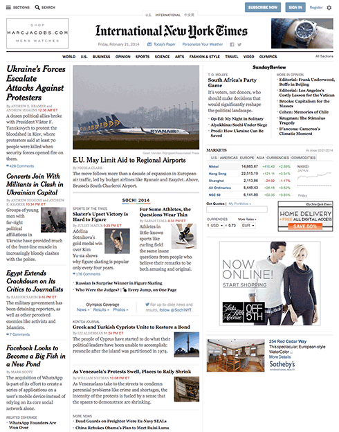
As layouts became more complex, a mix between tables and CSS was used, and by about 2007, the bugs had been removed enough that the New York Times, a standard-bearer, could go to a table-less layout based on floats. That broke the ice and after that almost everyone migrated to an all CSS layout
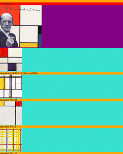
A float is easy enough, and it was introduced by Netscape Navigator 1.1. There is also a clear, to clear the float. It was originally intended to float pictures. The code that floats this example is <img style="float: right; padding: 0 0 10px 10px;" src="http://b.parsons.edu/~dejongo/12-fall/stuff/images/mondrian2.jpg" alt="clear float picture demo">
The next paragraph has clear applied to it. That forces the next element to clear the float. The second paragraph above, for example, does not clear, and continues to flow to the side of the picture.
There are a number of methods to achieve the same goal, but most of these build on the ability to float elements to the right or the left of the containing box. The problem using this method is getting the parent containing element to expand to hold the floated children, as the children can become unruly, and stick out below the parent box (see below for an example).
To prevent that, all kinds of fixes were created, like floating the parent container or the .clearfix method to push the parent box below its floated children. There is a faux column solution that uses a background element to give the impression that all the columns are the same size, and a method called the one true layout that uses margins to push the content into columns, which is similar to one called the holy grail, but they have mostly been supplanted by the overflow: auto method detailed below. For more information and links to tutorials, you can go to CSS tricks or smashing magazine.
When you apply float to an element, you make a box, take it out of the normal document flow, and shift it to the right or left of the containing box. The remaining content flows around the floated element. The floating elements always needs an explicit width. The #bbb and #999 boxes demonstrate what happens when you float boxes to the right, and they are handled as if they were inline elements so that the boxes float next to one another till there is no more space. To stop an element from flowing around the floated element, you have to clear it, as in clear: right;. That way the boxes can float under one another, as demonstrated by the #ddd box. The problem with building a complicated layout with floats lies in browser incompatibility, for it is possible that the page does not degrade properly. To not invite any more problems than necessary, make sure you reset the CSS.
So floats can be used to create columns, but there is another issue to consider.
A containing box will not expand unless there is content. For some reason, when you float a child element, the containing element fails to keep track of it. This becomes unsightly when there is a border or background color on the containing box, and the floating box extends below the border like this.
As you can see, this is not acceptable. The W3 recommends that you put in additional markup and clear: both;, but that is a bit of a hack and requires additional markup introducing an unwanted element at bottom. All kinds of clever solutions were found to create a CSS only solution to that problem, which I need not go into as someone discovered that adding overflow: auto; to the containing box did the trick.
It appears that all is well in CSS multiple column land. If you want more columns, you can make the floated child a parent to another floating child, so nesting floated children inside of floated children.
3 Column Float Demonstration
CSS Code View
HEADER
You will see that the columns fit the content, and that they do not all go to the bottom. This is a problem if you want to have columns with different backgrounds. The solution is to use an image that repeats vertically all the way to the bottom, which I have all ready for you to uncomment. You then have to comment-out the background colors of the columns themselves before you can see it.
HTML markup for the example
<div id="cd-wrap">
<div id="cd-header">
HEADER
</div>
<div id="cd-container">
<div id="cd-side-a">
SIDE A
</div>
<div id="cd-content">
CONTENT
</div>
<div id="cd-side-b">
SIDE B
</div>
</div>
<div id="cd-footer">
FOOTER
</div>
</div>
</div>
Sitepoint released a spot on article, Give Floats the Flick in CSS Layouts that goes over alternate strategies to lay out a page, mostly relying on the display property to change the display of an element from a list item to an inline-block, for example.
Inline-block displays block level elements into inline level elements with block attributes like margins, padding, width, height, and vertical-align, attributes that inline elements do not have. It’s incredibly useful in any situation where you want to align block elements horizontally in rows, as they can be aligned by the top, middle or bottom.
CSS Code View
Each line items can be more than just a menu item, which is what this property is often asked to do. The boxes can be aligned from the top, center or bottom, and can contain all kinds of objects to serve as a layout strategy. If your page were designed to contain a number of columns, this is one way to lay out that page.
Using Margins to Space Columns
By using a large margin to move the main body copy to the right, and using absolute positioning to place the content of the first column, you have a two columns page layout.
The markup for the 2 column layout looks like this:
Without using tables, of course. Apply the layout behavior of tables, rows and cells to any HTML element. For alignment into columns or rows, these display values are a quick and easy solution, harkening back when tables were the ubiquitous layout strategy, but unlike tables, this is legal.
CSS Code View
This can be used to create multiple column layouts.
CSS Code View
Bubble bath
A wet foam—such as that on a cappuccino—and a trough of plastic beads are both made up of nearly spherical, close-packed objects, but do these two types of materials, which are neither fully liquid or solid like, have anything in common? Experiments presented in Physical Review Letters suggest similarities between foams and granular matter that may lead to a more unified theory for describing the two materials.
In a tight spot, spin and charge separate
Strange things happen when there is a shortage of space. The Pauli exclusion principle is well known for its effect on fermions, but bosons (for instance, photons) also behave interestingly when pressed for space. For this reason, researchers are very interested in schemes that create this kind of environment, in search of new physics and new technologies.
Reading a single spin in silicon
The holy grail of research in quantum computing is to simultaneously meet the DiVincenzo criteria—five obstacles that must be overcome to transform a quantum system into a scalable quantum computer [1]. Overcoming the first two, namely to have well-characterized qubits and long decoherence times can be a simple matter: Nature provides a variety of long-lived quantum systems.
Vertically Centering a Box
It is almost impossible to vertically center an object unless you turn it into a table cell and assign it a vertical alignment of center. It could just as well be top or bottom, of course:
The markup for the centered example looks like this:
<div id="centered">
	<div>
<div>
	Vertically and horizontally centered
</div>
	</div>
</div>
CSS Code View
Vertically and horizontally centered
These page layout solutions do not rely on the ubiquitous float. The time will come when the W3 Grid Layout module is adopted, and the landscape changes, but these techniques will not go away. Instead, use them where they fit, anywhere you need to layout out your document.
Using different layout strategies build your portfolio following your Photoshop comp. Read chapter 11. Due: The following week. First Quarter Assessment: Have your landing page, first two assignments and portfolio up.
Materials
Additional materials for this unit can be found by following these links (52 pages):
Cheat Sheets that list all of the different HTML5 and CSS3 tags you can use. Print them out, use them. Explore and get to know them. You can use these during the quiz next week:
HTML5 Cheat Sheet all of the different tags and the attributes they can have.
CSS3 Cheat Sheet all of the different properties and all possible values or value types they take.
Install these Plug-ins if you use Firefox or Chrome. They will facilitate your web development. Do not forget to activate the Show Developer menu in menu bar under the Advanced tab in Safari’s Preferences. Detailed help pages are available for Safari Web Developer are available.
There are many frameworks that allow you to build your websites using preexisting CSS. They arose because layout in CSS is neither intuitive nor easy, and go from simple grids to complete font-end frameworks.
There are many services that allow you to build your own websites, and you can use the HTML and CSS skills you learn here to modify them. This can give you the best of both worlds, for you can use their platform and templates, but modified so that they look unique in ways that goes beyond template options.
build your own
WordPress Build your own with lots of templates to choose from.
Or use a pre-made platform. Note that there are limitations imposed, like Wix depends on absolute positioning to give it flexibility in designing the site, but that end up curtailing the flexibility in other ways.
Tumbler Customize the experience with HTML and CSS.
Lynda.com is a resource for instructional videos. She has been at it for a long time, and there are a lot of videos on HTML (34) and CSS (36). They can be a great resource, and in addition to my performance in class, the class notes and portal, the good and the web itself, there are no reason for not knowing. That said, there are too many titles to intuitively know what to do, and this section will appear whenever there are supporting videos at Lynda.com
CSS (Cascading Style Sheets) describes the rendering of documents on various media. When textual documents (e.g., HTML) are laid out on visual media (e.g., screen or print), CSS models the document as a hierarchy of boxes containing words, lines, paragraphs, tables, etc. each with properties such as size, color and font.
This module describes the basic types of boxes, with their padding and margin, and the normal “flow” (i.e., the sequence of blocks of text with margins in-between). It also defines “floating” boxes, but other kinds of layout, such as tables, absolute positioning, ruby annotations, grid layouts, columns and numbered pages, are described by other modules. Also, the layout of text inside each line (including the handling of left-to-right and right-to-left scripts) is defined elsewhere.
Boxes may contain either horizontal or vertical lines of text. Boxes of different orientations may be mixed in one flow. (This is a level 3 feature.)
This CSS3 module defines properties for text manipulation and specifies their processing model. It covers line breaking, justification and alignment, white space handling, text decoration and text transformation.
Floats. In the float model, a box is first laid out according to the normal flow, then taken out of the flow and shifted to the left or right as far as possible. Content may flow along the side of a float.
Absolute positioning. In the absolute positioning model, a box is removed from the normal flow entirely (it has no impact on later siblings) and assigned a position with respect to a containing block.
A float is a box that is shifted to the left or right on the current line. The most interesting characteristic of a float (or “floating” box) is that content may flow along its side (or be prohibited from doing so by the ‘clear’ property). Content flows down the right side of a left-floated box and down the left side of a right-floated box. The following is a (non-normative) introduction to float positioning and content flow; the exact rules governing float positioning are given in the next section.
A floated box is shifted to the left or right until its outer edge touches the containing block edge or the outer edge of another float. If there is a line box, the top of the floated box is aligned with the top of the current line box.
If there isn’t enough horizontal room for the float, it is shifted downward until either it fits or there are no more floats present.
Since a float is not in the flow, non-positioned block boxes created before and after the float box flow vertically as if the float didn’t exist. However, line boxes created next to the float are shortened to make room for the margin box of the float. If a shortened line box is too small to contain any further content, then it is shifted downward until either it fits or there are no more floats present. Any content in the current line before a floated box is re-flowed in the first available line on the other side of the float. In other words, if inline boxes are placed on the line before a left float is encountered that fits in the remaining line box space, the left float is placed on that line, aligned with the top of the line box, and then the inline boxes already on the line are moved accordingly to the right of the float (the right being the other side of the left float) and vice versa for rtl and right floats.
(This is a more advanced development of floats to exploit their wide usage in layout. It is one of the layout strategies coming out of the W3.org) CSS Floats and Positioning Level 3 allows authors to have text and other inline content wrap around specified elements, thereby allowing for the creation of more intricate layouts than is currently possible with existing CSS floaters. Specifically, CSS 3 Floats, also known as “positioned floats”, can be absolutely positioned on a web document, while still affecting the document flow. Authors can individually specify whether intersected block elements surrounding a positioned float (e.g. paragraphs, divs, etc.) overlap with the positioned float, and if so how they overlap with it. Positioned float can also be styled with a wrap-shape property, which specifies both how text within the positioned float is laid out and how content outside the positioned float wraps around the positioned float. It is also possible to define a shape based on transparency values within an image.
A typographic grid is a two-dimensional structure made up of a series of intersecting vertical and horizontal axes used to structure content. The grid serves as an armature on which a designer can organize text and images in a rational, easy to absorb manner.
The web is a design language, and as some of you are not primarily Communication Design students, it becomes clear that there needs to be a reference that covers what Visual Design students take for granted.
Parsons students can use these links as resources for researching their projects. Visual literacy goes beyond how something looks. It makes communication more effective.
Visual literacy is used to solve problems in communication. This is a lot like structuring an argument in the academic essay, where reason supplants opinion. Instead of finding causes and reasons why, or a genealogy, bringing visually literate structuring to the communication makes the message more engaging, apparent and clear.
To that end, I’ve assembled a number of links to help develop visual literacy.
A Modernist design manual
Designer Massimo Vignelli’s life’s work through his design philosophy with a wealth of examples in The Vignelli Canon. He distributed it free on his website for everyone to become better visually educated. That site no longer exists, so I put the book on my server. You can purchase it. The Vignelli Canon represents the status quo that David Carson opposed that we will cover in Week 6)
Design Inspiration
Use the following resources to explore your site design. Be inspired — copy, borrow, steal — but make sure that whatever you take, you make your own. The top priority is to effectively communicate the content.
Canva is an online graphic design platform that lets nondesigners put together and play with designs till something clicks. You can use it instead of photoshop to prototype your design. Download it as a PDF and open it in Illustrator, and all of the elements are editable.
Invision is a web and mobile device application design platform that allows you to create and user test your designs before you commit to them with code.
Web design layout strategies continues to change, from what it was at its inception to today, and from where it is today into the future. You have to go along with those changes. It started out as a presentation language for static documents written by scientists. That changed when the general public got a hold of it, but for the first twenty years, the size of the page was pegged to the size of a computer screen.
The iPhone revolution changed web design, and a web page is expected to perform equally well on many different devices, from smart phones and tablets to computer screens, car entertainment devices, and more.
Design for the web today has to cover all the differs devices with the same content and CSS. Think of web content as a flexible material that automatically adapts to different sized devices. Each device has its own characteristics, from the small pointer on a computer screen to the large finger on a smartphone.
It means that you cannot design for your laptop screen and hope it works on the other devices. You need to address the target audience for each device. This takes some time. You’d want layout functionality that automatically arranges the content in different ways, depending on size and function. You can trust that a person behind a desktop will sit there, but the person with a smartphone is probably on the go. You need to put your head in the right place when you design for the web.
There are automated formatting systems available that make it easier to place things in the right position for different user experience based on device size. Flex-box was introduced to create a more flexible layout experience. While flexbox allows you to choose both horizontal and vertical directions, it is most appreciated for its ability to organize content going across the page.
Nesting flex boxes allows for great horizontal or vertical placement using the margin:auto; property. This automatically places content at the top, bottom, left, right, or center of the parent object. Flex Grow, Shrink, and Basis provide controls that dynamically determine the proportion between the content items. It fits the flex-items to the remaining space, or lack of space as determined against a reference basis width, using grow, shrink and basis controls.
CSS grid does that flex box does, but in both horizontal and vertical directions at the same time. Grid is very flexible in laying out content and can automatically lay out content. It is actually possible to build a responsive website using CSS grid without using media queries.
The History
The CSS working group is finally addressing layout. For 20 years layout in CSS was an afterthought and designers had to be creative with the tools they had. Those days are behind us. New tools change the way we lay documents out.
The new tools and techniques augment the old layout strategies, superseding many of them. That does not mean these older properties and techniques disappear. They will have less to do, perhaps, in the grand layout scheme of things. As the new tools gain traction there will be a divergence from layout techniques before 2018: the Layout Modes, Floating Layouts, and Beyond Floats.
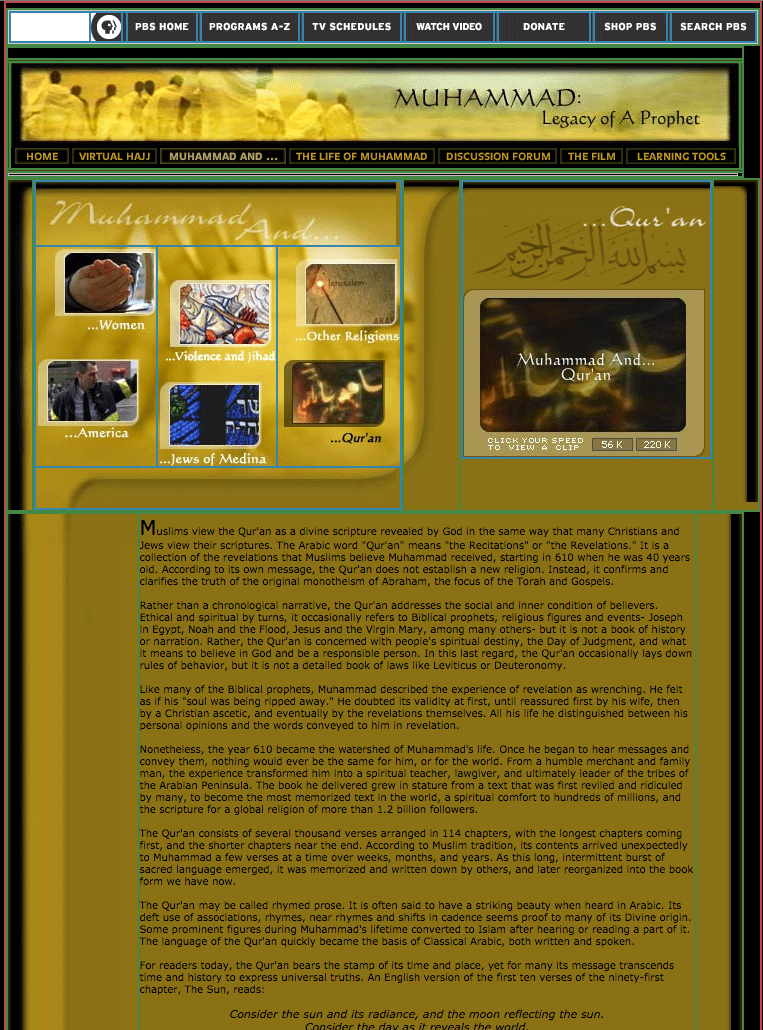
Tables were used in the prehistoric age before 2003. This admixture of form and content locked in the structure of a web page with its content and was never flexible. That may not have been a problem in the early days of the web when the computer screens were all pretty much standard but it would be a problem today. I recently stumbled on an old legacy table based website: Muhammad, Legacy of a Prophet on PBS. It is an example of a page designed in Photoshop and cut up into a table layout. This no longer happens.
Between 2003 and 2007 there was an attempt to develop the holy grail of web design, a CSS based perfect three-column layout using floats. The NY Times created its layout using CSS floats instead of table and pictures. Floats are less intuitive and more fragile than tables but they are more flexible as they separate form from the content. Who could have guessed that floats, originally conceived to run text around images and other elements would be used to power grid systems like Bootstrap constructing the majority of the web pages from 2007 to 2017. Bootsrap has been updated to use CSS flexbox instead.
The idea for Flex Box has been around since before 2008. By 2009 it was a working draft. Changes in the syntax kept it from becoming mainstream till after 2015. Flexbox is flexible, but it’s still just one dimension, either horizontal or vertical. For two dimension, both horizontal and vertical, you need the CSS Grid module released in 2017. Browsers adopted grid just a month after the standards committee released it, paving the way for era of modern web layout. Layout will become more automated, moving away from absolute and relative measurements toward flex spaces that automatically fit the content into whatever liquid layout may present itself.
The Basics
The different parts of CSS layout are tools. The better you know these tools, the more effective your layouts will be. The basics have to be understood before using flex and grid so we cover them first.
Inline
Inline follows the text flow inside the block element. Depending on the language, it can flow from left to right, right to left, top to bottom, or bottom to top.
Block elements: Down is Easy
Block elements automatically extend to the width of their parents and push content down. This is called Normal Flow. Normal Flow is how the browser lays out HTML pages by default when nothing is done to control page layout. Documents are built as if stacking building blocks upside down. Starting at the top, you work your way down. Each block automatically fills to the width of the parent.
The normal flow is used throughout the layout process and should be respected no matter what layout strategies used.
Horizontal Layout is More Problematic
All of the traditional layout strategies work to build elements horizontally by limiting the width of one element to something smaller than the parent element , and then using one or another strategy to place boxes (blocks) next to one another. It is necessary to limit the width of elements that would otherwise automatically fill up the entire width of the parent element, to something that fits within the parent element.
An exercise we will do in class is to look at the NY Times using Web Developer’s outline feature (this works only in Chrome or Firefox). You will see the following methods being used to determine the horizontal layout, starting with floats:
Each of these layout methods is demonstrated below. Try them out. Combine them in various strategies to create layout.
Floats
Applying a float value such as left can cause block level elements to wrap alongside one side of an element, like the way images sometimes have text floating around them in magazine layouts.
CSS Code View
Live Demo
Box A:
It is a testament to the creative problem solving of the CSS community that refined these techniques to the point where they will remain current for a long time.
This paragraph will either join the one above or clear: left; will clear the float.
Relative Positioning (using negative margins)
Positioning allows you to move an element from where it would be placed when in normal flow to another location. Positioning isn’t a method for creating your main page layouts, it is more about managing and fine-tuning the position of specific items on the page.
CSS Code View
Live Demo
Box B:
Box C: This box is positioned relative using negative margins.
Box D:
Absolute Positioning (with Margins)
CSS Code View
Live Demo
main content
Display Property Interactive
Display property is assigned by default to different elements making them inline, block, list, or table. Using the display property you can resign the display value of any element, from block to inline, for example.
CSS Code View
Live Demo
Box A:
Box B:
Box C:
Box D:
Creating layouts
Horizontal and vertical techniques are combined to create more complicated layouts. You will use one strategy to get the box to the side, another to populate it with content, and so on.
The inline content itself fills out the layout and expands the box (block) that its in.
The placement of elements is manipulated through relative and absolute positioning, floats and the display property, and given padding and margins so they fit the layout.
Absolute positioning, as used by Indesign and Illustrator, for example, is not a good layout strategy when it comes to the main elements of the website. It works well for print because, once a job is printed, that’s the end of the story. Web sites are continually viewed in different viewports and require a much more flexible approach. That is the key word here: flexibility.
That’s why the word processor is a better metaphor, as the content starts at the top of the page and is pushed down the page. Absolute or fixed positioning can be used to nail down details of the design but not the main parts of the layout.All elements need to be flexible enough to go along with the flow.
Positioning the Page in the Window (ViewPort)
The first decision is to place the document in the window. Does it take up the whole window? What if the window is 2400px wide? Does it take up a 1000px width in the middle of such a large screen? or does it stay to one side, ignoring the size of the window once it passes 1300px?
This requires a solution with at least two blocks; the first is a div with a class called wrapper, and the second is the sections tag. The div is needed to limit the maximum width of the window to 1300px, and the section determines the width of the page as well as horizontally centering itself inside of the wrapper. This is the strategy used in the HTML5 template and gone over step by step in setting up the page in the demonstration.
With the width of the page decided, the process now goes from the top of the section. First comes the header, then the navigation (the navigation is often nested inside of the header) then comes the main article with usually an aside to the right or left of it, and finally, a footer to define the bottom of the page.
If all of these are in the document flow, and determined by the size of the content, then the document is flexible, meaning that if something were to be added somewhere in the middle, it would be accommodated in the document flow, and everything else would adjust accordingly.
Building flexible documents is the ideal. Please aim for that, as it will make your documents much easier to manage. We have not yet covered responsive design using media queries but when we do, the document has to remain flexible so it can adapt to different size viewports, or window sizes, from the tiny screen of the iPhone to the largest monitors.
If you think it is hard to manage a static page, just imagine how much more difficult it would be to manage various states of the same document. Lets make our documents flexible for now, and worry about responsive layouts after the midterm.
Fixed Layouts
A fixed layout has pixel-based widths for the whole page and for each column of content. Its width doesn’t change when viewed on smaller devices like mobile phones and tablets or when a desktop browser window is reduced.
Fixed layouts are easiest when first learning CSS but are limited in addressing the many variable viewports.
Fluid Layouts
A fluid ( or liquid) layout uses percent-ages for widths, allowing the page to shrink and expand depending on the viewing conditions.
Elastic layout can use ems for both width and all other property sizes, so the page scales according to a user’s font-size settings.
There is no single layout strategy that is right for every circumstance, and you will find yourself using all of the CSS layout tools at one time or another.

