You have finished the portfolio. Congratulations. Now that you have learned to code, You need to go to the next level. For that reason, I have created this afterglow project, too continue the energy you put into the website you just created. You are to create your portfolio (or any other website) using AI or any other technology that helps you build websites. Now you know how to code, and put things together. I could not have asked you to ask AI before you learned how to code, for you would not have been able to integrate that code. Now that you understand what it takes to build a website, you are ready to rely on AI or any other technology to help complete the next one for you.
If it creates code, you have to understand what it is doing to integrate it. That is the purpose of this assignment. This is a trial run for the final. I want you to use what takes to get you to the next level to complete that project.
This is not as easy as asking AI to create your website. Be in the driver’s seat. Ask it to code certain things, and then integrate AI code goodness back into your self-promotion website 2.0. Use any source for code you find on the web or AI, as long as you can integrate it back into a fully functioning website. All I ask is that you document where you got the code from. Does it have to be my portfolio? No. You can create a website about anything you like. When is it due? I don’t know yet, but before the final, not after.
Category Archives: 08 Midterm Critique
08 Portfolio Presentation
Congratulations on completing your projects. Even if you’re not totally done/things are broken, present what you have and talk through your design decisions and code, starting with first assignment, eight steps, typography poster, issue website, and last but not least, your portfolio where you sell yourself to the rest of the class. As long as you’re in class, presenting your project, you’re welcome to resubmit it by the end of the semester.
Structure
I will assign in class a first responder (1R), second responder (2R), and notetaker (N). The first responder (1R) will kick off our discussion as soon as the presenter has finished sharing their work, covering design issues. The second responder (2R) will add, subtract, and expand on the first responder, focusing on the code. The notetaker will listen carefully and document the highlights of the critique in a class document for later reflection by the presenter. Class engagement is a requirement, so let us all work together to make each one of us the best that they can possibly be.
When critiquing, these are the questions that need to be considered:
-
Design considerations:
-
- Does the portfolio stand out?
- How would the target audience respond. Contextualize your answer.
- What is the narrative? Could the story be told better?
- How is the graphic design? Scale? White space? Typography?
- What is the inspiration/research behind it, How is the content supported?
- Do the layout and navigation support the goals for viewing the collection?
-
Code Considerations:
- Is the markup valid and semantically correct HTML5 ?
- Are images the correct format and size ?
- Are UX concerns driving the design process ?
- Are all 7 steps articulated in the design process for portfolio and final ?
- Is the CSS valid, clean, external, and using structural selectors wherever possible ?
- Are various layout strategies used to construct the layout ? Document Flow ? Positioning ? Floats ? Flex Box ? CSS Grid ?
- Is the website responsive to a change in viewport size, from smart phone to the standard web browser ?
08 How is the Final Graded?
To generate a general assessment of your performance and participation in class, on the midterm, and on the final, I will:
- Look for originality (surprise me)
- Check the code
- Check for completeness of the assignments and the efficacy of the communication.
- Look for overall improvement
The checklist I perform:
- Make overall assessment, checking off the assessable tasks set forth in the syllabus. Is the HTML valid and semantically correct HTML5? Centralized style sheet? (there should be no local or embedded styles). Etc.
- How responsive are the Final and Midterm?
- Are there sufficient pages to represent a professional website? You do not need to actually build the site but need to build enough pages to represent how the full site would look and function.
- Does it work in Firefox, Safari and Chrome? (If you know it works best in one or another browser, tell me.)
- Check the code using W3.org’s Markup Validation Service. I can tolerate a few issues but the code should be error free.
- Inspect the code as written for irregularities introduced by copying code and making it the basis of your code. It is OK to do some copying, borrowing, and stealing but not OK to rely on that. It is easy to tell if the code has been written or borrowed as all kinds of habits that I do not cover creep in.
- Check all of the older assignments for completeness
I create a preliminary grade based on the above criteria. After having gone though each student’s work I will have a feel for how the class performed as a whole. I go through the work again and adjust each student’s grade on the class curve if need be. I also consider each student’s background and expertise. I may be more gentle with a non-Parsons student when it comes to visual design, for example.
An A requires attention to all of the above criteria. A B means that you completed your work, but were found lacking in execution.
A C is likely if work is missing or incomplete.
A D or F reflects a lot of missing or incomplete work.
Email me if you think that I failed to perform a fair assessment.
08 Final Assignment
If the first assignment was to sell yourself, the final assignment is to sell anything other than yourself. Create a professional looking website that sells something. It can be a product such as jewelry, a service such as a restaurant, or something abstract such as an opinion or issue. Please use existing work from projects you have completed in other classes. That way you have well thought out content.
- There is a lot of leeway on this assignment. Please use it. Don’t be literal. Selling something allows you can find other websites selling the same thing. You will need to follow the Designing for the Web (7 steps) article and research what you are selling.
- The criteria is that it look professional.
- Students do their most creative work when they’re motivated by the work itself. Choose a final project that will motivate you to do your best work.
- The final project should persuade me (to give you a good grade).
- Focus on the User’s eXperience and site organization
- General Formal Proficiency
- Typographic Proficiency
- Creative Use of technology
- Quality of documentation
- Don’t be shy. Be bold! Be playful! Be emotional! Whatever it takes to grab your audience’s attention. Make them want to come along.
- I am here to help you realize your final.
If you have questions, ask me. - I am always surprised by the number of students who do not ask me when they are having problems. This happens a lot. The reason, I think, is that the answers can be found in both in the book and on this website. Students think they can figure it out on their own. The problem here is that there is so much information that it’s not always easy to connect up with what you need at that moment. So you get stuck and instead of overcoming your limitations you problem solve within them, which is not the best approach.
Do not hesitate. Ask me if you have questions. I am here to help!
- You can also book time at the Learning Center. How to make an appointment. and schedule an appointment.. They can help you understand and overcome the problems you are facing, help you code your final project, and keep you organized and working.
- The biggest obstacles is procrastination. It will catch up with you. I see it happen every semester. Some of you will have more important things to do and postpone working on the final till the end. The result is always an insufficiently developed final. Post your progress each week so I can follow your work.
- Come up with a proposal for your final project and create a new work-sheet. Specify what you are going to sell and how you are going to sell it, research how you plan to be successful in selling it, and develop a strategy based on the target audience. This is due next week!
- You will have the rest of the semester to finish the project. Next week we focus on making your portfolio responsive so that it works in all media. At the same time, you need to research and come up with the topic for your final and be prepared to defend it in class.
- Homework from here on out is divided into two parts. One part concerns the unit and the other part concerns the final project.
Your final site needs to be close to finished by week 14 for peer review. Do not procrastinate. Make your final a project you can be proud of.
Grading Rubric
We are to to have a rubric so that you have an idea of how I grade these projects. While a lot of planning goes into developing the course so that everyone can fish for a lifetime, there have to be standards for accountability.
Midterm Rubric |
above expectations |
at expectations |
needs work |
below expectations |
Volume of work | Additional pages or exquisitely done pages. Complete website | Fully functional front page, product page and bio page. | Pages are not fully functional and incomplete. | Pages missing or too incomplete to be functional. |
Technical Ability | Is innovative and uses User Experience guidelines and clear site architecture to develop engaging web site. | HTML is semantic and validates. Various CSS strategies are used to layout the website. | Code has errors but still works. | Code does not work. |
Clean Design | Design is consistent with clear design elements throughout; Design tied to meaning; Nothing irrelevant, everything has a purpose. | Design satisfies the requirement. Communicates its intent and is clear | Design is simplistic and does not add anything to the communication. | Design hampers the communication. |
Research | The portfolio is well situated and targets all potential users. | The portfolio is well thought out from the artist’s point of view. Additional research did not broaden the horizon. | The portfolio demonstrates artist’s perspective, but lacks general appeal. | Lack of research shows up in product that is not clearly defined for any audience. |
Assessable Tasks
Assessable tasks are those core tasks required to create modern web design.
TASKS / ACTIVITIES | DATE | REQUIREMENTS / INDICATORS |
Marking‑up Content | week 1 | Is the markup valid and semantically correct HTML5? Are images the correct formatand size? |
User Experience | week 2 | Are UX concerns driving the design process? |
Design Process | week 2 | Are all 8 steps articulated? Are they reflected in the portfolio and final? |
Styling the Content | week 3 | Is the CSS valid, clean, external, and using structural selectors wherever possible? |
Layout out the Content | week 4 | Are multiple layout strategies used to construct the website? Document Flow? Positioning? Floats? Flex Box? Grid? |
Constructing the Portfolio Site | week 5 | Is the site logically organized? Is it SEO friendly? Is it tracked using Google Analytics? (only for non‑Parsons hosted websites) |
Is the web site Future Proof? | week 3‑6 | Is the website responsive to a change in viewport size, from smart phones to 4K Screens? |
Does the typography communicate? | week 6 | Does the typography promote legibility? Accessibility? Does it communicate the messaging, tone, sentiment, and aesthetics? |
Exploring CSS3 and beyond | week 9‑11 | Are advanced CSS modules used to create the look, feel, and functionality of the website? Does it stand out? |
Modularity and Interactivity | week 12 | Are PHP and Javascript used in the final website? |
CMS: WordPress | week 9‑13 | Are You capable of creating a site using WordPress? |
Forms | week 14 | Are forms used in the final website? |
08 Positioning Your Final
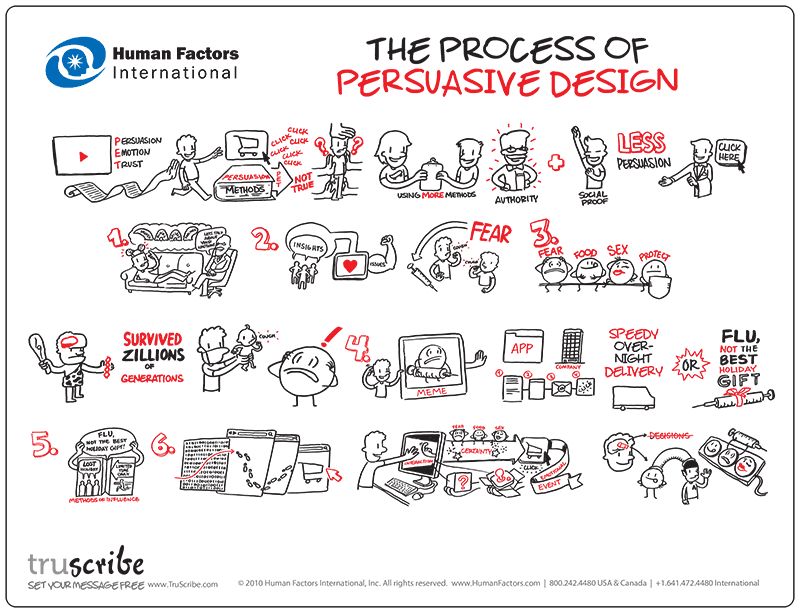
Whatever you are selling, your final web site needs persuasive design and brand development, meaning that you need to think about how to position your site in a competitive marketplace.
Brands embody user trust.
Use a marketing approach that seeks to separate your website from the similar websites. Target your audience and relate to them — their interests, personality and characteristics — for maximum exposure.
That is where persuasion comes in.
A brand is the collection of feelings, thoughts, emotions and experiences (negative or positive) a person has about your website.
Stand for something. Ideally, differentiate your website in a way that targets the audience. Sucess is standing out above the competiton.
Guide your audience on how to think, feel and do about your brand in a way that is best for what you have to offer them.
Developing the Brand Identity
Everyone develops a brand identity, even when they neglect to do it. Spend the time to do it in a thoughtful way. Think over the following questions while developing your website.
Position the Brand
Who is your target audience? Where are the spaces in your industry/category that allow you to be first, seen, heard and remembered for strategic competitive advantage? How can we take an outside-in approach that helps us understand what site visitors actually think, feel and do?
Everyone starts with an inside-out approach. That is only natural. You have ideas of what you want to sell, and how to sell it. We do not have time for test marketing the web site, but stand in your target audience’s shoes. Would they buy it?
Brand Meaning
Build meaning into your brand. How do you talk about it? What do you say about it? What does it look like and what do you stand for? What can you say about it in 30 seconds? Why and how does your website really benefit your customer? What is the reason for its existence?
Brand Delivery
How do you deliver the brand? What consistent parameters do you place around your website? What ways can you leverage it? What media and channels best supports it?
Identify…
your website’s problems, strengths, weaknesses, opportunities, threats and goals.
Audit…
your competitors positioning to identify their weaknesses for strategic advantage.
Understand…
your target audience, community and potential industry/category channels.
Gather…
qualitative (interviews, insights or information) or quantitative (web metrics, trends, industry data).
Uncover and Innovate…
the potential areas of white space that allows your website to be first, seen, heard and remembered.
Placement…
the compelling evidence and vision that makes your website unique.
Differentiate…
your website to make your claim credible, trustworthy and reliable.
Create…
the messages that will accurately communicate and resonate with your targets.
Implement…
strategic design tactics to attract, acquire and retain.
Deliver…
the brand through internal employee alignment and adoption, customer touch-points, external media, marketing and sales objectives.
08 Homework
The Final Project
prepare a pitch of your final website in a new 7-step worksheet dedicated to the final.
- Introduce the idea.
- What are you selling?
- This is the problem your website has to solve?
- How will the website solve the problem?
- Is the proposal sound?
- How it is different from other, similar websites?
- How does it addresses the target audience?
- Write down the problem you are solving and how the website will solve the problem. Include websites of similar products or competing products that helped you form your decision as to how to proceed in the work-sheet, as I will compare the pitch to the final website.
- You are allowed to change the problem and how you plan on solving it as time goes on. Add this to the worksheet, as this is to track your creative process.
Homework for the Unit
- You are to make your portfolio responsive.
- It is up to you to finish it.
- I want to see the core pages responsive to one media query, targeting small screens like the iphone.
The Webby Awards use criteria to evaluate web sites. You should be aiming for something similar.
- Content
- Content is the information provided on the site. It is not just text, but music, sound, animation, or video — anything that communicates a sites body of knowledge. Good content should be engaging, relevant, and appropriate for the audience. You can tell it’s been developed for the Web because it’s clear and concise and it works in the medium. Good content takes a stand. It has a voice, a point of view. It may be informative, useful, or funny but it always leaves you wanting more.
- Structure and Navigation
- Structure and navigation refers to the framework of a site, the organization of content, the prioritization of information, and the method in which you move through the site. Sites with good structure and navigation are consistent, intuitive and transparent. They allow you to form a mental model of the information provided, where to find things, and what to expect when you click. Good navigation gets you where you want to go quickly and offers easy access to the breadth and depth of the site’s content.
- Visual Design
- Visual design is the appearance of the site. It’s more than just a pretty homepage and it doesn’t have to be cutting edge or trendy. Good visual design is high quality, appropriate, and relevant for the audience and the message it is supporting. It communicates a visual experience and may even take your breath away.
- Functionality
- Functionality is the use of technology on the site. Good functionality means the site works well. It loads quickly, has live links, and any new technology used is functional and relevant for the intended audience. The site should work cross-platform and be browser independent. Highly functional sites anticipate the diversity of user requirements from file size, to file format and download speed. The most functional sites also take into consideration those with special access needs. Good functionality makes the experience center stage and the technology invisible.
- Interactivity
- Interactivity is the way that a site allows you to do something. Good interactivity is more than a rollover or choosing what to click on next; it allows you, as a user, to give and receive. It insists that you participate, not spectate.
- It’s input/output, as in searches, chat rooms, e-commerce and gaming or notification agents, peer-to-peer applications and real-time feedback. It’s make your own, distribute your own, or speak your mind so others can see, hear or respond. Interactive elements are what separates the Web from other media. Their inclusion should make it clear that you aren’t reading a magazine or watching TV anymore.
- Overall Experience
- Demonstrating that sites are frequently more — or less than the sum of their parts, the overall experience encompasses content, structure and navigation, visual design, functionality, and interactivity, but it also includes the intangibles that make one stay or leave. One has probably had a good overall experience if (s)he comes back regularly, places a bookmark, signs up for a newsletter, participates, emails the site to a friend, or stays for a while, intrigued.
08 Midterm Presentation
Week 8
10/16
Midterm Portfolio Presentation. Development of the Final Assignment / website.
Homework
Final assignment: create a site that sells something. Develop a proposal for your final project. Final Assignment is Due: at the end of the course. Topic for final is Due: next week. Second Quarter Assessment: Midterm. Have your midterm up by Wednesday Night so I can grade your work.
Materials
Additional materials for this unit can be found by following these links:
- Positioning Your Final
- Midterm Portfolio Presentation
- Afterglow (Engage AI) project
- Final Project
- Final Project Objectives
- How is the Final Graded?
- Midterm Evaluation resources:
Peer Review, Assessable Tasks, and Grading Rubric
Goal
The goal of this unit is to:
- provide each student with the time to exhibit their work to the rest of the class, to share what went right, and the walls they have hit because it takes time to digest the large amount of new information that we have covered in the last six weeks.
- receive feedback from everyone else about what works and does not work so well.
- discover that you have all been in the same boat, which should make you feel a whole lot better.
Outcomes
At the end of this unit, students will have:
- spent about ten minutes each presenting their portfolio and their typography assignment.
- expressed the UX and IA decisions that went into the project
- explained the problems they set out to solve
- show the way that they tackled those problems.
- used the work-sheets to help present and express themselves.
Definitions
These are the general criteria that The Webby Awards use to evaluate web sites. You should be familiar with them.
- Content
- Content is the information provided on the site. It is not just text but music, sound, animation, or video — anything that communicates a sites body of knowledge. Good content should be engaging, relevant, and appropriate for the audience. You can tell it’s been developed for the Web because it’s clear and concise and it works in the medium. Good content takes a stand. It has a voice, a point of view. It may be informative, useful, or funny but it always leaves you wanting more.
- Structure and Navigation
- Structure and navigation refers to the framework of a site, the organization of content, the prioritization of information, and the method in which you move through the site. Sites with good structure and navigation are consistent, intuitive and transparent. They allow you to form a mental model of the information provided, where to find things, and what to expect when you click. Good navigation gets you where you want to go quickly and offers easy access to the breadth and depth of the site’s content.
- Visual Design
- Visual design is the appearance of the site. It’s more than just a pretty homepage and it doesn’t have to be cutting edge or trendy. Good visual design is high quality, appropriate, and relevant for the audience and the message it is supporting. It communicates a visual experience and may even take your breath away.
- Functionality
- Functionality is the use of technology on the site. Good functionality means the site works well. It loads quickly, has live links, and any new technology used is functional and relevant for the intended audience. The site should work cross-platform and be browser independent. Highly functional sites anticipate the diversity of user requirements from file size, to file format and download speed. The most functional sites also take into consideration those with special access needs. Good functionality makes the experience center stage and the technology invisible.
- Interactivity
- Interactivity is the way that a site allows you to do something. Good interactivity is more than a rollover or choosing what to click on next; it allows you, as a user, to give and receive. It insists that you participate, not spectate.
- It’s input/output, as in searches, chat rooms, e-commerce and gaming or notification agents, peer-to-peer applications and real-time feedback. It’s make your own, distribute your own, or speak your mind so others can see, hear or respond. Interactive elements are what separates the Web from other media. Their inclusion should make it clear that you aren’t reading a magazine or watching TV anymore.
- Overall Experience
- Demonstrating that sites are frequently more — or less than the sum of their parts, the overall experience encompasses content, structure and navigation, visual design, functionality, and interactivity but it also includes the intangibles that make one stay or leave. One has probably had a good overall experience if (s)he comes back regularly, places a bookmark, signs up for a newsletter, participates, emails the site to a friend, or stays for a while, intrigued.
08 Final Project Objectives
Outcomes
At the completion of the final project, students will have developed the following skills:
- Project management skills
- Managing files and using file-naming conventions
- Designing for usability and accessibility
- Managing a quality assurance test
- Factoring visitor response into redesign
- Synthesizing content based on reflection
- Design skills
- Investigating and incorporating color and layout consistently
- Applying principles of user interface design
- Considering screen size
- Designing consistent website pages
- Rebuilding web pages based on visitor feedback
The Webby Awards use criteria to evaluate web sites. You should be aiming for something similar.
- Content
- Content is the information provided on the site. It is not just text, but music, sound, animation, or video — anything that communicates a sites body of knowledge. Good content should be engaging, relevant, and appropriate for the audience. You can tell it’s been developed for the Web because it’s clear and concise and it works in the medium. Good content takes a stand. It has a voice, a point of view. It may be informative, useful, or funny but it always leaves you wanting more.
- Structure and Navigation
- Structure and navigation refers to the framework of a site, the organization of content, the prioritization of information, and the method in which you move through the site. Sites with good structure and navigation are consistent, intuitive and transparent. They allow you to form a mental model of the information provided, where to find things, and what to expect when you click. Good navigation gets you where you want to go quickly and offers easy access to the breadth and depth of the site’s content.
- Visual Design
- Visual design is the appearance of the site. It’s more than just a pretty homepage and it doesn’t have to be cutting edge or trendy. Good visual design is high quality, appropriate, and relevant for the audience and the message it is supporting. It communicates a visual experience and may even take your breath away.
- Functionality
- Functionality is the use of technology on the site. Good functionality means the site works well. It loads quickly, has live links, and any new technology used is functional and relevant for the intended audience. The site should work cross-platform and be browser independent. Highly functional sites anticipate the diversity of user requirements from file size, to file format and download speed. The most functional sites also take into consideration those with special access needs. Good functionality makes the experience center stage and the technology invisible.
- Interactivity
- Interactivity is the way that a site allows you to do something. Good interactivity is more than a rollover or choosing what to click on next; it allows you, as a user, to give and receive. It insists that you participate, not spectate.
- It’s input/output, as in searches, chat rooms, e-commerce and gaming or notification agents, peer-to-peer applications and real-time feedback. It’s make your own, distribute your own, or speak your mind so others can see, hear or respond. Interactive elements are what separates the Web from other media. Their inclusion should make it clear that you aren’t reading a magazine or watching TV anymore.
- Overall Experience
- Demonstrating that sites are frequently more — or less than the sum of their parts, the overall experience encompasses content, structure and navigation, visual design, functionality, and interactivity, but it also includes the intangibles that make one stay or leave. One has probably had a good overall experience if (s)he comes back regularly, places a bookmark, signs up for a newsletter, participates, emails the site to a friend, or stays for a while, intrigued.