The web changed completely when it comes to typography. For the first twenty years we could specify only a few fonts. There were 18 fonts to use in 2008. The core fonts licensed by Microsoft are: Andale Mono, Arial, Arial Black, Comic Sans MS, Courier New, Georgia, Impact, Times New Roman, Trebuchet MS, Verdana, Webdings. Apple added Helvetica and Times. That was it. By 2010, there were thousands of fonts available. What a change. Since then they introduced open type variable fonts.
While typography’s been around for hundreds of years, it’s only been in the last hundred years or so that it became both art and science. The art and science of typography forced typographers to ply their craft in the service of the end user who reads it. That makes them the original user experience designers, so take heed.
The web is different from print. The user is in charge in a way that is foreign to print. The attention span is different, and the typography should facilitate the user experience as soon as they arrive on the page. The typographic defaults that taken for granted took their shape from the years of experience in the print world. Do not blindly accept these defaults by which to express your content on the web. The web is different from print.
You will be required to deviate from the standard web fonts like Arial, Helvetica, Verdana and Georgia in the final. These are common fonts supplied by the operating system that have defined typography on the web for far too long. They are safe, legible and entirely predictable. It is possible that legibility may suffer in favor of better expression of the content. It’s a brave new world. Please push the typography if you can. It has been documented that legibility isn’t all that its been cracked up to be when it comes to retaining information.
On the one hand, the legibility of a typeface is its invisibility, that is, just like the cuts in a movie and they are not supposed to draw attention to themselves but convey the content in service to the story. The typeface and the way it is laid out should transparently facilitate the content to the user, whose focus, after all, is on what is being said. But if you want the delivery of the content to express something, it better have style. It’s possible to do both, and in the name of communication, even if you forgo some legibility, I encourage you to do so for the sake of communication, if that is what it takes.
David Carson famously did this twenty years ago, designing, among other things, covers for HOW magazine which I was writing for. If we need an expanded vision to counterbalance all of the rules, we can visit his work, with the understanding that rules are meant to be broken, with intelligence and purpose, and if the content demands it.
Honor the content with your typography, so that it aids in the facilitation of that content. After all, it is only through reading the letterforms that the content can be transmitted. As a designer, you have the power to determine that gateway.
Balance function and beauty, or whatever emotion grabs you to fulfill that function with style. Be playful, lively, think your way through the problem but let the solution be surprising, and just have fun! Having fun is contagious, and if you exhibit joyful creation, it is bound to be infectious.
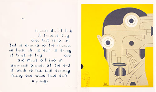
Here’re two spreads on intuition from David Carson’s 2nd Sight, his influential book on graphic design after the end of print. There is a TED talk and another one of his creations in the homework. Let that get you started.
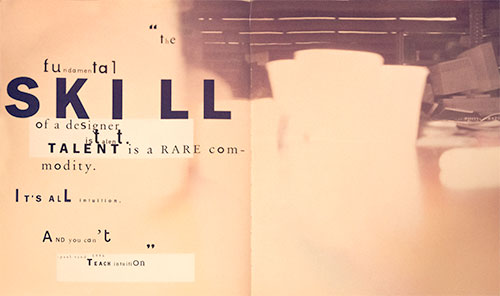
The Fundamental Skill of a designer is talent. Talent is a rare commodity. It’s all intuition. And you can’t teach intuition. — Paul Rand
Intuition doesn’t look at things as they are: that is prison, that is anathema to the intuitive. He looks, oh, so ever so shortly at things as they are and moves off into an unconscious process, at the end of which he has seen something nobody else would have seen — C.G. Jung
CSS or Cascading Style Sheets makes life easy. There are two parts, the rules and the cascade. The rules give form to the content. The cascade connects the rules to targeted HTML elements. All the rules for the website are located in one external style sheet making it easy to change the site as a whole.
It’s possible to avoid the cascade by writing all the CSS rules inline. That would be painful. It becomes even more painful if the site is to be revised. Unlike Print, websites are in a continual state of revision. It is possible to embed styles in the head of an HTML document. This is great for writing style definitions once and applying them many times throughout the page. If there are more pages, however, it’s better to separate the styles out of the document into an external style sheet. A link to that stylesheet in the head of the HTML page keeps it in synch with the external style sheet.
Imagine updating your whole site by changing only one rule. That is the power of CSS!
The Bright Side
Using a single stylesheet is a boon for consistency.
A reduction in repetition and file size.
By separating form from content, the content can be repurposed to work on watches, phones, tablets and computer screens. This is called responsive web design.
Build fantastically complex web pages with relative ease.
Ease of revisions to the layout.
CSS allows for better Search Engine Optimization. You can put the most important information first no matter where it ends up being on the page. Content remains readable compared to using tables for layout purposes.
The Darker Side
The cascade can become confusing as the number of style definitions grow.
Leave out one character and the whole thing can break down. More usually, only the declaration breaks down but watch out for errors by validating often.
Quick Peek
The browser allows you to apply any inline CSS style to any object just for the page you are looking at. Open up the inspector in Chrome — right-click on the object you wish to investigate and select inspect. Once the new window opens up, navigate to the top of the left sidebar and right below the Filter box you will see: a javascript function that will insert whatever inline CSS style you want on the selected element.
element.style {
}
Here you can add any style to the selected element. This style will disappear as soon as the page is refreshed but it allows you to see what a style would look like. The left column, when looking at elements, provides a detailed description of all the css used to paint this object. You will be exploring this feature the more time you spend coding. The same feature is available in Safari and Firefox.
CSS is hard because its properties interact, often in unexpected ways. Because when you set one of them, you’re never just setting that one thing. That one thing combines and bounces off of and contradicts with a dozen other things, including default things that you never actually set yourself.
One rule of thumb for mitigating this is, never be more explicit than you need to be. Web pages are responsive by default. Writing good CSS means leveraging that fact instead of overriding it. Use percentages or viewport units instead of a media query if possible. Use min-width instead of width where you can. Think in terms of rules, in terms of what you really mean to say, instead of just adding properties until things look right. Try to get a feel for how the browser resolves layout and sizing, and make your changes and additions on top of that judiciously. Work with CSS, instead of against it.
Another rule of thumb is to let either width or height be determined by content. In this case, that wasn’t enough, but in most cases, it will be. Give things an avenue for expansion. When you’re setting rules for how your elements get sized, especially if those elements will contain text content, think through the edge cases. “What if this content was pared down to a single character? What if this content expanded to be three paragraphs? It might not look great, but would my layout be totally broken?”
CSS is weird. It’s unlike any other code, and that makes a lot of programmers uncomfortable. But used wisely it can, in fact, be awesome.
The 404 or Not Found error message is a HTTP standard response code indicating that the browser was able to communicate with the server, but the server could not find what was requested.
The web site hosting server will typically generate a “404 Not Found” web page when a user attempts to follow a broken or dead link; hence the 404 error is one of the most recognizable errors users can find on the web.
Customize the 404 page, or file not found error message, so it is not generic, but reflects the identity of the website.
Not found 🙁
Sorry, but the page you were trying to view does not exist.
It looks like this was the result of either:
a mistyped address
an out-of-date link
<!doctype html>
<title>Page Not Found</title>
<style>
  body { text-align: center;}
  h1 { font-size: 50px; text-align: center }
  span[frown] { transform: rotate(90deg); display:inline-block; color: #bbb; }
  body { font: 20px Constantia, "Hoefler Text",  "Adobe Caslon Pro", Baskerville, Georgia, Times, serif; color: #999; text-shadow: 2px 2px 2px rgba(200, 200, 200, 0.5); }
  ::-moz-selection{ background:#FF5E99; color:#fff; }
  ::selection { background:#FF5E99; color:#fff; }
  article {display:block; text-align: left; width: 500px; margin: 0 auto; }

  a { color: rgb(36, 109, 56); text-decoration:none; }
  a:hover { color: rgb(96, 73, 141) ; text-shadow: 2px 2px 2px rgba(36, 109, 56, 0.5); }
</style>

<article>
   <h1>Not found <span frown>:(</span></h1>
   <div>
       <p>Sorry, but the page you were trying to view does not exist.</p>
       <p>It looks like this was the result of either:</p>
       <ul>
           <li>a mistyped address</li>
           <li>an out-of-date link</li>
       </ul>
   </div>

    <script>
    var GOOG_FIXURL_LANG = (navigator.language || "").slice(0,2),
        GOOG_FIXURL_SITE = location.host;
    </script>
    <script src="http://linkhelp.clients.google.com/tbproxy/lh/wm/fixurl.js"></script>
</article>
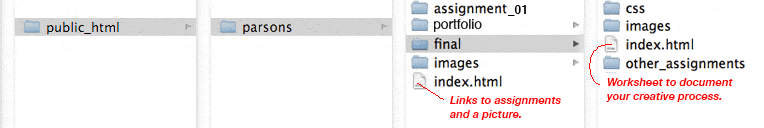
I expect you to use your root — public — directory for your own purposes. You will create a new folder and call it parsons (lowercase p) in the root directory. That is where you will develop all of your work for this class. As there is a midterm with associated assignments and a final, create two folders a portfolio and a final folder.
Web Site Organization
Index.html and Worksheet.
You will create an index.html page inside of the parsons folder that will contain the links to each of your assignments. You will place a photograph of yourself, along with your name, so I can associate your work with you as a person.
The index.html in the portfolio and final assignment folders will serve as your worksheet. This is where I expect you to document your creative development. See example. Update these files in a timely manner!
I expect your class web space to be organized exactly like this or I cannot review your work.
The web space for each student needs to work exactly the same. This is how I make contact with your work. I will be going to this page to check up on your progress once a week, so keep it current. Your grade depends upon it. Homework needs to be up the day before — so I have a day to check it before teaching, for issues that need to be addressed in class.
Even if you are not finished with the homework, upload it and show me what you have, even if it is not finished. You work is due on time, and you can revise it according to the syllabus, until the 12th week of the semester. Work not handed in on time will be graded at my discretion.
The web is a design language, and as some of you are not primarily Communication Design students, it becomes clear that there needs to be a reference that covers what Visual Design students take for granted.
Parsons students can use these links as resources for researching their projects. Visual literacy goes beyond how something looks. It makes communication more effective.
Visual literacy is used to solve problems in communication. This is a lot like structuring an argument in the academic essay, where reason supplants opinion. Instead of finding causes and reasons why, or a genealogy, bringing visually literate structuring to the communication makes the message more engaging, apparent and clear.
To that end, I’ve assembled a number of links to help develop visual literacy.
A Modernist design manual
Designer Massimo Vignelli’s life’s work through his design philosophy with a wealth of examples in The Vignelli Canon. He distributed it free on his website for everyone to become better visually educated. That site no longer exists, so I put the book on my server. You can purchase it. The Vignelli Canon represents the status quo that David Carson opposed that we will cover in Week 6)
Design Inspiration
Use the following resources to explore your site design. Be inspired — copy, borrow, steal — but make sure that whatever you take, you make your own. The top priority is to effectively communicate the content.
Canva is an online graphic design platform that lets nondesigners put together and play with designs till something clicks. You can use it instead of photoshop to prototype your design. Download it as a PDF and open it in Illustrator, and all of the elements are editable.
Invision is a web and mobile device application design platform that allows you to create and user test your designs before you commit to them with code.
Web design layout strategies continues to change, from what it was at its inception to today, and from where it is today into the future. You have to go along with those changes. It started out as a presentation language for static documents written by scientists. That changed when the general public got a hold of it, but for the first twenty years, the size of the page was pegged to the size of a computer screen.
The iPhone revolution changed web design, and a web page is expected to perform equally well on many different devices, from smart phones and tablets to computer screens, car entertainment devices, and more.
Design for the web today has to cover all the differs devices with the same content and CSS. Think of web content as a flexible material that automatically adapts to different sized devices. Each device has its own characteristics, from the small pointer on a computer screen to the large finger on a smartphone.
It means that you cannot design for your laptop screen and hope it works on the other devices. You need to address the target audience for each device. This takes some time. You’d want layout functionality that automatically arranges the content in different ways, depending on size and function. You can trust that a person behind a desktop will sit there, but the person with a smartphone is probably on the go. You need to put your head in the right place when you design for the web.
There are automated formatting systems available that make it easier to place things in the right position for different user experience based on device size. Flex-box was introduced to create a more flexible layout experience. While flexbox allows you to choose both horizontal and vertical directions, it is most appreciated for its ability to organize content going across the page.
Nesting flex boxes allows for great horizontal or vertical placement using the margin:auto; property. This automatically places content at the top, bottom, left, right, or center of the parent object. Flex Grow, Shrink, and Basis provide controls that dynamically determine the proportion between the content items. It fits the flex-items to the remaining space, or lack of space as determined against a reference basis width, using grow, shrink and basis controls.
CSS grid does that flex box does, but in both horizontal and vertical directions at the same time. Grid is very flexible in laying out content and can automatically lay out content. It is actually possible to build a responsive website using CSS grid without using media queries.
The History
The CSS working group is finally addressing layout. For 20 years layout in CSS was an afterthought and designers had to be creative with the tools they had. Those days are behind us. New tools change the way we lay documents out.
The new tools and techniques augment the old layout strategies, superseding many of them. That does not mean these older properties and techniques disappear. They will have less to do, perhaps, in the grand layout scheme of things. As the new tools gain traction there will be a divergence from layout techniques before 2018: the Layout Modes, Floating Layouts, and Beyond Floats.
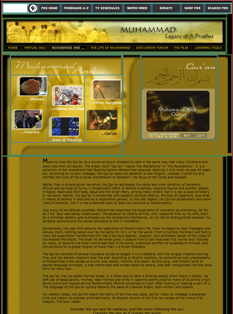
Tables were used in the prehistoric age before 2003. This admixture of form and content locked in the structure of a web page with its content and was never flexible. That may not have been a problem in the early days of the web when the computer screens were all pretty much standard but it would be a problem today. I recently stumbled on an old legacy table based website: Muhammad, Legacy of a Prophet on PBS. It is an example of a page designed in Photoshop and cut up into a table layout. This no longer happens.
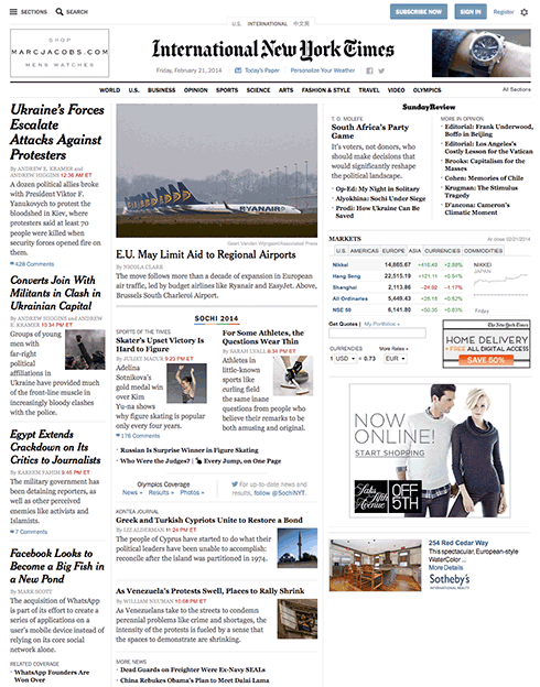
Between 2003 and 2007 there was an attempt to develop the holy grail of web design, a CSS based perfect three-column layout using floats. The NY Times created its layout using CSS floats instead of table and pictures. Floats are less intuitive and more fragile than tables but they are more flexible as they separate form from the content. Who could have guessed that floats, originally conceived to run text around images and other elements would be used to power grid systems like Bootstrap constructing the majority of the web pages from 2007 to 2017. Bootsrap has been updated to use CSS flexbox instead.
The idea for Flex Box has been around since before 2008. By 2009 it was a working draft. Changes in the syntax kept it from becoming mainstream till after 2015. Flexbox is flexible, but it’s still just one dimension, either horizontal or vertical. For two dimension, both horizontal and vertical, you need the CSS Grid module released in 2017. Browsers adopted grid just a month after the standards committee released it, paving the way for era of modern web layout. Layout will become more automated, moving away from absolute and relative measurements toward flex spaces that automatically fit the content into whatever liquid layout may present itself.
The Basics
The different parts of CSS layout are tools. The better you know these tools, the more effective your layouts will be. The basics have to be understood before using flex and grid so we cover them first.
Inline
Inline follows the text flow inside the block element. Depending on the language, it can flow from left to right, right to left, top to bottom, or bottom to top.
Block elements: Down is Easy
Block elements automatically extend to the width of their parents and push content down. This is called Normal Flow. Normal Flow is how the browser lays out HTML pages by default when nothing is done to control page layout. Documents are built as if stacking building blocks upside down. Starting at the top, you work your way down. Each block automatically fills to the width of the parent.
The normal flow is used throughout the layout process and should be respected no matter what layout strategies used.
Horizontal Layout is More Problematic
All of the traditional layout strategies work to build elements horizontally by limiting the width of one element to something smaller than the parent element , and then using one or another strategy to place boxes (blocks) next to one another. It is necessary to limit the width of elements that would otherwise automatically fill up the entire width of the parent element, to something that fits within the parent element.
An exercise we will do in class is to look at the NY Times using Web Developer’s outline feature (this works only in Chrome or Firefox). You will see the following methods being used to determine the horizontal layout, starting with floats:
Each of these layout methods is demonstrated below. Try them out. Combine them in various strategies to create layout.
Floats
Applying a float value such as left can cause block level elements to wrap alongside one side of an element, like the way images sometimes have text floating around them in magazine layouts.
CSS Code View
Live Demo
Box A:
It is a testament to the creative problem solving of the CSS community that refined these techniques to the point where they will remain current for a long time.
This paragraph will either join the one above or clear: left; will clear the float.
Relative Positioning (using negative margins)
Positioning allows you to move an element from where it would be placed when in normal flow to another location. Positioning isn’t a method for creating your main page layouts, it is more about managing and fine-tuning the position of specific items on the page.
CSS Code View
Live Demo
Box B:
Box C: This box is positioned relative using negative margins.
Box D:
Absolute Positioning (with Margins)
CSS Code View
Live Demo
main content
Display Property Interactive
Display property is assigned by default to different elements making them inline, block, list, or table. Using the display property you can resign the display value of any element, from block to inline, for example.
CSS Code View
Live Demo
Box A:
Box B:
Box C:
Box D:
Creating layouts
Horizontal and vertical techniques are combined to create more complicated layouts. You will use one strategy to get the box to the side, another to populate it with content, and so on.
The inline content itself fills out the layout and expands the box (block) that its in.
The placement of elements is manipulated through relative and absolute positioning, floats and the display property, and given padding and margins so they fit the layout.
Absolute positioning, as used by Indesign and Illustrator, for example, is not a good layout strategy when it comes to the main elements of the website. It works well for print because, once a job is printed, that’s the end of the story. Web sites are continually viewed in different viewports and require a much more flexible approach. That is the key word here: flexibility.
That’s why the word processor is a better metaphor, as the content starts at the top of the page and is pushed down the page. Absolute or fixed positioning can be used to nail down details of the design but not the main parts of the layout.All elements need to be flexible enough to go along with the flow.
Positioning the Page in the Window (ViewPort)
The first decision is to place the document in the window. Does it take up the whole window? What if the window is 2400px wide? Does it take up a 1000px width in the middle of such a large screen? or does it stay to one side, ignoring the size of the window once it passes 1300px?
This requires a solution with at least two blocks; the first is a div with a class called wrapper, and the second is the sections tag. The div is needed to limit the maximum width of the window to 1300px, and the section determines the width of the page as well as horizontally centering itself inside of the wrapper. This is the strategy used in the HTML5 template and gone over step by step in setting up the page in the demonstration.
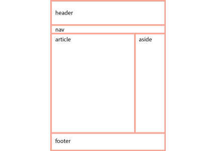
With the width of the page decided, the process now goes from the top of the section. First comes the header, then the navigation (the navigation is often nested inside of the header) then comes the main article with usually an aside to the right or left of it, and finally, a footer to define the bottom of the page.
If all of these are in the document flow, and determined by the size of the content, then the document is flexible, meaning that if something were to be added somewhere in the middle, it would be accommodated in the document flow, and everything else would adjust accordingly.
Building flexible documents is the ideal. Please aim for that, as it will make your documents much easier to manage. We have not yet covered responsive design using media queries but when we do, the document has to remain flexible so it can adapt to different size viewports, or window sizes, from the tiny screen of the iPhone to the largest monitors.
If you think it is hard to manage a static page, just imagine how much more difficult it would be to manage various states of the same document. Lets make our documents flexible for now, and worry about responsive layouts after the midterm.
Fixed Layouts
A fixed layout has pixel-based widths for the whole page and for each column of content. Its width doesn’t change when viewed on smaller devices like mobile phones and tablets or when a desktop browser window is reduced.
Fixed layouts are easiest when first learning CSS but are limited in addressing the many variable viewports.
Fluid Layouts
A fluid ( or liquid) layout uses percent-ages for widths, allowing the page to shrink and expand depending on the viewing conditions.
Elastic layout can use ems for both width and all other property sizes, so the page scales according to a user’s font-size settings.
There is no single layout strategy that is right for every circumstance, and you will find yourself using all of the CSS layout tools at one time or another.
Listed below are a number of issues you need to be aware of when coding for the web.
Absolute and Relative Addresses
The difference between a relative addresses or paths and an absolute address can be confusing.
The short answer is that you should build your website using relative paths. That way you can build it on your local disk and copy it to your web server and it will still work. It also allows the site to be moved from the Parsons’ B server to your own hosting service when you get around to making it part of your identity.
An absolute web address is unique on the web. That way you can go to that address when you click it, no matter where it is located on the web, hard disk, thumb drive, etc. Relative links, on the other hand, indicate locations relative to the file itself.
Anchor href and Image SRC attributes
Anchor tags <a> use the href="hyper_reference-location" attribute to hyper reference or link to another page. Images use source, the src="image-location" attribute for the image that will replace the code when the page is displayed. All attributes use an equal sign and put the value in double quotes.
Absolute References
An absolute reference or address would be the complete address, all the way back to the root. An absolute address on your computer will look something like this: file://localhost/Users/onno/aWork/Parsons_Fall_2012/03-absolute-positioning.html.
This says that the file 03-absolute-positioning.html is located in the Parsons_Fall_2012 folder, located in the aWork folder, located in the onno folder, located in the Users folder in the root directory of my computer, called localhost.
In the same way, the absolute address for this page on the World Wide Web is: http://b.parsons.edu/~dejongo/01-absolute-and-relative-addresses/. Some browsers hide http:// and there may or may not be a wwwdepending on the way the hosting service is set up. Browsers can also hide that information, so all you may see is b.parsons.edu/~dejongo/01-absolute-and-relative-addresses/.
Relative References
Relative addresses originate from the page on which it is written. Relative address directions you would give someone who asked how to get to the store a few blocks away. You would say, “Walk this way for two blocks, make a right turn, walk another block, and the store is on the left.” The directions are relative from where you are standing and giving directions.
Relative addresses are relative to the file in which they occur. If only the name is given, it assumes that a file or folder with that name is in the same folder as the file in which the link appears.
Connecting to Resources in Different Folders
If the file is located in a folder (directory), or even buried several folders down, each of the folder/directory names would have to be spelled out with a slash between each of the names. <a href="down-two-blocks/right-one-block/store-on-left"> directions to the store </a>. You get the idea.
In Unix or Linux, and I sometimes see it used in web design, a single dot with a slash./ explicitly designates the current directory.
This allows you to drill down to any and every folder or file on the website.
But what if the file itself is enclosed in a folder, and it has to go back up the directory structure?
The way to go up the directory structure to the parent folder that’s holding the file is done with two periods and a slash (signifying a change in directory/folder)../. <a href="../../index.html"> two folders up </a>.
An external CSS file located in its own CSS folder that references a picture in an image folder located in the parent directory will need to go up one level and then go into the image folder before it can access the file. The url would look something like: url(../images/file.jpg).
The ability to move up and down the directory/folder hierarchy is crucial to building web sites. Make sure you understand this before you continue.
Upper and Lower Case: Careful: the Internet Bites Back
If you do not name your files correctly, you cannot expect the internet to fix your problem. The links just do not work.
You should be made aware that the computer does not see a difference between an upper and lower case letter, a and A but to the server, they are two completely different letters. This can result in your website working correctly on your computer but when you move it to the web, the links break.
The computer also sees the space character as a completely different character %20, This%20file%20uses%20spaces so do not use any spaces when naming web files. You can use the underscore and the dash. The underscore links words together when you double click, while the dash isolates them. You can also use camel case thisFileIsCamelCase.
The space is an example of a reserved character and is changed to a percent-encoding. It also effects: " % , . < > \ / ^ ` { | } so do not use these reserved characters when you name a folder or file.
The Slash at the End of the Address
An address that ends in a slash instead of a file name often means to go to that folder, though it could also signify a custom permalink. In content management systems like WordPress, a database query like ?p=123 is replaced with a custom URL structure to improve the aesthetics, usability, and forward-compatibility of the links.
The Default Index
When a link does go to a folder, it will default to the index.html file. If there is no index.html file, it will show the contents of the folder, if the server has not disallowed that. It is recommended that you have an index.html file in every folder, as that will keep people from exploring files you may not intend for public consumption.
Refresh Does Not Update After Changes
For expedience sake the browser does not always go back to the server and shows you what is in its cache. To force a browser refresh so it looks for the files on the server, hold down the shift key while clicking on the refresh icon.
Target A New Blank Window or Browser Tab
Another oft used attribute is to target a new window if you do not want the visitor to leave the page when clicking on the link. The target attribute usually takes the new page value: or <a href="" > new window </a>.
Email Address
You can also address an email using the format <a href="mailto:dejongo@newchool.edu"> email Onno </a>.