01 History of the Web

The Prophet of the Computer Age.

In 1945 Vannevar Bush published an article, As We May Think that helped set the stage for the pioneers who actually developed hypertext, twenty or so years later. By then, the future of the internet could more or less be predicted.

Apple comes out with the Macintosh computer in 1984. A few years later in the mid 1980’s it releases HyperCard for free to all Macintosh users, a condition specified by its creator, Bill Atkinson. Hypercard instantly provided a simulation of what the web would be in easily editable hyper-text stacks. It was a successful hypermedia forerunner to the WWW. It came with a programing language called HyperTalk that is the inspiration for javascript.

Apple’s HyperCard was used to implement an AppleTalk networked based hypertext information database system in the office of CERN where Tim Berners-Lee developed the WorldWideWeb, the very first browser to edit and see what would become the world wide web. Here is the first web site.

Tim Berners-Lee created the browser on a Next computer, using its innovative software to both render and edit web pages. It was later renamed Nexus, to differentiate it from the World Wide Web, and was released as open source in August 1991.

The World Wide Web

The very first popular browser was also inspired by HyperCard. ViolaWWW was developed that same year, and was an attempt to recreate HyperCard in X Terminals. ViolaWWW was adopted as the basis for the Web’s development till Mosaic was released, which was the first widely adopted web browser.

Netscape Navigator was created by the same people who created Mosaic, and was released just as the internet was coming out of the universities and into the public realm. Its popularity exploded and by 1994, industry pundits talked about the birth of a new ubiquitous computer experience that would be computer platform agnostic.

I still remember the heady claims in 1995, that this new medium would undercut Microsoft’s monopoly and that everything would be moved onto the web. Remember, all we had back then were slow and finicky modems that the changed the data-stream into sound, so any communication was very slow.

This challenged Microsoft’s bid for world domination, and it quickly licensed code from Mosaic to build Internet Explorer, bent on making sure that this new paradigm would never happen, or if it did, that it would be on their terms. This resulted in the historic fight for control of the web: Netscape Navigator vs Internet Explorer.

Web Standards

At the time, the visual presentation of the content was delivered by the HTML tags themselves, generally using frames and tables. Pictures took a long time to download, so they were carefully optimized and used sparingly.

CSS1 was introduced in 1996 to separate the presentation from the markup, and was further refined by the release of CSS2 in 1998. The browser manufacturers were slow to integrate these standards, as they were too busy adding proprietary features to ensnare users.

Microsoft’s forceful ways worked. It trounced Netscape Navigator’s domination of the web browser market. Internet Explorer reached 93% market penetration by 2003.

It did this by leveraging its 95% of installed computer operating system base to lock users in. Microsoft gave Internet Explorer proprietary access to the rest of the operating system.

Some think that it almost committed suicide by tying the browser into the Windows Operating System. Microsoft made the entire operating system vulnerable to all kinds of hacks.

Having lost the battle, Netscape Navigator gives up. With the race won and no competition, Microsoft stops development of Internet Explorer with version 6.5, having achieved a monopoly, but the victory would not last. Standards compliant browsers slowly began to make inroads into Microsoft’s world domination.

CSS 2.1, released in 2002, further refined this standard. It was fully embraced by the new browsers on the market.

Apple released Safari in 2003 and Firefox was born out of the ashes of what was left of Netscape Navigator in 2004, and Opera was there as well. This adoption is the beginning of standards based web design so prevalent today.

You can read the story as a comic strip presented below:

The New World

The plan was to sock it to Microsoft by creating stable web applications that could challenge both Microsoft Office and the Windows operating system. With web applications, the new paradigm would make the operating system underneath agnostic, not just for web pages, but for all computer usage.

That was the design goal of HTML5. Google developed Chrome, a browser where each window runs independent from other windows, bringing operating system like stability to the browser for the first time.

The next evolution is a change from computer based browsers to all kinds of handheld devices. Apple’s iPhone, iPad and Google’s Android operating systems are essentially internet devices that replace the desktop computer. To this end, both Apple and Google contributed much to the new HTML5 and CSS3 standards.

This is what Microsoft was afraid of, for its office suite and windows operating system generated most of its money. Though still a lumbering giant, Microsoft is no longer the monopoly it once was, and it decided to get on board.

Everyone wondered what was up when it released a public beta of a mostly standards compliant IE 9. It has since shown that is committed to open standards by releasing the IE10 beta right on the heels of IE 9.

It has joined in, helping to create new standards. That’s a solid affirmation that the future belongs to open, standards compliant computing.

It’s entirely feasible that HTML5 & CSS driven devices will be the future, and that it’s only a matter of time. Jeffrey Zeldman, a pioneers standards based web design, envisions that all interfaces will use such open standards.

A Glimpse of the Old World

The following two videos and the Zen Gardens web site are a snapshot of what the web was like in 2003. Molly E. Holzschlag demonstrates what the web looked like before CSSand after. This new world was brought into focus by the CSS Zen Gardens web site, which demonstrated the power of CSS with the separation of content from form.

The Existing Standards

While development of Internet Explorer stood still, a new crop of browsers aimed toward compliance of the HTML4, XHTML and CSS 2.1 standards, as set forward by the W3 organization, which brings us up to today.

The New Standards

Very exciting changes are here with the next generation, HTML5 and CSS3. This is, in part, because more and more interface elements are being created with HTML5 and CSS3, like the iTunes store interface, iOS apps, Android and others, so it’s possible that in the future, most interfaces will be using this most universal of languages, which places the scope of you learning HTML5 and CSS3 well beyond the browser.
HTML5 and CSS3 examples.

01 Homework

What do you hope to achieve this semester?

Write a few sentences expressing what you hope to achieve this semester, if you haven’t already done so in class. You will post this on the landing page that you will create next week.

Explore your future using OpenAI: chat . Follow the example. Paste text into assignment week 3.

Your Presence on the Web

The web is a medium, like print or video. The medium is fluid like water running down the creek or sand held in by the walls of an hourglass. Communication and design for the web is responsive to the many different devices that may exhibit the work (from a tiny watch to the largest screen) and the many different circumstances in which the work may be exhibited (the mobile experience can happen anywhere). Print and video are passive. Web design reaches out to grab the audience and through behaviors elicit responses tailored for interactive engagement. Web design is immediate, dependent upon satisfaction and the gratification of the user or they click away. A lot goes into web design.

You need to make a website. Please read Why do most websites all look the same? You have an opportunity to stand out. Take advantage of your skills to make your work stand out. Your career depends on it.

Pick a Website to Inspire Your Portfolio

Choose a professional website that represents your aspirations. Pick a few. For example, if you’re a photo major, pick a photographer’s website. It should be a website that represents the kind of future you want to build for yourself. The assignment for the midterm is to sell yourself. This homework is the second of seven steps of next week’s assignment, Designing for the Web

Once you have found the website(s) that represents your aspirations, analyze it. Read Design Fundamentals to get an overview of the design process. This is the starting point for thinking about your own portfolio.

Articulate who the primary target audience is. The content strategy? How should the navigation work? The visual design? Answering these kinds of questions makes you aware of the elements that go into building your own portfolio. Writing them down provides you with content to mark up.

Ideally, you become more focused on delivering your work to your target audience. That will help you focus your work in ways that can only benefit you as you leave Parsons for the real world. In the mean time, you can prepare for that day by learning to build good websites.

Assignment #1: Create a Website Style Guide

Check out the example by Kathryn Lawrence.

  1. Intent: What is the intent of the website? Use the intent to inform all of the other qualities. This should be a short and concise statement, as in to sell skills.
  2. Voice: What is the voice of the website? Is the site’s voice impassioned, assured, energetic, or conversational? Pick a number of descriptive adjectives that capture the experience that whoever had the site built attempted to convey the intent.
  3. Tone: Whereas voice is consistent for the site as a whole, the tone is a contextual refinement that helps convey the content. An about page may have a different quality about it than the home page or a page in the shopping cart.
  4. Brand: How does the website establish its brand? Is it consistent? Is it upscale, casual, youthful, objective?
  5. Persona: Think of the many different users this website is addressing. If we were to write down the characteristics of any of these users and the label them, we would create a persona. Personas are composite sketches that reflect real-world behaviors, attributes, and attitudes of end users.

    You can start with yourself, as you are one of the audiences targeted by the website. Take, for example, Naoto Fukasawa‘s website, a Japanese industrial designer. The audience can be personas representing museums, corporate clients, architects that may use his products in their work, end users, students doing assignments for a web basics class, and the list goes on.

  6. Create 3 Personas: Personas are composite sketches that reflect real-world behaviors, attributes, and attitudes. Create a character sketch for at least three personas.

    Go into the details why they would be attracted to the site, how the site informs them, and what can they do with this information. Would each of these people come back and be a repeat customer? Show how the site addresses these concerns.

    Tell a story, assign each of these personas a name and personal details. By making them real, you can visualize the audience and walk them through the website. Stories activate many areas in the target audience’s brain, facts do not.
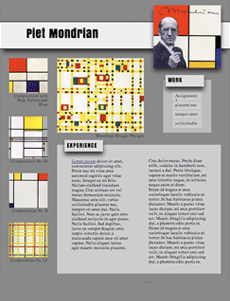
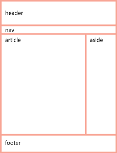
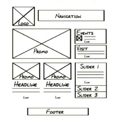
  7. Wireframe: Draw a wireframe for the main pages.

    wireframe
  8. Copy Deck: In developing a website for a client, the content is often done by different people and the designer requires that all the copy for the website be assembled into a copy deck. Copy the content of the first page, break it down and label it as if it were part of a copy deck. Take a look at the SAMOCA copy deck example for guidance.
  9. Competition: How does this website stack up against the competition? What does it have that competitor websites do not, in terms of voice, tone, brand, style, design and so on? Can anything be learned from the competition?

This exercise is meant to get you into the development process of building a website — your portfolio!

You will mark up your answer and create an index.HTML page with links and linked images that you will bring to class next week.

Posting the Assignment on your Domain

Ideally, you can post the assignment on the b.parsons.edu server. Some of you may not gain access to this server. In that case, you will need to purchase a domain name and server space.

Turn to the Tools of the Trade article for instructions on how to set up your website.

Use Fetch to upload your files.

Put a “parsons” folder inside the public_html folder.

Fetch acts like a finder window, so when you drag files into the window, they end up on your server. Unlike your finder, you replace the file when the names are the same. This is how you update files to a newer version.

Within the “parsons” folder, create a folder called “assignment-1”. The title of your web site profile should be “index.html”. It should end up in the “assignment-1” folder.

Review Writing HTML article to help you create the HTML file. I have an old assignment as a homework sample.

Visit Interactive Video Introduction to HTML course to learn all about HTML or watch the video series below.

Watch Video Series Do Not Fear the Internet

These videos (about half an hour) are much more fun and direct than my lectures or the Lynda.com videos. Many if not all of your basic questions will be answered by listening to either my lecture or watching these videos. Please let me know in class or email me if there is still something that is not clear. To go on without resolving what is not clear will cascade into many problems later on.

A fun introduction to the basics of HTML and CSS.

  1. Don’t Fear the Internet


  2. HTML: Hamburger Text Markup Language


  3. Don’t Fear the Browser


  4. Starting from Scratch: HTML


01 Setting up your Server Space

I expect you to use your root — public — directory for your own purposes. You will create a new folder and call it parsons (lowercase p) in the root directory. That is where you will develop all of your work for this class. As there is a midterm with associated assignments and a final, create two folders a portfolio and a final folder.

Web Site Organization

web site organization

Index.html and Worksheet.

You will create an index.html page inside of the parsons folder that will contain the links to each of your assignments. You will place a photograph of yourself, along with your name, so I can associate your work with you as a person.

The index.html in the portfolio and final assignment folders will serve as your worksheet. This is where I expect you to document your creative development. See example. Update these files in a timely manner!

I expect your class web space to be organized exactly like this or I cannot review your work.

The web space for each student needs to work exactly the same. This is how I make contact with your work. I will be going to this page to check up on your progress once a week, so keep it current. Your grade depends upon it. Homework needs to be up the day before — so I have a day to check it before teaching, for issues that need to be addressed in class.

Even if you are not finished with the homework, upload it and show me what you have, even if it is not finished. You work is due on time, and you can revise it according to the syllabus, until the 12th week of the semester. Work not handed in on time will be graded at my discretion.

01 Visual Literacy

The web is a design language, and as some of you are not primarily Communication Design students, it becomes clear that there needs to be a reference that covers what Visual Design students take for granted.

Parsons students can use these links as resources for researching their projects. Visual literacy goes beyond how something looks. It makes communication more effective.

Visual literacy is used to solve problems in communication. This is a lot like structuring an argument in the academic essay, where reason supplants opinion. Instead of finding causes and reasons why, or a genealogy, bringing visually literate structuring to the communication makes the message more engaging, apparent and clear.

To that end, I’ve assembled a number of links to help develop visual literacy.

A Modernist design manual

Designer Massimo Vignelli’s life’s work through his design philosophy with a wealth of examples in The Vignelli Canon. He distributed it free on his website for everyone to become better visually educated. That site no longer exists, so I put the book on my server. You can purchase it. The Vignelli Canon represents the status quo that David Carson opposed that we will cover in Week 6)

Design Inspiration

Use the following resources to explore your site design. Be inspired — copy, borrow, steal — but make sure that whatever you take, you make your own. The top priority is to effectively communicate the content.

  1. Design Inspiration
  2. Inspirational Sites
  3. Design History
  4. The Story of Art
  5. Rijks Studio
  6. Visual Literacy
  7. Adobe Behance

Design Sandbox

Canva is an online graphic design platform that lets nondesigners put together and play with designs till something clicks. You can use it instead of photoshop to prototype your design. Download it as a PDF and open it in Illustrator, and all of the elements are editable.

  1. Canva

Web Design Sandbox

Invision is a web and mobile device application design platform that allows you to create and user test your designs before you commit to them with code.

  1. InVision

Typography

Typography remains elusive for many, so I gleaned useful definitions, descriptions and links to explain the basics.

  1. typographic resource
  2. Fonts in Use

Books on Design and code

  1. Casey Reas, Chandler McWilliams, and LUST, Form+Code in Design, Art, and Architecture

  2. Kimberly Elam, Geometry of Design
  3. Armin Hofmann, Graphic Design Manual
  4. Robert Bringhurst, The Elements of Typographic Style
  5. Frank Chimero, The Shape of Design
  6. Leah Buley, The User Experience Team of One
  7. Compiled by Laurel Schwulst, Very Interactive Library
  8. Paul Ford, What is Code?
  9. Emil Ruder, Typographie

01 Absolute and Relative Addresses and Other Things

Listed below are a number of issues you need to be aware of when coding for the web.

Absolute and Relative Addresses

The difference between a relative addresses or paths and an absolute address can be confusing.

The short answer is that you should build your website using relative paths. That way you can build it on your local disk and copy it to your web server and it will still work. It also allows the site to be moved from the Parsons’ A server to your own hosting service when you get around to making it part of your identity.

An absolute web address is unique on the web. That way you can go to that address when you click it, no matter where it is located on the web, hard disk, thumb drive, etc. Relative links, on the other hand, indicate locations relative to the file itself.

Anchor href and Image SRC attributes

Anchor tags <a> use the href="hyper_reference-location" attribute to hyper reference or link to another page. Images use source, the src="image-location" attribute for the image that will replace the code when the page is displayed. All attributes use an equal sign and put the value in double quotes.

Absolute References

An absolute reference or address would be the complete address, all the way back to the root. An absolute address on your computer will look something like this: file://localhost/Users/onno/aWork/Parsons_Fall_2012/03-absolute-positioning.html.

This says that the file 03-absolute-positioning.html is located in the Parsons_Fall_2012 folder, located in the aWork folder, located in the onno folder, located in the Users folder in the root directory of my computer, called localhost.

In the same way, the absolute address for this page on the World Wide Web is: http://b.parsons.edu/~dejongo/01-absolute-and-relative-addresses/. Some browsers hide http:// and there may or may not be a wwwdepending on the way the hosting service is set up. Browsers can also hide that information, so all you may see is b.parsons.edu/~dejongo/01-absolute-and-relative-addresses/.

Relative References

Relative addresses originate from the page on which it is written. Relative address directions you would give someone who asked how to get to the store a few blocks away. You would say, “Walk this way for two blocks, make a right turn, walk another block, and the store is on the left.” The directions are relative from where you are standing and giving directions.

Relative addresses are relative to the file in which they occur. If only the name is given, it assumes that a file or folder with that name is in the same folder as the file in which the link appears.

Connecting to Resources in Different Folders

If the file is located in a folder (directory), or even buried several folders down, each of the folder/directory names would have to be spelled out with a slash between each of the names. <a href="down-two-blocks/right-one-block/store-on-left"> directions to the store </a>. You get the idea.

This allows you to drill down to any and every folder or file on the website.

But what if the file itself is enclosed in a folder, and it has to go back up the directory structure?

The way to go up the directory structure to the parent folder that’s holding the file is done with two periods and a slash (signifying a change in directory/folder)../. <a href="../../index.html"> two folders up </a>.

An external CSS file located in its own CSS folder that references a picture in an image folder located in the parent directory will need to go up one level and then go into the image folder before it can access the file. The url would look something like: url(../images/file.jpg).

The ability to move up and down the directory/folder hierarchy is crucial to building web sites. Make sure you understand this before you continue.

Upper and Lower Case: Careful: the Internet Bites Back

If you do not name your files correctly, you cannot expect the internet to fix your problem. The links just do not work.

You should be made aware that the computer does not see a difference between an upper and lower case letter, a and A but to the server, they are two completely different letters. This can result in your website working correctly on your computer but when you move it to the web, the links break.

The computer also sees the space as a completely different character, so do not use any spaces when naming web files. You can use the underscore and the dash. The underscore links words together when you double click, while the dash separates them.

The space is an example of a reserved character and is changed to a percent-encoding. It also effects:   "   %   ,   .   <   >   \   /   ^   `   {   |   } so do not use these reserved characters when you name a folder or file.

The Slash at the End of the Address

An address that ends in a slash instead of a file name often means to go to that folder, though it could also signify a custom permalink. In content management systems like WordPress, a database query like ?p=123 is replaced with a custom URL structure to improve the aesthetics, usability, and forward-compatibility of the links.

The Default Index

When a link does go to a folder, it will default to the index.html file. If there is no index.html file, it will show the contents of the folder, if the server has not disallowed that. It is recommended that you have an index.html file in every folder, as that will keep people from exploring files you may not intend for public consumption.

Refresh Does Not Update After Changes

For expedience sake the browser does not always go back to the server and shows you what is in its cache. To force the browser refresh to go back to the server, hold down the shift key while clicking on the refresh icon.

Target A New Blank Window or Browser Tab

Another oft used attribute is to target a new window if you do not want the visitor to leave the page when clicking on the link. The target attribute usually takes the new page value: or <a href="" > new window </a>.

Email Address

You can also address an email using the format <a href="mailto:dejongo@newchool.edu"> email Onno </a>.

01 HTML & CSS Primer

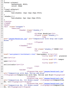
code

The biggest hurdle when first coming to web design from other design fields is how to relate the process of design to coding. Hand coding is completely different from the design interfaces that you are used to. The intention of this article is to explain how to think about code so that you can design with it.

The design process in Illustrator, InDesign and some aspects of Photoshop allows for the creation and positioning of objects anywhere on the page, and in any order.

Anyone familiar enough with how these programs work will know that behind the scenes, there is a long list of instructions that make up the document.

Code looks like this linear sequence of instructions without the interface. Unless you are familiar with coding, it is hard to tell how code relates to the objects on the page. This makes it difficult to apply your design experience.

What one has to understand is that each of these lines of code is a potential design object, and can be given form.

Preparing the Content: HTML

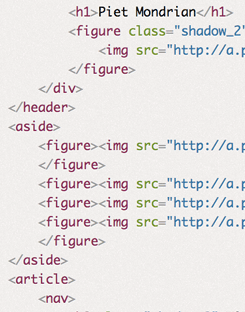
code Close-up

There are two parts to this process. The first is marking up the content. HTML stands for hypertext markup language. This entails tags, or instructions, for the browser to interpret. These tags are placed at the beginning and the end of each discrete part of the content, like a <h1>for headline, <div> for division, <p>paragraph and <li> for list item. Just to make it confusing, there is also a <header>tag for headers.

For example, a header represents the area of a page, and is designated by using the header tag: <header> Header content </header>A headline has six levels, for the main one, represented by <h1> to the least important, <h6>. The paragraph: <p>paragraph content</p> and the code for a list contains both the ordered list tags and the list item tag, and looks like: <ol><li>list item</li></ol>.

Some tags are replaced by the content they represent. These are self-closing tags. They do not require an end tag. The image tag is replaced by the image itself: <img src="address of picture" alt="description of picture for screen readers, etc."> and the line break tag <br> is replaced by the line break itself. Read about the other HTML tags.

As you can imagine, the first step in the web design process, after all of the design development has taken place, is to mark up all of the content. Once the content has been marked up, it is possible to start giving the content form.

Turning the code into design elements

assignment

The opening and closing tags and the content sandwiched between creates an element or object.

All of the content must be marked up in this way and turned into objects before the design process can begin. What looks like lines of code to the uninitiated ends up being many objects, one after the other.

Without intervention, content itself merely follows the default document flow, like a word processor. It starts at the top left hand corner, moves to the right till it runs out of room and then returns to the next line, like this.

Specifying the content in paragraphs forms block level elements that simulates what happens when the return key is hit on an old fashioned typewriter or word processor. It initiates a new paragraph to start below the existing paragraph. All paragraphs stack vertically down the page.

We have just described two ways that content can flow on a page: The horizontal or inline direction is a lot like characters in a line of text. The vertical or block direction has each object come one below the other, like paragraphs.

In coding, this is done by inserting the tag for a paragraph <p> in front of the paragraph and a closing tag </p> at the end of the paragraph. Each paragraph acts just like the paragraphs in a word processor, proceeding vertically down the screen, one below the other.

In Illustrator or InDesign this paragraph could be in its own box and moved anywhere on the screen just by clicking and dragging, independent from all of the other elements or objects. This is also possible by styling the code, which becomes possible to do once you have marked up a document in to discrete elements.

CSS: Giving Form to the Content

CSS stand for cascading style sheets. Giving form to the elements in an HTML document is done by writing rules that specify a quality of the object.
InDesign Toolbar

In Indesign, a box is drawn by first selecting the Text Creation Tool and then clicking and dragging the mouse. It can be filled with a paragraph of text.

If it were moved to the lower right hand of the document, that would be reflected in the status boxes of the tool bar, which would provide the distance from the top left corner on the x, or horizontal axis, and the y, or vertical axis. It would also provide the width (W) and height (H) of the box.

Used the mouse to create the box, it might say X: 25p0, Y: 41p8, W: 16p8 and H: 8p4. If it doesn’t, you could tweak the dimensions of the box by changing the numbers in the toolbar.

Clicking and moving the mouse to create code is not an option if you are writing code. There are programs that will change a click-and-drag into objects that you can then move around, but we are learning how to actually do this without the help of such programs.

The same effect is done by writing a rule that specifies that the paragraph is to be absolutely positioned, allowing it to be moved so many pixels along the x and y axis irrespective of whatever else is in the document, and that it should be so many pixels wide and high.

The language used to specify the rule uses properties and values that are similar to the way we speak. We can write the code for that paragraph into the <p> using the style attribute style="position: absolute; left; 300px; top: 500px; width: 200px; height: 100px;". This specifies the paragraph just as Indesign specifies the box using numbers.

I could stroke the box with a 1 point line and add some Inset Spacing in InDesign to keep the content from butting up against the border of the box. Using the Text Frame Options Dialog Box available under the Object Menu in InDesign provides the ability to add Inset Spacing to the top, right, bottom and left.

The same border and inset spacing can be applied to the paragraph by adding the following properties to the rule: border: 1px solid black; padding: 6px;.

It is possible to select words within the paragraph. In Indesign, you select a word and give the command to make it bold. In HTML, you surround the word with inline code <em> like this: <em>word</em>.

You then define a rule that makes the inline selected content bold with the property font-weight: 700; where the weight of a character is determined from 100 to 900 in jumps of 100. It could also be specified by the keywords bold or normal. In the style sheet, the rule would look like: strong {font-weight: 700;}. It should be noted that this does not create font weights, but only specifies fonts that are available to be used.

Though it is possible to write the rules in the element tags themselves, <strong style="font-weight: 700"> that is not a good idea. CSS is designed to apply the rules at a distance. That way, all of the rules that inform how the web page is to look can then be collected in one place, an external style sheet, and all the pages of a web site can reference that external style sheet, and be styled by just one set of rules.

This is done by providing a selector in front of each rule that seeks out the element it is to style. In the example above, the name of the tag itself came before the rule. That way the rule would be applied to all <em> elements wherever they are used in the website.

Putting it All Together

blocks

The content is marked up by the hypertext markup language as discrete blocks that can be manipulated by cascading style sheet language.

These blocks can be treated as separate elements or objects, removed from the document flow, the way Illustrator or InDesign treats objects. This is not the way it is usually done, however.

That is because the web requires flexibility. Chances are that a page has to adapt to various formats, from tall and skinny to fat and wide.

To maintain that flexibility, the design elements on the page need to be organized more like a word processor rather than a page layout system used for preparing documents for print.

Think of a child stacking blocks. Now turn those blocks upside down, as if they were staking them onto the ceiling.

Instead of being fixed in their position as they are for print design, they need to be flexible and able to change hale and location, and even what they look like, depending on the context.

The word processor model allows the blocks to reflow depending on the size of the window. The window is called the viewport.
blocks upside down

All of the elements originate from the top left hand corder of the page and moves down. They form a chain of boxes that act much like a word processor.

When one word is deleted, the rest of the sentence fills the gap. So it is with the elements in the document flow. This is what is means to be chained together from the top of the document.

Since block elements move downward by default, the challenge is how to move objects horizontally. This is like having two paragraphs next to one another. This can be done by floating one of paragraphs.

There is a lot to learn.

So Where is the Design in designing a Web Page?

Page Layout

The design of the layout happens before the coding begins. There is little design in the actual creation of the web page. All of the design happens before, just as it does with InDesign.

To be fair, the coding can be likened to preparing an image for print, in which the creative design has already been executed, and now the image is prepared so that it prints correctly.

The process is as follows.

Using paper and pencil to create thumbnails, develop the equivalent of stick figures in a wireframe, and then use photoshop to render it so you have something to aim for when you code. Only then do you start to code.

Coding is more like solving puzzles than designing. Unlike print, the interactivity of web pages requires a continual back and forth between designing the way it looks and coding the design.

We spend two weeks on learning how to mark up documents, two weeks on CSS, and the rest of the semester learning how to use them in a way that is professional and standards compliant.