CSS2.1 provided basic layout modes, from inline and block and tables to positioned layout, which is either based on normal flow or a relative position from that flow, or absolute and fixed positioning, which avoids the flow all together. Add floats and the ability to change the display mode of objects, and that was what designers had to create their pages.
CSS3 adds a number of layout modules, but most are still in the process. Check the Can I Use? website and make sure the properties are well supported before using. Some of these layout strategies are Positioned Floats, Exclusions, Grid Alignment/Grid Layout, Template Layout Module and Regions, which has recently been proposed by Adobe. These new CSS modules will significantly change the Layout and Design landscape for the better.
CSS3 Multiple Column Layout
This property is mostly supported with the exception of the break before, break inside and break after properties. Mozilla is not able to span columns and it is not supported on the older IE browsers, most significantly, IE 9.
It is easy enough to create multi-column layouts using the new CSS3 multiple columns property. The document flow runs though any number of columns inside a box. In the demo, you can change the property to show a number of columns, depending on the size of the screen. A good use of multiple columns is in media queries, where small screens get one column, tablets get two and computer monitors get three columns.
Multi-Columns Interactive
CSS Code View
Live Demo
What is “Fun?”
“I’ll know it when I see it.”
As designers, we get a lot of similarly elusive adjectives from clients, as they tell us what they want their sites to be: “The site needs to be ‘cool,’” “It should be ‘exciting,’” “I want it to ‘pop.’” When we ask them to clarify, the answer we get back sounds a lot like “I can’t tell you what it is, but I’ll know it when I see it.”
“Fun” is a particularly difficult concept to define. And we’re starting to hear it a lot more from clients as we design for different contexts of use.
So what’s a designer to do?
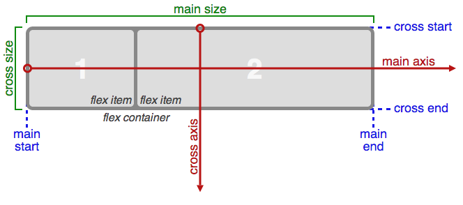
Flexible Box Layout Module
Where multiple columns is a one trick pony for layout, flex box is a serious problem solver. It automatically adjusts boxes to fit horizontally or vertically. It is almost ready for prime time. There are issues with Webkit but time will iron this out.
Flexbox is a module. That means it relies on a relationship, in this case, of a parent box and sibling boxes. Flex controls how the children behave as they align along the two axis. Depending on the direction, the main axis is horizontal or row, and the secondary axis is perpendicular to that.
Flex-Box Interactive
CSS Code View
Live Demo
I’m Centered!
This box is both vertically and horizontally centered. Even if the text in this box changes to make it wider or taller, the box will still be centered. Go ahead, give it a try. Just click to edit the text.