06 homework

  1. Don’t Fear Web Typography


  2. click to start the video.
  3. Watch the the Don’t be Afraid video on Web Typography by Jessica Hische and Russ Maschmeyer. It is only 11 minutes long. The first half explains font-family, font-weight, font-size, text-transform, letter-spacing, line-height and text-align. The second half goes through the creation of a menu in 11 steps with a link to the the starting file along with the steps mentioned in the video so you can follow along: step 1, 2, 3, 4, 5, 6, 7, 8, 9, 10 and the final step 11. Take a look at the finished file. You’ll learn a lot and it is what I want your typography to look like, so please take the time to watch the video!
  4. Know the rules in design and typography. Know when to break them. Be inspired to push or break the rules for typography in web design. David Carson on the end of print with William S. Burroughs reading from his own texts.

    David Carson: The End of PRINT


  5. David Carson speaking about his own work.

    David Carson: Ted Talk


  6. Create a poster utilizing your work using Illustrator or Photoshop, and then scale it down to a pamphlet size and code it for the web.
  7. Include a profound statement, a saying you are attracted to, or a poem on which to exercise your newfound web typography skills.
    • Untiled poem by ee cummings (for inspiration —you do your own thing):

       
      l(a
       
      le
      af
      fa
      ll
       
      s)
      one
      l
       
      iness

  8. The Type Poster is due in Two Weeks. The new typographic possibilities have to be reflected in your portfolio. No traditional fonts. The midterm is due next week for in-class presentation and critique.

Climate Emergency Teach-In Assignment

  • In 2018 The New School spent the week on DISRUPT CLIMATE INJUSTICE. Create a five page website highlighting one or another aspect of climate change and build a convincing website. State your case, back it up with facts and tell the world what you are going to do about it. I do not expect you to write so much as express your opinion with the facts and pictures that you gather. This semester they have the Climate Emergency Teach-In on March 2, a Monday, from 11:00 to 3:00. I will be there. Attend and do your website on the climate emergency.
  • The Website is due in Two Weeks along with the portfolio website. The new Grid Layout and typographic possibilities have to be reflected in your portfolio and the Climate Emergency Teach-In website.
  • 05-8 Homework

    Three homework assignments to be finished by week 8.

    No additional homework will be given.

    previous homework needs to be completed.

    Be ready to present your work in class by week 8.

    Midterm:

    • Portfolio is to have a minimum of five pages, the landing page, three product pages and a bio page.
    • Navigation does not have to extend beyond five pages but it’s a good idea to plan and develop the entire online portfolio. Having your information architecture and navigation in place saves on revision time.
    • Implement the HTML5 Boilerplate, build the navigation and code the remaining design.
    • Start simple with a responsive wireframe that works on all three types of devices, from phones to large computer screens, before developing the details of your design.
    • Post the wireframe

    Build Political Website


    • You are to be inspired by a political cause and built a five page website highlighting some aspect of the political cause if your choice as a practice run to see how quickly you can build a convincing website. Use available content by searching the web. This is only an exercise in building a website, please take pictures and copy from other sources. State your case, back it up with facts and tell the world what it’s about.
    • The New School celebrated its centennial last Semester and I submitted a proposal and got two lectures happening, but that has passed. This semester they have the Climate Emergency Teach-In on March 2, a Monday, from 11:00 to 3:00. I will be there. Attend and do your website on the climate emergency.
    • Create a website highlighting what you learned and build a convincing argument. State your case, back it up with facts and tell the world what you are going to do about it. I do not expect you to write the material yourself. Google the information from whoever shares your options including copy, facts, and pictures.
    • The Website is due in Two Weeks along with the portfolio website. It should be built with the new flex box and css grid and use the new typographic tools we went over in class.
    • Other topics: Climate Change social justice , imperialism, or find your own. Does it have to be political. No, but it better be good.

    Typography Poster

    • Typography Exersize: Watch the the Don’t be Afraid video on Web Typography by Jessica Hische and Russ Maschmeyer. It is only 11 minutes long. The first half explains font-family, font-weight, font-size, text-transform, letter-spacing, line-height and text-align. The second half goes through the creation of a menu in 11 steps with a link to the the starting file along with the steps mentioned in the video so you can follow along: step 1, 2, 3, 4, 5, 6, 7, 8, 9, 10 and the final step 11. Take a look at the finished file. You’ll learn a lot and it is what I want your typography to look like, so please take the time to watch the video!
    • Know the rules in design and typography. Know when to break them. Be inspired to push or break the rules for typography in web design. David Carson on the end of print with William S. Burroughs reading from his own texts.

    David Carson: The End of PRINT


  • David Carson speaking about his own work.

    David Carson: Ted Talk


    Chose a poem or statement or use the Cummings Poem l(a

    “l(a” is a poem by E. E. Cummings. It is the first poem in his 1958 collection 95 Poems

    “l(a” is arranged vertically in groups of one to five letters.

    l(a
    le
    af
    fa
    ll
    s)
    one
    l
    iness

    When the text is laid out horizontally, it either reads as l(a leaf falls)oneliness —in other words, a leaf fallsinserted between the first two letters of loneliness– or l(a le af fa ll s) one l iness, with a le af fa ll s between a l and one.

  • 04 Homework

    1. Watch the last video in the Don’t Fear the Internet series on traditional layout. These are basic but necessary layout tools, and the web has gone well beyond this, but if you are not 100% sure, it is good to watch the whole series.

    Don’t Fear the Layout


    Quiz part 2

    1. Do the flexbox and grid Worksheet (quiz 2)
    2. Open up the worksheet, right-click and show page source. Select all. Copy and paste into a blank Brackets document. Save as quiz-2.html and follow instructions. You will be writing CSS. Do not change the HTML.
    3. Watch the video by Rachel Andrews .
    4. The following links provide detailed information of CSS flexbox and grids:
      1. For a deeper understanding of flexbox check out What Happens When You Create A Flexbox Flex Container?, Everything You Need To Know About Alignment In Flexbox, How Big Is That Flexible Box?, and Use Cases For Flexbox.
      2. For a deeper understanding of CSS grid at Smashing Magazine, Creating a Grid Container, Grid lines, and grid template areas.

    Create a Responsive Wireframe of the Midterm

    1. Implement @media break points for SmartPhone and tablet if you designed your website for your laptop screen. @media go below your large screen styles. Note that if you designed your website for the smart phone first, you create tablet and large screen @media queries.
    2. Apply @media queries to the section element of the portfolio that you marked up last week, and change the border or background color to test out if the @media queries work. If they work, target the next biggest element, like header, to make sure it also changes. Do so for the navigation, main article, and footer elements, and create a wireframe.
    3. Tweak the elements so they show correctly for each media. The wireframe should update to best display the contents on each medium. When the wireframe works smoothly, it and link it to the portal.
    4. Fill out each part of the wireframe with pictures and text as rendered in step 8.

    Heads Up

    1. In 2018 The New School spent the week on DISRUPT CLIMATE INJUSTICE. Create a five page website highlighting one or another aspect of climate change and build a convincing website. State your case, back it up with facts and tell the world what you are going to do about it. I do not expect you to write so much as express your opinion with the facts and pictures that you gather.
    2. This semester the school has the Climate Emergency Teach-In on March 2, Monday, from 11:00 to 3:00. I will be there. One possibility is to attend and do your website on the climate emergency teach-in.

      Grading Criteria

      I am looking to see how well you can juggle these boxes, and it takes a while to move them around through the document flow.

      It is a lot like when you were a kid, playing with blocks, only here that world is upside-down, as you start on top, and build your way down. You will get the hang of it by doing it.

      Validating your work often is a good technique to keep you on the strait and narrow path. Once you get better, you need not check so often but right now, check every few lines of code.

      I will be grading you on levels of confidence, consistency, creativity, innovation, precision, accuracy, efficiency and the ingenuity as you manipulate the elements in the document flow to build your page.

    03 Homework

    • Starting From Scratch, Part 2: CSS
    • Don’t Fear Specificity

    Quiz part 1

    1. Complete the Selection Worksheet (quiz 1)
    2. Open up the worksheet, right-click and show page source. Select all. Copy and paste into a blank Brackets document. Save as quiz-1.html and follow instructions. You will be writing CSS. Do not change the HTML.

    Marking Up the Midterm

    Designing for the web has 8 steps. The last step is a PhotoShop comp for desktops, tablets, and mobile devices. Write the content and mark up your portfolio site. Collect and prepare any pictures you plan on using, so you can be ready to apply the CSS layout covered next week.

    Finish up your previous assignments if you have not done so already.

    Grading Criteria

    I will be grading you on levels of confidence, consistency, creativity, innovation, precision, accuracy, efficiency and the ingenuity by which you are able to solve the problems.

    02 Homework

    Watch the I love UX Design Videos

    Two video shorts made by ADDIKT for Adobe describing the roll of the UX designer.

    1. ILUVUXDESIGN part I from lyle on Vimeo.

    2. ILUVUXDESIGN part II from lyle on Vimeo.

    Design for the Web

    1. If you haven’t already done so, your first assignment needs to be finished and marked up with semantic HTML5.
    2. The first assignment is a preparation for step one and two of Designing for the Web (8 steps) . Make User eXperience the central concern as you work through the eight steps. Finish with a statement on how your final comps reflect UX principles.
    3. Read the first chapter Designing Systems, Create design systems, not pages in Atomic Design by Brad Frost. Companion to Designing for the Web.

    Document the Design Process

    1. The eight steps are the basis for a sketch-book equivalent I call the work-sheet that is to accompany each major assignment. You will end up with two such work-sheets for the course, one for the portfolio site and one for the final. Worksheet Example
    2. The purpose of the work-sheet is to organize all the behind-the-scenes creative-decision making. I give credit for good decisions even if they aren’t executed.
    3. Jot down notes, questions and anything that helps you track your creative process. I will be looking at these to monitor your progress.

    Instructions for creating the worksheet

    1. Use the HTML5 Template.
    2. Link to the assignment.
    3. Write in full sentences and use headers to explain what you are writing about. I like to see work that’s structured in a consistent in a logical way.
    4. Write down any questions, comments or observations that you may have in an ordered list <ol> at the top of the document.
    5. Assess problems and identify solutions.
    6. Include pictures of however many number of thumbnails it took (more is good) and at least one mood board to show the trail of ideas and colors that led you to your final product. Show the creative development, spatial exploration and how you’ve gone about solving the problems you’ve identified.
    7. You can photograph or scan in the thumbnails together or as individual pictures and comment them as you wish using <figcaption>
    8. Size any and all images to be no larger than the size you present them. Larger pictures take longer to download.

    Landing Page

    1. You are to create an index.html inside your parsons folder that contains
      1. Make the h1 your name and update the page title to your name.
      2. a picture of you (to help me associate the person with the name)
      3. your major
      4. your minor if you have one
      5. the paragraph you wrote on your learning goals for this semester
      6. links to all of your assignments
      7. and the OpenAI text dialogue.
    2. An example of a link to an assignment looks like this: <a href="first_assignment/index.html>Website Analysis</a> I would put the OpenAI discussion below the links to your assignments. This assignment, along with the learning goals paragraph, is new for this semester, and has no precedent in the previous examples. Here is an example from a few semesters ago (expect assignments to be slightly different).
    3. Copy and paste this table into a HTML5 Template at the location of the <p> (paragraph) tag, in the <article> tag. You will turn each homework into a link that leads to your assignment. The week 2 link is provided but only works if there is a folder first_assignment with an index.html for the first assignment.
    4. See Setting Up Your Server Space for more complete details on how to set up the landing page and the other assignments on the server. See how to create a Relative Address and Creating Tags if you need a reminder of how to do that.
    <table >
    <tr><th>Date Due</th><th><th style="text-align: right;">Percent</tr>
    <tr><td>Week 2<td><a href="first_assignment/index.html">Website Analysis</a> <td>5%</tr>
    <tr><td>Week 3<td>Midterm Worksheet  (8 Steps)<td>5%</tr>
    <tr><td>Week 3<td>Responsive Mockup<td>5%</tr>
    <tr><td>Week 3<td>CSS Selection Exercise  <td>5%</tr>
    <tr><td>Week 4<td>Grid Exersize <td>5%</tr>
    <tr><td><td><strong class=quartegrade >First Quarter Assessment</strong><td>25%</tr>
    <tr><td>Week 5<td>Responsive Wireframe<td>5%</tr>
    <tr><td>Week 5<td>Code Portfolio Front Page<td>5%</tr>
    <tr><td>Week 5<td>Quiz <td></tr>
    <tr><td>Week 6<td>Typography Poster <td>5%</tr>
    <tr><td>Week 7<td>Current Topic Website<td>5%</tr>
    <tr><td>Week 8<td>Portfolio: Class Presentation <td>5%</tr>
    <tr><td><td><strong class=quartegrade >Second Quarter Assessment </strong><td>25%</tr>
    <tr><td>Week 9<td>Final: Worksheet<td>5%</tr>
    <tr><td>Week 10<td>Final: CSS3 Collateral<td>5%</tr>
    <tr><td>Week 11<td>Final: CSS3 Animatic<td>5%</tr>
    <tr><td>Week 12<td>Final: HTML/CSS<td>5%</tr>
    <tr><td>Week 12<td>Final: Modular Navigation<td>5%</tr>
    <tr><td><td><strong class=quartegrade >Third Quarter Assessment</strong><td>25%</tr>
    <tr><td>Week 13<td>Final: Multimedia<td>5%</tr>
    <tr><td>Week 13<td>Final: Alternatives<td>5%</tr>
    <tr><td>Week 13<td>Final: Peer Review<td>5%</tr>
    <tr><td>Week 14<td>Final: Forms<td>5%</tr>
    <tr><td>Week 15<td>Alternative<td>5%</tr>
    <tr><td><td><strong class=quartegrade >Final Quarter Assessment</strong><td>25%</tr>
    <tr><td>Week 15<td><strong>Final: Presentation</strong><td>10%</tr>
    <tr><td><td><strong>Two assignments dropped:</strong><td>-10%</tr>
    <tr><td><td><strong>Total:</strong><td>100%</tr>
    <tr><td><td>List of sources and services used <td></tr>
    </table>
    

    Grading Criteria

    I am looking to see how your coding skill are progressing, in both the homework and the worksheet. The more you code, the better you get at it. Once again, using the validator will help you to deliver a technically perfect document. Use it often if you are having problems, every few lines of code, that way you can see the mistakes you make and correct them one by one.

    I want to see you explore your solution in the creative process from how you state the problem to possible answers, and to have you eliminate all that does not work as well as the answer you end up with. Have many thumbnails to document the process, not just the few that lock into the concept that you’ve gone with. While all of this documentation is overkill for the current assignment, you will get into the habit and develop the proper methods when it comes to creating a complete web site.

    I will be grading you on levels of confidence, consistency, creativity, innovation, precision, accuracy, efficiency and the ingenuity by which you are able to solve the problems.

    Grading Rubric

    I realize that English is not everyone’s first language. It is my second language. I am not going to ask the impossible, and I will take such difficulties into consideration. That said, persuasive content is crucial to a successful website.

    1. At bare minimum, I expect a couple of paragraphs marked up for each part of the assignment, pictures sized correctly and placed on the page using HTML5.
    2. Ideally, I expect the writing to be coherent and informative. This assignment will morph into your midterm portfolio, and I expect you to have some respect for your own work, and show that.
    3. I will be pleasantly surprised if you are able to create a story that is engaging and fun to read, and not just coherent and informative.

    01 Homework

    What do you hope to achieve this semester?

    Write a sentence or two expressing what you hope to achieve this semester. Include something about the teaching style that aligns best with how you learn. Are you a self learner or do you prefer everything to be structured? You will post this on the landing page you will create next week in class.

    A.I.

    Explore your future using OpenAI: chat . Follow the example. Place it at the bottom of the landing page.

    Your Presence on the Web

    The web is a medium, like print or video. The web as medium is fluid like water running down the creek or sand held in by the walls of an hourglass. Communication and design is responsive to the many devices that may exhibit the work (from a tiny watch to the largest screen) and many circumstances as the mobile experience can happen anywhere. Print and video are passive in comparison. Web design can reach out and grab its audience through behaviors that elicit responses tailored for interactive engagement. This makes web design immediate, dependent upon satisfaction and gratification or the user will click away. A lot goes into web design.

    Assignment #1: Pick a Website to Inspire Your Portfolio, and analyze it

    You are to make a website. To make it stand out, pick a website that you find compelling, and analyze it. Please read Why do most websites all look the same? This is an opportunity for you to stand out. Differentiate your work. Your career depends on it.

    The midterm assignment is to sell yourself. This homework is part of the research you will do for the second of seven steps of next week’s assignment, Designing for the WebChoose a professional website that represents your aspirations. For example, if you’re a photo major, pick a photographer’s website. It should be a website that represents the future you want to build for yourself.

    Once you have found website(s) that represent your aspirations, analyze it. This is the starting point for thinking about your own portfolio.

    Articulate who the primary target audience is. The content strategy? How should the navigation work? The visual design? Answering these kinds of questions makes you aware of the elements that go into building your own portfolio. Writing them down provides you with content to mark up.

    Ideally, you become more focused on delivering your work to your target audience. That will help you focus your work in ways that can only benefit you as you leave Parsons for the real world. In the mean time, you can prepare for that day by learning to build good websites.

    Creating a Website Style Guide

    Check out the example by Jaeeun Jessica Jeong.

    1. Intent: What is the intent of the website? Use the intent to inform all of the other qualities. This should be a short and concise statement, as in to sell skills.
    2. Voice: What is the voice of the website? Is the site’s voice impassioned, assured, energetic, or conversational? Pick a number of descriptive adjectives that capture the experience that whoever had the site built attempted to convey the intent.
    3. Tone: Whereas voice is consistent for the site as a whole, the tone is a contextual refinement that helps convey the content. An about page may have a different quality about it than the home page or a page in the shopping cart.
    4. Brand: How does the website establish its brand? Is it consistent? Is it upscale, casual, youthful, objective?
    5. Persona: Think of the many different users this website is addressing. If we were to write down the characteristics of any of these users and the label them, we would create a persona. Personas are composite sketches that reflect real-world behaviors, attributes, and attitudes of end users.

      You can start with yourself, as you are one of the audiences targeted by the website. Take, for example, Naoto Fukasawa‘s website, a Japanese industrial designer. The audience can be personas representing museums, corporate clients, architects that may use his products in their work, end users, students doing assignments for a web basics class, and the list goes on.

    6. Create 3 Personas: Personas are composite sketches that reflect real-world behaviors, attributes, and attitudes. Create a character sketch for at least three personas.

      Go into the details why they would be attracted to the site, how the site informs them, and what can they do with this information. Would each of these people come back and be a repeat customer? Show how the site addresses these concerns.

      Tell a story, assign each of these personas a name and personal details. By making them real, you can visualize the audience and walk them through the website. Stories activate many areas in the target audience’s brain, facts do not.
    7. Wireframe: Draw a wireframe for the main pages.
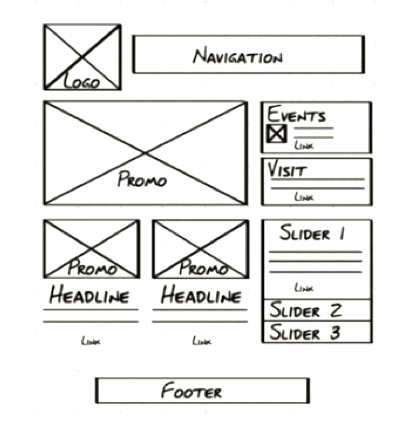
      wireframe
    8. Copy Deck: In developing a website for a client, the content is often done by different people and the designer requires that all the copy for the website be assembled into a copy deck. Copy the content of the first page, break it down and label it as if it were part of a copy deck. Take a look at the SAMOCA copy deck example for guidance.
    9. Competition: How does this website stack up against the competition? What does it have that competitor websites do not, in terms of voice, tone, brand, style, design and so on? Can anything be learned from the competition?

    This exercise is meant to get you into the development process of building a website — your portfolio!

    You will mark up your answer and create an index.HTML page with links and linked images that you will bring to class next week.

    Posting the Assignment on your Domain

    You will post the assignment on the b.parsons.edu server. Some of you may not gain access to this server right away. don’t worry about it. Just do the work and you will get on soon enough.

    Turn to the Tools of the Trade article for instructions on how to set up your website.

    Use Fetch to upload your files.

    Put a “parsons” folder inside the public_html folder.

    Fetch acts like a finder window, so when you drag files into the window, they end up on your server. Unlike your finder, you replace the file when the names are the same. This is how you update files to a newer version.

    Within the “parsons” folder, create a folder called “assignment-1”. The title of your web site profile should be “index.html”. It should end up in the “assignment-1” folder.

    Review Writing HTML article to help you create the HTML file. I have an old assignment as a homework sample.

    Visit Interactive Video Introduction to HTML course to learn all about HTML or watch the video series below.

    Watch Video Series Do Not Fear the Internet

    These videos (about half an hour) are much more fun and direct than my lectures or the Lynda.com videos. Many if not all of your basic questions will be answered by listening to either my lecture or watching these videos. Please let me know in class or email me if there is still something that is not clear. To go on without resolving what is not clear will cascade into many problems later on.

    A fun introduction to the basics of HTML and CSS.

    1. Don’t Fear the Internet


    2. HTML: Hamburger Text Markup Language


    3. Don’t Fear the Browser


    4. Starting from Scratch: HTML